Echo Park Pirate Tales 6×6 Paper Pad
So… My Echo Park mystery box included the Pirate Tales 6×6 paper pad. It wasn’t a paper pad I normally would have picked since I tend to go for bright colors but the black, navy and burgundy had a nice masculine feel to them. And masculine cards are a common request with the charity where I donate my cards.
Since I like to have a few extras of commonly used supplies, I had a brand new package of Recollections black cardstock which I was able to use as the matting for most of the cards. For masculine cards I tend to keep the embellishments to a minimum so the brads, bakers twine and Love From Lizi peel-offs I had on-hand worked perfectly. For sentiments, I decided to use the cut-aparts in the paper pad. They were all good sized, 2 x 2 and 2 x 3 inches, and had cute pirate themed sayings or images.
I really liked the paper with the red, white and blue banners. I thought it was too busy for a background so instead picked a sketch where I could still use a larger piece as a focal panel. I added the cute “Shiver me timbers” cut-apart and a few metallic brads and this card was done.

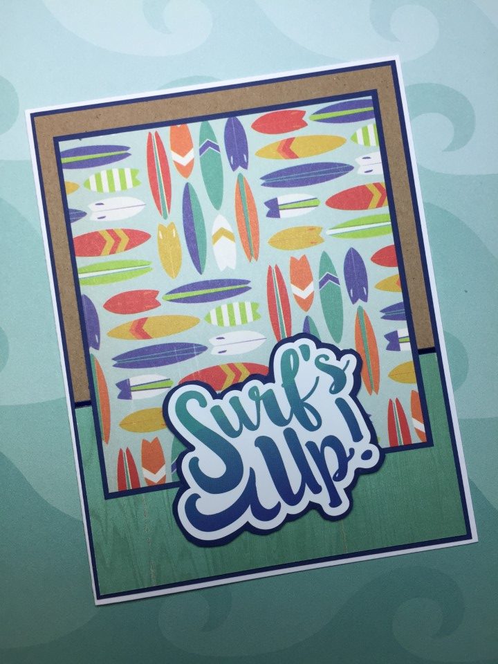
I created the focal panel on this card by combining a 2×3 inch cut-apart for the top and printed paper for the bottom. This was a great way to use up cut-aparts and smaller pieces of the printed paper. And the horizontal strip across the panel covered any small gaps where the printed paper was a little short.
It’s a simple layout, but I use it quite frequently. For these cards it worked great with the 2×3 inch cut-aparts. The layout is very easy to modify to work with different sized focal panels and to combine printed papers.

The paper pad had a lot of busier prints and just a few tone-on-tone papers. So instead of using the tone-on-tone as a background I used smaller pieces to “mute” the busier prints. There’s just enough of the busy print showing without it being too overwhelming. The Love from Lizi’s matte gold peel-offs on the navy horizontal strip pick up on the gold octopuses in the paper.

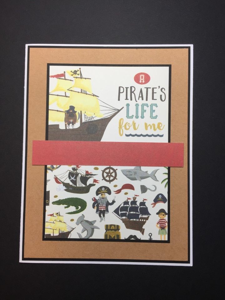
Although I still had a few larger pieces of paper left, the busyness and the direction of the prints made them difficult to combine. Instead I stuck with using a single print and pairing it with a coordinating solid color cardstock. The prints are quite colorful so there were lots of choices. I selected burgundy for this card which also picked up on the color in the cut-apart.

While not my favorite paper pad, I did like the challenge of using a theme and colors outside my comfort zone. For my next project I pulled out a 6×6 paper pad I’ve had in my craft room for a couple years. There’s still so much fun stuff from the mystery box but I really need to use up some older supplies to make room for the new purchases.