Browsed by
Month: October 2020

Ms. Sparkle and Co. Aviary Garden

Ms. Sparkle and Co. Aviary Garden

This was another 5.5 x 7.5 inch paper pad I picked up at Joann’s for less than $1.  Like The Greenery paper pad I used a few weeks ago, this is paper and not cardstock.  The papers are nice and bright and most had several colors to work with when choosing coordinating prints and cardstock.  For something different I decided to try using only 2 layouts.

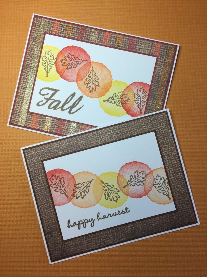
I decided there were only 2 patterns that I liked for backgrounds – the bold black and white stripe and the large pink and white polka dot.  After looking at the possible paper combinations I paired the stripe with the swan print and the polka dot with the turquoise floral print.  With 4 sheets of each print, there was enough paper for 4 stripe and 4 polka dot backgrounds.  The larger paper size allowed for 2 focal panels to be cut from each sheet.  To create the additional backgrounds needed I pulled in some additional paper from my stash.  With all the different colors, it was easy to find cardstock for the horizontal piece running across the card.  Instead of matting the horizontal piece I used several different Love from Lizi peel-offs which created a little separation and added some sparkle and shine.  I kept the sentiments simple with “Thinking of  you” and “Happy Thoughts”.

The remaining 2 pattern papers, both colorful bird prints, were easy to pair up with several different colors and prints for the backgrounds.  For the paper with the white background I used a yellow gingham print and a multi-color polka dot print.  For the paper with a green background I used a black print and a blue on blue print.  With more open space on the focal panels adding a few rhinestones along with the peel-offs gave the cards some more sparkle.  In keeping with the bird theme, the “a little birdie told me…” sentiment was perfect.

After completing the first layout I was left with several 2 inch wide strips of paper.  For the first few cards I was able to pair up strips using paper from the paper pad.  A few more of the strips were paired with papers used for backgrounds.  For the final strips I pulled in some additional paper from my stash.  Since I like to have some separation between printed papers, a strip of washi tape was added down the center of the card.  To break up all of the straight lines, the sentiment was stamped on a die-cut circle which was matted and popped up with foam tape.  Depending on the print, rhinestones and epoxy dots were added on a few of the cards.  While not the most exciting layout, it worked well with the remaining paper and left few scraps.

By using only 2 layouts it was quick and easy to make several cards.  Not a lot of time had to be spent figuring out the different measurements.  I don’t know that using so few layouts would work all the time, but it seemed to work out well for this paper pad.

Autumn Cards

Autumn Cards

I’m starting to get in the autumn holiday mood but didn’t want to pull out all of the Thanksgiving stamps and paper pads.  Instead I decided to use a layout/technique that I’ve used in the past for many different occasions – birthday, baby, spring, etc.  I only needed a couple ink pads, a few stamps and some printed paper in fall colors.

As all the cards used the same layout and sizes of paper I followed an assembly line process to create the cards.  To get started I cut several sheets of white cardstock into 2 7/8 x 4 1/8 inch pieces.  I then picked an ink pad (red, yellow or orange) and stamped a circle on the left side of the white cardstock.

After stamping a circle on 6-10 pieces of white cardstock, I switched to another colored ink and stamped the 2nd circle slightly overlapping the 1st.  I followed the same steps for the next 3 circles.

I then switched to brown ink and stamped a leaf in the center of each circle.  I think changing the direction of the leaf gives the feeling of motion, like leaves falling from the trees.

The final step for the white cardstock panel was to add the sentiment.  As the circles were all randomly stamped, the space for the sentiment was slightly different on each panel.  Again using brown ink, I stamped an appropriately sized autumn sentiment on each panel.

While the ink was drying I cut the rest of the papers – background paper to 4 x 5 1/4, coordinating matting to 4 1/8 x 5 3/8 and matting for the stamped pieces to 3 x 4 1/4.  By then the ink was dry and I was able to assemble the first batch of cards.

The first few batches of cards used 12×12 paper from an older Recollections paper pad for the backgrounds.  I was able to make 6 cards from each 12×12 sheet.

The final few batches used partial 12×12 sheets and a few 6×6 sheets for the backgrounds.  The batches were smaller, but it was interesting to see how using the different backgrounds changed the look of the cards.

I can’t decide if my favorite uses the wood panel paper or the brown checked paper as the background.

All of the stamping was a bit time-consuming but with an assembly line process and small batches it was easy to complete about 50 cards in just a few days.  And, while the layout and supplies used are all the same, each card is slightly different as everything was hand-stamped.

Triptych Stamped Image

Triptych Stamped Image

After the scrap cards I was a bit bored with pattern paper so I decided to use a stamped image as the main focal point.  I didn’t want to use an image that I would have to color and after rummaging through my stamps I found an image that could be stamped in a single color.  Since I still had some of the scrap paper out, I looked for pieces that could be used for the background.

The first paper I selected was bright green with a tiny white print.  I knew I had some ink that would match this paper perfectly.  Using the Misti stamping tool, I stamped the image multiple times on white cardstock to get a nice clean impression.  I then cut the image into 3 pieces and matted them with black cardstock.  The “hello” sentiment is stamped on black cardstock, with Versamark watermark ink, and heat embossed with white embossing powder.  For a bit of dimension the sentiment is popped up with some foam tape.

I liked the way the green cards turned out and decided to try it again with a different color combination.  Flipping through more scrap paper I found a piece of pink tone-on-tone pattern paper.  The shade of pink was a nice match to a pink ink pad that I have.  I stamped the image several times to get a good impression, matted the 3 pieces with black cardstock and heat embossed the same “hello” sentiment.

For something a little different, I used a busy black and white pattern paper for the background.  At first I thought the pattern might be too much, but the stamped image covers quite a bit of it.  Pink and black is one of my favorite color combinations and I think this card might be my favorite.

For the last few cards I pulled out a yellow and white pattern paper for the background.  I tried stamping the image with yellow ink but it just seemed to fade into the background paper.  So I tried an orange ink which provided a nice contrast to the yellow paper.  In keeping with the scheme of 3 colors per card, I used orange cardstock for the matting.  I was also able to find some orange embossing powder in my stash to create the sentiment.

Overall the cards are quite simple and use a minimum number of supplies.  I like the look of the cards but wonder if there is something I could do to add more “pop”.  Maybe use foam tape on one of the 3 image panels for more dimension.  Maybe stamp the image in 3 different colors of ink and use 1 piece of each color to create the full image.  Or it might be interesting to use 3 shades of a single color ink to create an hombre effect.  It could also be interesting to cut the image horizontally instead of vertically.  I think I’ll have to make a note and try this again in the future using a few of these ideas.

Scrap Cards

Scrap Cards

I still couldn’t decide what to work on so I pulled out the “large scrap” paper drawer.  It’s full of partial sheets of 8×8, 8 1/2 x 11 and 12×12 papers and full sheets of 6×6 papers.  The papers are from different paper pads, one off single sheets, leftovers from kit collections, etc.  So basically nothing was intended to “match”.  For a bit of a challenge I decided to only use the printed papers (other than cardstock for matting) that were in the scrap drawer.

To get an idea of what papers I had to work with, I spread the paper out on the floor – grouping it by color, print and theme.  After sifting through the paper I ended up with 10-15 possible “matches”.  Since these were larger scraps I was able to make at least 2 of most of the cards.  To get started I went with a combo I think I many have used in the past – a pink and yellow scallop print paired with a large yellow polka dot.

For the next set of cards I used a new-to-me card sketch.  The papers are all brightly colored with stripes, polka dots and floral print.  I used a scalloped border punch on the striped paper to create a “softer” seam with the polka dot paper.  For more scallops, I used a scalloped circle punch for the matting on the sentiment panel.

The pink floral paper on the next group of cards was part of an 8×8 sheet.  The print ran diagonally across the paper.  With some strategic cutting I was able to get three 3×3 inch squares.  I paired the floral with a pink, white and green stripe for the background and a green print for the strip running across the card.  For the embellishments I used an idea I saw in an old Stampers Sampler Take Ten magazine – a small brad in the center of a die cut circle.

The next batch of cards used paper from a couple different Recollections 12×12 paper pads – one a tropical theme and the other a desert theme.  I again used the scalloped border punch on the seam between the printed papers but it got “lost”, especially on the tropical print paper.  By adding some matting, the scallops are more noticeable.  To finish the cards I added ribbon and a few rhinestones/epoxy dots.

The last group of cards used some of the smaller scraps.  None of the scraps were big enough for a full background but using a simple half and half layout worked great.  I liked the look of the border punched paper and matting from the previous cards and I decided to do that again.  In addition to the scalloped border punch I used a parentheses border punch on a few of the cards.

I still had a couple potential “matches” left but they weren’t my favorites so I decided to move on to a new project.  I’m constantly adding new scraps to the paper drawer so I’m sure there will be lots more paper combinations to try in the future.