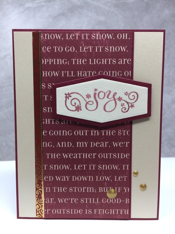
Christmas Cards from Scraps
Before moving on to the next paper pad, I decided to use up the scraps from the Jingle All the Way paper pad. With all the different colors and patterns in the paper pad there weren’t any scraps that could be combined. So I pulled out some scraps from the Authentique Colorful Christmas paper pad which also included pinks and teals. By mixing scraps from both paper pads I was able to make a few more cards.
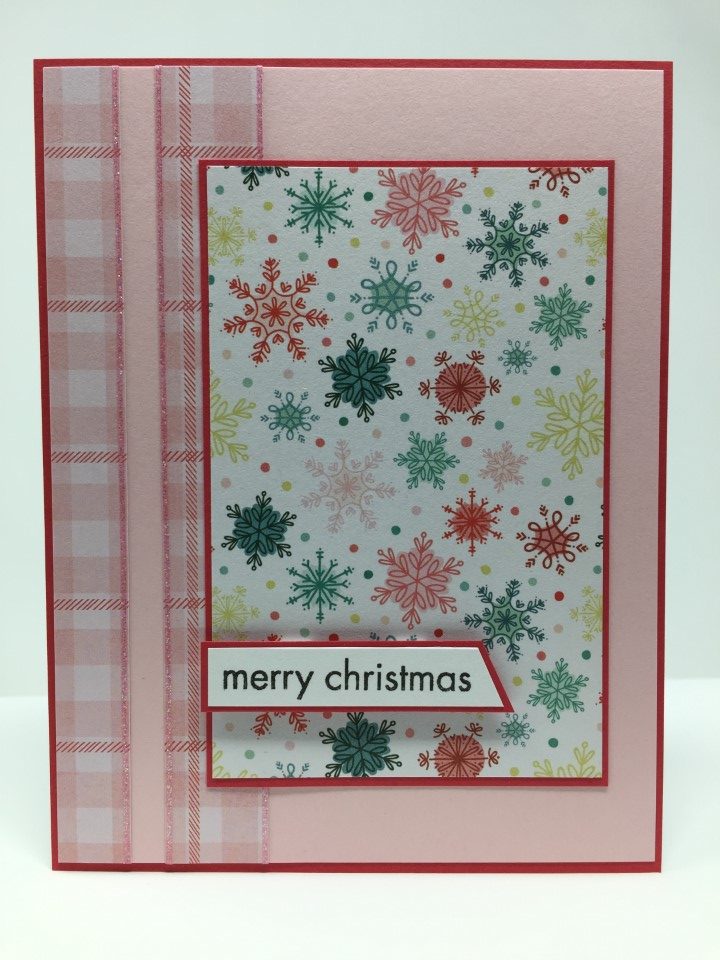
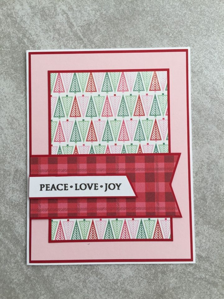
This card pairs the red plaid from Jingle All the Way with a tree print from Colorful Christmas. After trying a few options for the background I decided to go with the pastel pink. I think the non-traditional color is a nice compliment to the more traditional plaid and tree prints.
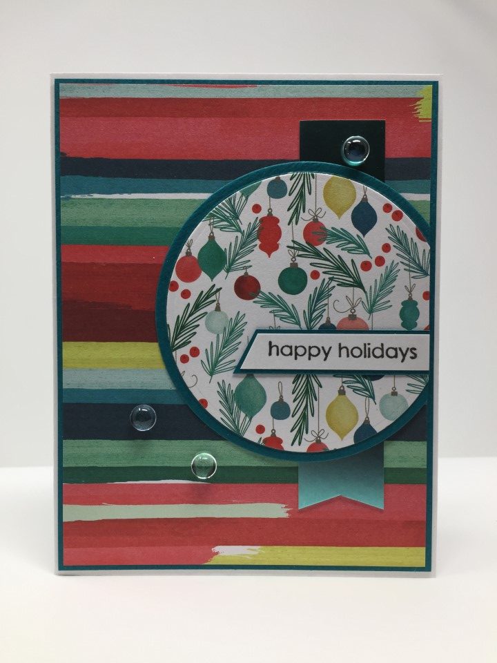
For the next couple cards I paired the multi-colored ornaments from Jingle All the Way with a print from Colorful Christmas. Both papers include the same colors and if I didn’t know better would think they came from the same paper pad/collection. I selected sketches that worked with the size and shape of the Colorful Christmas paper scraps. The layout for the first card worked best with a vertical pattern scrap. The focal panel was created with a die set from Gina Marie designs.
The layout for the second card featured a horizontal pattern scrap. A small scrap of the Jingle All the Way ornament paper was used for the focal panel. To add some texture to the aqua background, the cardstock was embossed using a swiss dot embossing folder. For a little shine, a thin strip of teal satin mirror cardstock was added under the Colorful Christmas paper.

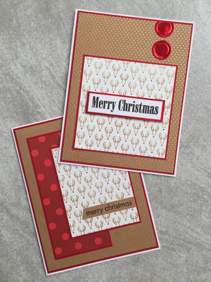
For the last couple cards I used the red polka dot print from Jingle All the Way with the deer print from Colorful Christmas. Kraft paper, which matches the color of the deer print, was used as the background for the first card. The red polka dot print picks up the color of the deer noses. To bring in more red, a red cardstock was used for the matting.
I liked the look of the deer print with the kraft cardstock but without another print to pair it with thought it was too plain. Combining the kraft color with a print, I pulled out a sheet of gold foil kraft cardstock from the DCWV Kraft & Gold paper pad. The tiny gold polka dots are just enough. To finish the card a few circles die cut from red mirror cardstock were added to the upper right corner.
By combining the scraps from these 2 paper pads I was able to make several cards. With their non-traditional colors and Christmas themed prints, I think it would have been difficult to use these papers with anything else.