Browsed by
Month: February 2021

My Mind’s Eye World Traveler

My Mind’s Eye World Traveler

I had never purchased a coordinating ephemera pack but one of my favorite cardmakers uses them occasionally so I thought I’d give it a try.  Since I wasn’t sure if I’d like using the ephemera I decided to see what was available at my local Tuesday Morning store (prices of papercrafting products are usually up to 50% off retail).  There were several paper pads but only 1 had the coordinating ephemera – World Traveler by My Mind’s Eye.  I liked the colors and the prints in the paper pad and figured I could use just the paper if I didn’t like using the ephemera.

I’m sure the paper would work for birthday, miss you, etc. but I decided to skip any sentiments and only use what was included in the ephemera pack.  And with 60 ephemera pieces there was a lot to use up.

The hot air balloon was my favorite ephemera piece so I used it first.  The background uses the hot air balloon paper for the bottom portion and a bright green cardstock for the top portion.  A blue Love from Lizi peel-off was added to the seam between the 2 papers.  The balloon and “So Fun!” ephemera pieces were popped up with foam tape on the the pink/white stripe panel.  The top portion of the card looked a little plain so I wrapped the panel with blue and white bakers twine and tied a small bow.  As a finishing touch a few clear crystal drops were added around the ephemera.

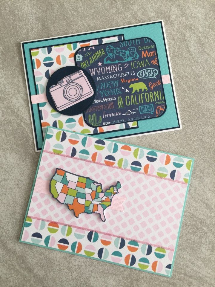
The camera print paper was cute but with the white background it seemed to wash out the brightly colored papers.  Instead of trying to brighten up the camera print I decided to go with the pale color scheme, pairing it with a pale pink/white print and using a pale pink cardstock for the background.  The navy cardstock used for all the mattings highlighted the different panels.  Keeping with the pink theme, a couple pink brads and pink glitter Love from Lizi peel-offs were added as embellishment.

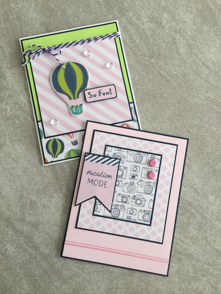
Another fun ephemera piece was the pink camera.  To ensure it didn’t get lost in the busyness of the two paper panels, I matted it on a blue cardstock circle.

With all of the different colors, the map ephemera should have been easy to use but…  Instead of layering it on the bright prints, it seemed to work best when layered on one of the pale pink/white prints with the bright print used as the background.

The ephemera pack included a couple of larger sized tags which I used as focal panels.  A bit of bakers twine was added to the tops of the tags and then the entire piece was matted with coordinating cardstock.  Since they were airport baggage claim tags, I paired them with the airplane print paper.

For the road sign ephemera, like the Route 66 and Detour pieces, I paired them up with the map and other road travel related paper.

I’m not sure if this was the best ephemera pack to use as a first try.  While all of the pieces were travel related, they could only realistically be paired with specific papers.  For example, the road sign ephemera wouldn’t have worked with the airplane print paper and the airplane ephemera wouldn’t have worked with the bicycle print paper.  I did manage to use up over half of the pieces but other than a couple small tags I’m not sure what I’ll do with the remaining ephemera.  I’m not giving up on using ephemera packs, but based on the experience with this collection, next time I will look for paper and ephemera with a narrower focus (i.e. only one type of travel).

Recollection’s Love and Devotion

Recollection’s Love and Devotion

Now for the red, pink, hearts and flowers Valentine cards…

I used Recollection’s Love and Devotion 12×12 paper pad.  All of the papers are the traditional red and pink with lots of heart and flowers.  It’s a pretty paper pad with some sheets having a glitter or mirror accent.  Since there is so much paper, I tried to use only papers from this paper pad for all of the backgrounds and focal panels.  But, there were a couple cards where none of the papers worked for the background and I did end up using some white shimmer paper.

Along with the cut-aparts, I used a few Valentine and love sentiment stamps.  All of the cut-aparts were square or rectangular, but a few worked well for die-cutting into circles.  I also used a few dies to cut hearts for the sentiment panel and embellishments.

My favorite card uses Mojo Monday sketch #370.  I’ve used this sketch in the past and really like how you can mix multiple pattern papers.  For this card I only used 2 patterns since the “Love” background and the tic-tac-toe focal panel are both a bit busy.  For the other card, I used another of the cut-aparts as the main focal panel.  More of the floral print and polka dot papers were used for the other panels.  Since adding another print would have been too much, white shimmer paper was used for the background.  For embellishment, a pale pink chiffon ribbon was tied around the card front.

The next 2 cards used a couple of sketches that I have been using quite a bit lately.  The first card used another of the “Love” pattern papers for the focal panel.  For some separation from the background, the focal panel is matted on white cardstock with a scalloped border.  For the second card more of the tic-tac-toe paper was used for the focal panel.  Die cut hearts, rhinestone hearts and red mirror Love from Lizi peel-offs were used as embellishments.

After making over 40 cards, I’m ready to move on to something new.  There is still tons of paper left including several prints that I didn’t even use.  I’ll have plenty of paper for Valentine cards for next year.

More Valentine Cards

More Valentine Cards

I still wasn’t ready for the full blown red, pink, hearts and flowers Valentine cards.  Instead I pulled out a couple sheets of non-Valentine paper from Pink Fresh Studio’s Felicity collection.  One features a modern take on a heart print in red, gray and peach.  The other small colorful hearts sprinkled across a white background.

The first set of cards paired the red, gray and peach heart print with a peach/red polka dot paper from my craft room.  I used a simple layout that I had used for the previous batch of Valentine cards.  The heart print paper is used for the focal panel and the polka dot paper is used for the background.  To ensure as many “hearts” as possible are visible, some of the cards are done vertically and others horizontally.  A simple Valentine sentiment is stamped and trimmed into a banner shape.  For the vertical cards, a couple red heart shaped rhinestones were added in the upper right hand corner.

The next couple cards used a new-to-me sketch and an old favorite.  The new sketch features the focal panel trimmed into a banner.  A large die cut heart was added towards the top of the banner and the sentiment strip was popped up over the lower portion of the die cut.  For some sparkle, a couple red rhinestone hearts were added.  The second card used one of my favorite sketches.  The heart print is again used for the focal panel.  To add some interest to the right side of the card, a couple heart rhinestones were added.

At this point there were only a few strips of the polka dot paper left.  I looked for sketches where I could use the strips instead of a full sheet of paper for the background.  The first card used a panel of the heart print paper across the card and the second used a panel down the center of the card, both panels covered the edges of the polka dot strips.  Instead of matting the heart panels, red mirror Love from Lizi peel-offs edged the panels and a couple of die cut hearts were added for embellishment.

The second group of cards pairs the colorful heart print with a teal geometric print also from the Felicity collection.  So far the focal panel on all of the cards were square or rectangular.  For something different, I used a circle focal panel.  A simple “Love” sentiment was stamped and added across the lower portion of the circle.  And for embellishment, a small die cut heart and clear heart shaped rhinestone were added to the end of the sentiment strip.

The next set of cards used a couple of my favorite sketches.  Both cards feature a single large focal panel perfect for featuring the heart print paper.  The first card has a large fish-tailed sentiment banner and a long thin flag cut from a scrap of teal satin mirror cardstock.  The second card features a small die cut heart stamped with a Valentine greeting, making it look like a candy conversation heart.  A few clear heart shaped rhinestones were added next to the focal panel for a little bit of sparkle.

Using the leftover strips of background paper worked so well that I decided to try it again.  The first card used one of the same sketches, but instead of a vertical card, I flipped it horizontally to work with the direction of the heart paper.  Love from Lizi peel-offs, a large die cut heart and a few clear heart shaped rhinestones finish the card.  The second card uses a similar layout, but the vertical strips of the geometric print are different sizes.  The heart paper is matted with some of the teal cardstock and edged with 2 different sizes of Love from Lizi peel-offs.  Instead of a sentiment panel, a few fun Valentine greetings were stamped on small die cut “candy conversation hearts”.

Even though the cards were made for Valentines Day, I think they would work any time of the year.

Valentine Cards

Valentine Cards

After a short break it was time to get going on Valentine cards.  To get started I pulled out all the Valentine specific paper.  As I was doing this I noticed a few sheets of heart print paper that I had picked up with the intention of making “Miss You” cards.  Instead I decided to use the paper for Valentine’s Day cards.  Not every Valentine needs to be red and pink, right?

Since the hearts are mainly shades of blue with just a couple peachy pinks and rosy reds, I decided to focus on the blue hearts.  I found a soft blue-green scallop print and a partial sheet of bright royal blue check print to pair with the heart paper.  Keeping with the non-traditional theme none of the sentiments were specifically “Happy Valentine’s Day” and all of the sentiments were stamped using Ranger Cobalt Blue ink.

Because of the scale of the heart paper, a single large focal panel was used to ensure multiple colors of hearts were visible on each card. The first couple cards used the scallop print for the background.  To bring in just a touch of valentine color, a scrap of rosy red/white polka dot print was used for the strip across the card.  The sentiment was popped up with foam tape to add a bit of dimension.

The next set of cards again used the scallop print for the background.  A long “XOXO” sentiment was stamped and the ends were cut into a fish tail.  A small heart was die cut from more of the polka dot paper and popped up with foam tape.  The heart was placed at different spots along the sentiment depending on the location of the hearts on the focal panel.

For the next few cards, I pulled out some washi tape that has been hanging out in my craft room for quite some time.  The colors of several stripes in the washi tape also appear in the heart paper.  For some of the cards the washi tape appears to be taping the focal panel to the card.  For others, the washi tape covers the seam between the pattern papers.

The next group of cards used the blue check print for the background.  The size of the focal panel on the cards is the same but the pattern is vertical on one and horizontal on the other.  The same sentiment is used for both layouts.  On the vertical card the sentiment panel has fish-tailed ends and is popped up for some dimension.  On the horizontal card a die cut heart, popped up with foam tape, has been added to one end of the sentiment panel.

The last couple cards used up the rest of the scallop and check print papers.  To separate the printed papers, Love from Lizi peel-offs were used.  A small “Luv U” sentiment was added to the bottom corner of the cards.  The last of the polka dot paper was used to die cut a few hearts which were popped up with foam tape for some dimension.  As a final embellishment, a few rhinestones were added for some sparkle.

I really like how these cards turned out.  I think they would work for masculine or feminine Valentine Cards.  Or with the non-traditional colors and prints could also be used any time of year.  I still have a couple sheets of the heart print paper left and may eventually get around to using it for “Missing You” cards.

American Crafts Hot Cocoa 6×6 Paper Pad

American Crafts Hot Cocoa 6×6 Paper Pad

And now for the last of the Christmas cards…

It’s after Christmas but there was still one more paper pad I wanted to use.  Also, I had purchased a few new dies after Christmas and I didn’t want to wait until next Christmas to try them out.

The paper pad was not specifically Christmas but the prints all had a winter feel to them so I decided to use holiday sentiments.  There were only 4 colors in the paper pad – black, white, red and kraft, which made it easy to pick coordinating cardstock.  I used red and black cardstock for the matting and red, kraft and white shimmer papers for the backgrounds.

I used sketch #516 from MFT on the last batch of cards and decided to use it again.  Solid colored cardstock was used for the background and printed paper was used for the focal panel and the horizontal banner.  Red mirror cardstock was used for the banner on the left side of the card.

The next few cards used two of my new dies – a deer silhouette and a snowflake.  I cut both images out of red cardstock.  The deer is paired with a red/white/kraft tree print and the snowflake is paired with a kraft/white snowflake print.  Everything was matted with more of the red cardstock.  I really liked how these cards turned out and know I’ll get a lot of use out of these dies in the future.

The paper pad included a couple sheets of cut-aparts, some of which were small tags.  I really liked the tags and thought it might be fun for the sender to personalize the To/From tags.  Using a die, I created a small envelope for each tag.  A bit of coordinating twine was added to each tag and then they were placed into the envelopes.

These next few cards used only black and white prints with a pop of red.  Both cards used more of the new dies.  The deer die cut, being a more solid image was easily visible on the black/white tree paper but the snowflake seemed to get lost on the same print.  To ensure the snowflake was visible, I die cut several snowflakes and stacked them together, which gave the snowflake some dimension.

With the scraps, I decided to do a slightly different take on an OWH sketch.  Using an old punch and the scraps, I punched several scalloped squares.  I also punched several squares out of some kraft cardstock.  For the kraft squares I added a red or white snowflake die cut with one of the new dies.  A coordinating ribbon was added across the bottom of the card.  I didn’t want to cover up too much of the scalloped squares and decided to skip the sentiment.

The paper pad included 36 sheets so I knew I would probably make more cards than usual but 50+ cards was a lot.  This put my total to over 200 Christmas cards this season and I’m going to call it done.  The charity where I donate my cards starts packaging/shipping Christmas cards in July so I have plenty of time to drop these off before then.  Now I’ll take a short break before starting on Valentine cards.