Browsed by
Month: April 2024

Spellbinders Always Remember Card Kit

Spellbinders Always Remember Card Kit

I’m still working my way through my collection of Spellbinders card kits.  This is the February 2022 kit and is filled with pretty pastel colors, lots of florals and fun spring images.  I hadn’t used the Always Remember kit before so I knew I wouldn’t be finishing or even making a dent in the kit.

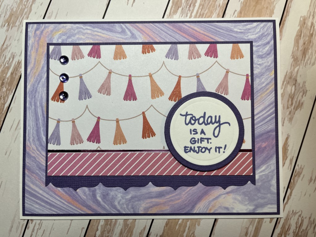
To get started I used one of the sample cards for inspiration.  As I tend to like a “cleaner” look, I used fewer pieces of ephemera on the card.  I still like the look and with duplicates of most of the ephemera pieces, I was able to make 2 cards.

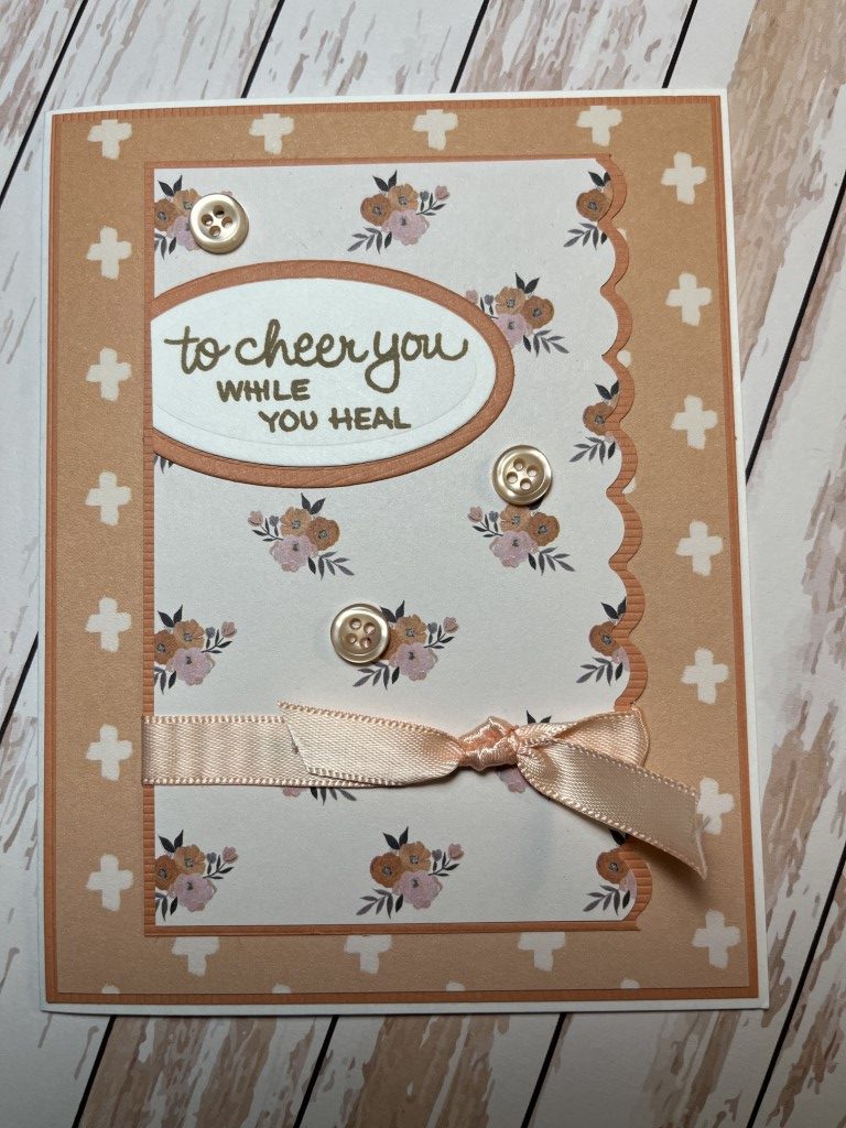
The next card is also based on a sample.  I switched up some of the sentiment pieces and included fewer hearts which keeps the card general enough so that it could be used for a birthday or wedding.

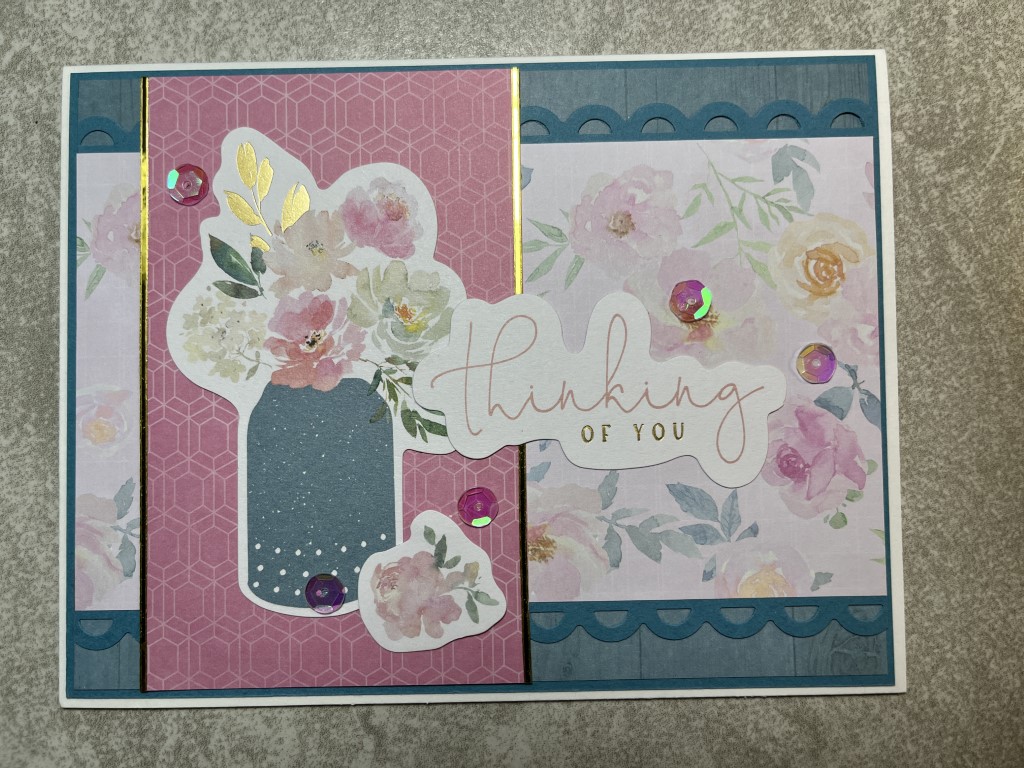
For the last card I used a sketch for inspiration.  The larger vase of flowers fit nicely on the vertical panel.  Using the floral print for the strip across the card added more flowers and color.  A Fiskars border punch was used to create the matting for the floral print.  A few of the included sequins added some sparkle and finished the card.

No surprise I still have tons of ephemera left and haven’t tried the included stamp and die sets yet.  I’ve put the kit away for now as I have plenty of spring cards to take to my antique booth.  It’s definitely a go-to kit for spring, wedding or feminine themed cards.

Spellbinders Around the World Card Kit

Spellbinders Around the World Card Kit

This batch of cards was created using Spellbinders August 2020 card kit – Around the World.  I had used the kit before and still had plenty of epherema to use up.  The goal was to use as much of the ephemera as possible without being too over the top.

I decided to try a “structured” collage look for the first card.  Instead of overlapping the different pieces of ephemera I loosely aligned the pieces leaving some of the background visible.  I started by grouping the ephemera by color and by mixing the pink and aqua ephemera pieces was able to come up with a layout that I liked.  It did take a bit of auditioning to select pieces that included a nice mix of shapes and sizes.  To give the piece some dimension, I also popped up a couple of pieces like “Sydney” and “Tokyo”.  I’m sure this style won’t appeal to everyone, but as I tend to lean more towards the clean, linear look this worked really well for me.

In fact, I liked the first card so much I decided to do another collage piece.  This time I focused on blue and peach ephemera pieces.  Instead of a white background I used a blue tone-on-tone map print which matched the color and theme of the ephemera.  Including pieces with different profiles (zig zag edge on the map, rounded edge on the pins) as well as paper die cut and chipboard pieces make the layout more interesting.  Popping up a couple pieces, like the map and suitcase, added some dimension.

The focal panel on the last card features a more traditional definition of collage.  Here I selected several pieces of ephemera and overlapped them on a circle focal panel.  To keep it interesting, I trimmed the map but allowed the elephant feet and trunk to extend beyond the circle.  I added a few tags cut from pattern paper and the simple “Vacay” sentiment.

As the kit includes 2 of each die cut piece, I was able to make doubles of each card.  With the first 2 cards using about 10 ephemera pieces per card I used up quite a bit of ephemera.  There is still plenty left, but I did use enough to consolidate everything into a smaller container.  Yay!

Recollections Warm Luxury 12×12 Paper Pad

Recollections Warm Luxury 12×12 Paper Pad

This batch of cards uses the Warm Luxury paper pad by Recollections.  It’s the 12×12 size but I thought the prints were small enough to work well on cards.  When I purchased the paper pad I liked that it included several purple/lavendar prints which I don’t come across that often.  Now, trying to find coordinating cardstock in my craft room has been a bit of a challenge.

I wanted to make just a few cards to have in my antique booth for spring.  The first card pairs a pretty floral with a fun geometric print.  I used a peachy orange cardstock for the matting and the scalloped strip across the card.  For contrast I stamped the sentiment in purple ink.  For embellishments I used peach satin ribbon, a Love from Lizi peel-off (along the top edge of the scalloped strip) and a few Queen and Co. bubbles.

I switched to a purple palette for the next card.  I really liked the swirling print as a background.  I paired it with the tassel garland print and a strip of striped paper from the cut-apart border sheet.  Both are matted on purple cardstock with a parentheses border created with a Fiskars border punch.  I used the same purple ink for the sentiment and a few more Queen and Co. bubbles for embellishment.

The next card paired another floral with a geometric print and used the same peachy orange cardstock fo the matting.  I used another Fiskars border punch to create the scalloped edge on the floral print.  The sentiment is stamped using Versafine’s Vintage Sepia ink.  For embellishments I used the same peach satin ribbon and a few small shiny peach buttons.

The last card is another purple card.  This time I paired several geometric prints together.  The small strip across the center of the card is another strip from the cut-apart border sheet.  I used some more of the peach satin ribbon and Queen and Co. bubbles for embellishment.

I made doubles of all 4 cards – 1 set for the booth and another set to donate.  I really liked how all 4 cards turned out and think they have a nice spring feel to them.