Browsed by
Category: 12×12 Kits

Echo Park Spring Market Collection Kit

Echo Park Spring Market Collection Kit

The next batch of cards were created for the Spring Fling event that took place at the antique store where I have a booth.  For the event I put together a giveaway that included a batch of handmade spring cards along with other spring themed vintage items.

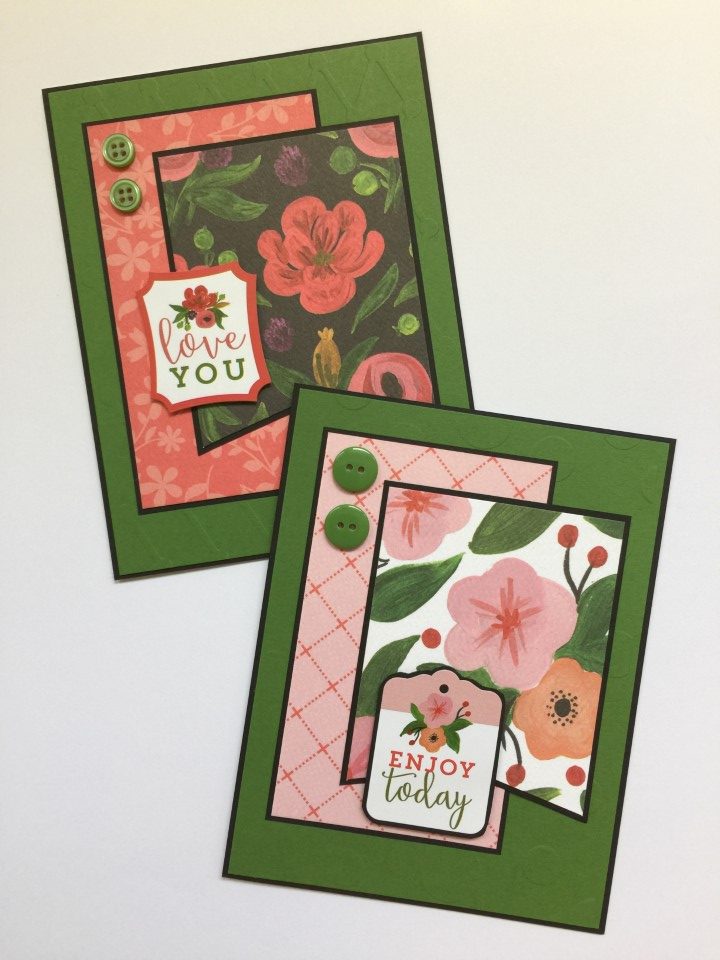
I’ve used the Spring Market collection kit before and knew that the patterns and prints would be perfect for a set of spring cards.  I choose the Stampendous True Friends stamp set as the flower related sentiments worked well with the theme and were general enough to use for mulitple occasions.

For the first card I used my favorite paper from the collection (the rain boot and flower bouquets) paired that with a peachy-pink pattern for the background.  For some texture and dimension, I added a chiffon ribbon around the panel.  I then punched a green scallop border for matting on one side of the bouquet panel and used a gold Love from Lizi peel-off for the other side.  The sentiment was stamped using Versafine Vintage Sepia ink and die cut using a Spellbinders label die set.  Everything was then matted on a piece of kraft cardstock.

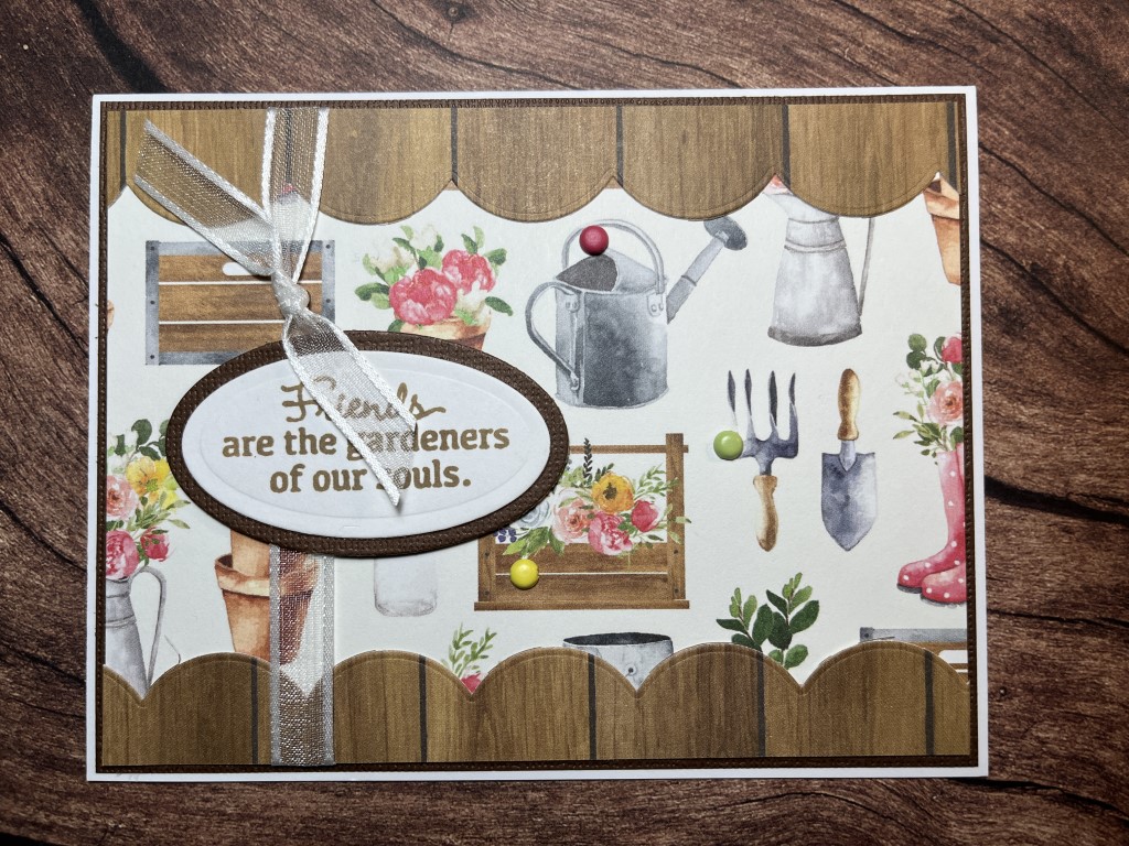
For the second card I used a fun garden tool print as the background.  A Spellbinders border die was used to create the large scallop border from a wood grain print which I added to the top and bottom edges of background.  I then tied a piece of white chiffon ribbon around the panel.  I used the same ink to stamp the sentiment and cut it out using a Spellbinders oval die.  Everything was then matted with brown cardstock.

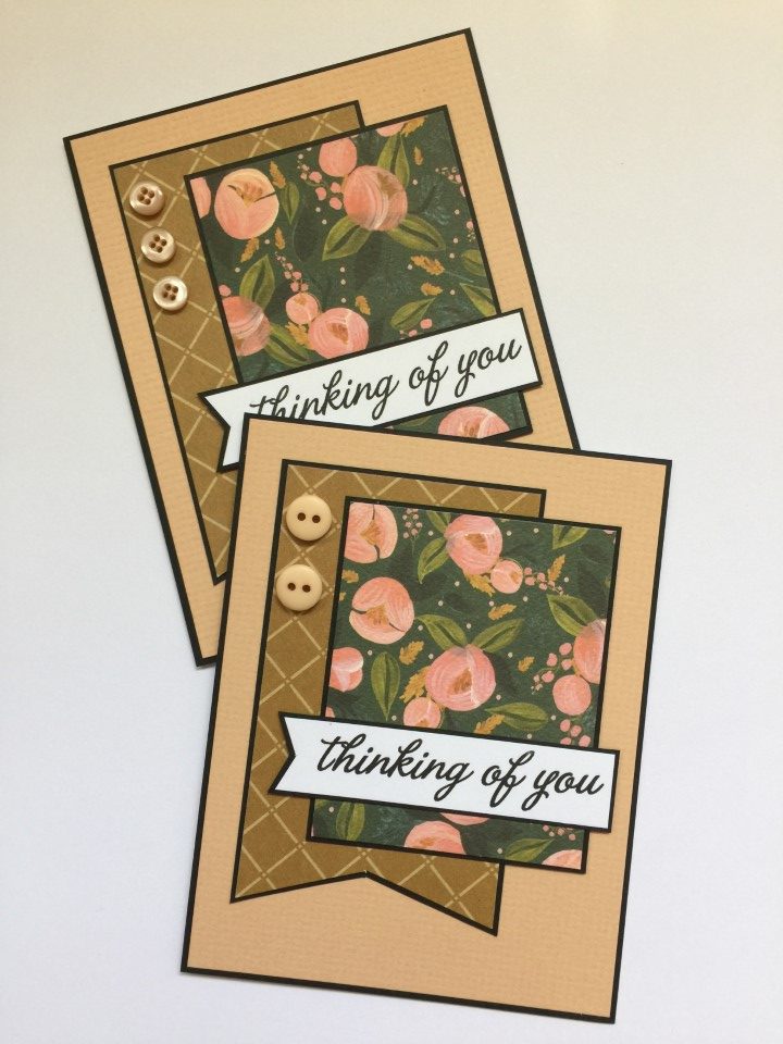
The next card used a small strip of the peachy-pink paper and more of the wood grain print paper for the scallop detail.  I used another floral print from the collection kit for the large panel on the card.  More chiffon ribbon was tied around the panel before it and the sentiment were matted using brown cardstock.

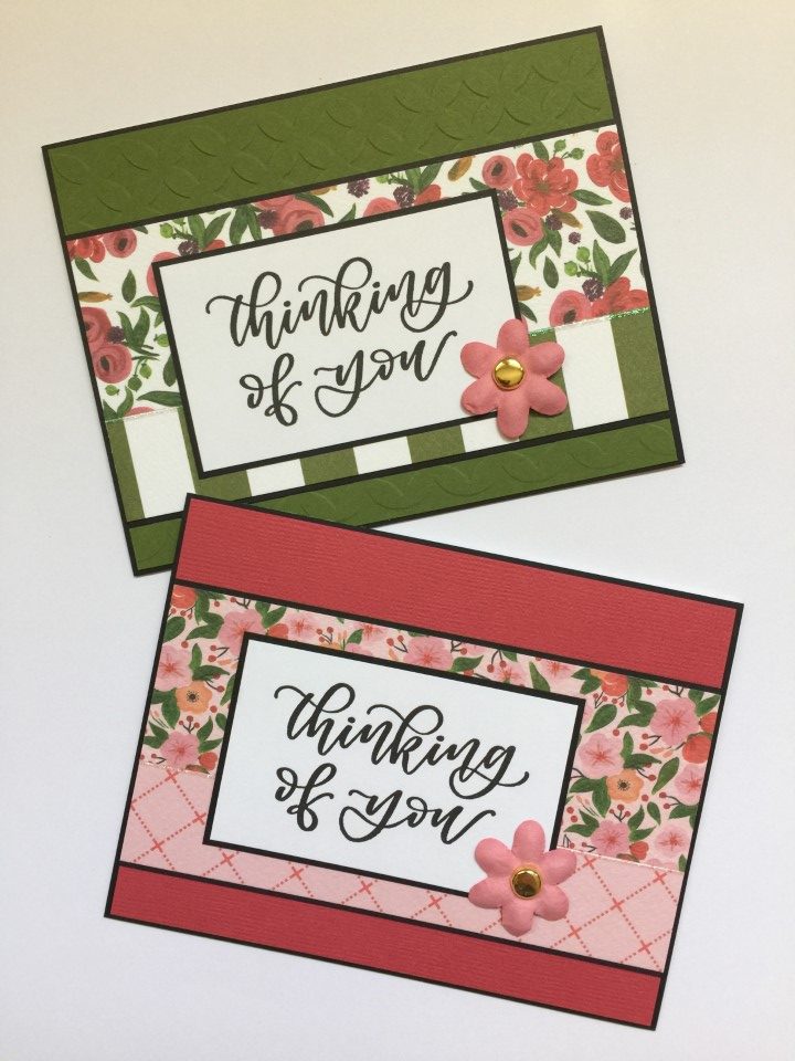
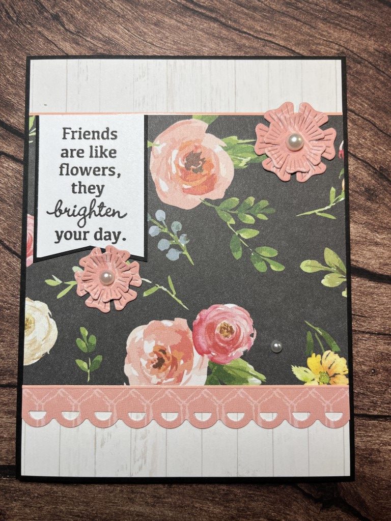
The last card uses a larger floral print for the main panel.  A small strip of the peachy-pink paper was punched using a Fiskars scallop border punch.  A peach Love from Lizi peel-off was added along the top edge of the floral print panel.  The sentiment was stamped using Versafine Onyx Black ink and then cut into a banner shape.  Everything was matted on black cardstock.  For dimension a floral die set and pearls were used to create the flower embellishments.

I liked how the cards turned out and they fit the Spring Fling theme perfectly.

Echo Park Summer Dreams Collection Kit

Echo Park Summer Dreams Collection Kit

With Graduation and Father’s Day cards done for my booth at Touch of Country Mall, I decided it was a good time to make some cards to donate.  With summer just over a month away I pulled out the Sumer Dreams Collection kit from Echo Park.  It’s full of bright colors and fun summer images.  All of the cards, other than a couple with birthday sentiments, are either blank (no sentiment) or use summer themes like “vacation”, “stay cool”, etc.

I wanted to focus on the fun images, so I looked for sketches that featured large focal panels.  For the first card I used the bikini paper as the focal panel and a small scale aqua paper for the background.  For an embellishment I wrapped thin pink and silver ribbon around the top portion of the card.  The “Vacation” sentiment was stamped in blue ink and embossed using clear embossing powder.

One of my favorite papers was the ice cream and popsicle print.  It made me think of birthdays and was perfect for a few birthday cards.  I used a couple different dies to create the scalloped border on the printed paper and the pink cardstock.  A few aqua epoxy dots were added to the white boardwalk print to bring a bit of color to the lower portion of the card.

I think my favorite cards used a few of the ferris wheel stickers as the focal panel.  A watercolor stripe paper was used for the lower panel on the card.  A solid color cardstock, which picked up on the most prominent color on the ferris wheel stickers, was used for the upper panel.  To separate the panels a coordinating ribbon was added.  A fun “Enjoy the Ride” sticker fit perfectly under one of the ferris wheels.  A few “ticket” stickers worked great with the teal and yellow ferris wheel.  To finish the cards a couple coordinating epoxy dots and rhinestones were added.

The sticker sheet included a few “sunglasses” stickers.  I wanted to use them with the sunglasses print paper but didn’t want them to get lost on the busy print.  I decided to make the stickers the focal panel by placing them on a white die cut circle but the contrast between the stickers and the white cardstock was too much.  Using a blending tool, I applied some ink to the cardstock to tone down the contrast and add a bit of color.  I then reattached the stickers.  A few Love from Lizi peel-offs for embellishment and a simple “Relax” sentiment finished the cards.

For the next batch of cards I decided do an assembly line process and make several cards using the same layout and papers.  This wouldn’t be something I’d do for cards I’m placing in my booth, but for donation this is a great way to make a lot of cards.  And since the charity sorts the cards and creates bundles from several card makers, the recipients always receive a large selection of themes and sentiments.  For the layout I used a sketch which has 3 main pieces – a background, a focal panel and an accent strip.  It was easy to quickly cut several of each piece and the coordinating matting.  For the sentiments, more stickers were used.  As a finishing touch on all of the cards a few epoxy dots or rhinestones were added.

At this point I was ready to move on to some new paper but before I put the kit away I decided to make a few more cards with the remaining scraps of paper.  By using 3 different papers a background panel was created.  A scallop border punch was used to create a fun edge on some of the strips.  A “Stay Cool” sentiment and a few more stickers completed the cards.

Although the kit included 12 sheets of paper I ended up only using 5 sheets to make 21 cards.  There’s plenty of paper and even a few stickers left which I can pull out later to make many more cards.  While most of the cards will be donated, I’ll probably slip a couple into the booth.

Echo Park Fine and Dandy Collection Kit

Echo Park Fine and Dandy Collection Kit

After all the oranges and browns in the last batch of cards I decided to do something bright and cheerful.  The colors and images in the Fine and Dandy collection were perfect.  The kit included 12 12×12 sheets of paper and 2 sheets of stickers.  I’ll probably not use the sheet of alphabet stickers but I did use quite a few of the image stickers.  I made over 30 cards and still didn’t use up all of the paper.  I ended up putting the remaining sheets and leftover scraps back into the packaging and will pull it out later when I’m looking for a small project.

For the first set of cards I used the bumble bee paper.  I knew it would be perfect with the “be Happy” stamp.  Using colored pencils I colored the stamped image to match the paper.  As a final touch I used a Wink of Stella pen to highlight all of the bumble bee wings.

One of my favorite prints were the owls which I thought were very cute.  The background is a bright pink chevron print.  For the strip across the card I used a few different colors of cardstock which I edged with Love from Lizi clear iridescent glitter peel-offs.  To keep the cards usable for multiple occasions, I used several of the coordinating image stickers instead of a sentiment.

When I saw the birds perched on bunting paper, I immediately pulled out the “a little birdie told me…” sentiment stamp.  I only use the stamp when I have paper with birds on it, so not very often.  To mimic the draped shape of the bunting I used a die to create a scalloped edge on the paper.  To keep the card nice and bright I used a striped paper for the bottom of the card.  To ensure the sentiment didn’t blend it too much, I matted it in bright pink cardstock and popped it up with foam tape.  For a little sparkle I added a few Queen and Company goosebumps.

The red and white gingham print was quite bold so I wanted to pair it with a more toned down print.  With a white background the less busy floral paper was a nice match.  Placing the sentiment panels, some coordinating stickers and others stamped, on the lower portion of the card also helped tone down the gingham print.

I wasn’t a fan of the yellow paper.  I’m not sure if it was the pattern or the color but since the print on the opposite side was too large for cards…  I decided to use the yellow paper as a background and paired it with more of the floral print.  A blue scalloped border was added to one side of the floral panel for some contrast and Love from Lizi gold holographic peel-offs were added to the other.

One of the last papers I used was the mason jar print.  By this point I had used up most of the papers that I thought would work for a background.  So instead of putting the paper aside I decided to try some white shimmer paper as the background.  Adding a scalloped cardstock strip and bright yellow ribbon across the card added some more color and broke up the solid background.  A small “miss you” sentiment popped up on the bottom of focal panel finished the card.

Although it’s not a “baby” themed paper, I thought the owl print would make a nice baby card.  Paired with a light pink background, bright stripes and a leftover strip of pink chevron paper made for a bright happy baby girl card.  While I didn’t think about it at the time, fish-tailing the sentiment strip matched the chevrons on the bright pink strip across the card.

Another nice paper/sentiment combination was the music note paper and the “Just a Note”… stamp.  I cut the music note paper to 4 x 5 1/4 inches, which allowed me to get 6 background panels from 1 12×12 sheet of paper.  Instead of a single matted layer I double matted the background first with yellow and then blue cardstock.  For the focal panel I used the rest of the bird/bunting paper.  The flags under the focal panel were cut from the cardstock scraps from earlier cards.

For my last 2 projects, a 6×6 paper pad and a collection kit, I was able to make a lot of cards.  However, towards the end of each project I was getting a bit bored.  My next project was something smaller with motivation provided by a cardmaking video I saw online.

Carta Bella Flora No. 1 Collection Kit

Carta Bella Flora No. 1 Collection Kit

One of my favorite card makers used the 6×6 paper pad version of this collection a few years ago.  When I saw the collection kit at a scrapbook show I had to pick it up.  For inspiration I watched the video for the 6×6 version and decided it would be fun to try using the same card sketches to see if they would work for the larger sized paper.  The kit included a 12 x 12 sheet of alphabet stickers and several sentiments.  I skipped the alphabet stickers but used all of the sentiments.

To get started I pulled out multiple colors of cardstock that I thought would work with the different prints.  Some of the cardstock was textured but for those that weren’t I used a few different embossing folders to add texture.  I used a diamond patterned embossing folder on some, but for others I used a swiss dot folder since some of the patterned paper was a diamond print.

I liked how the cards turned out and decided to use the sketch again.  A textured peach cardstock was used for the background and a simple stamped “thinking of you” for the sentiment.

For the next few cards I used kraft cardstock for the background panel.  Since it was smooth cardstock I used an embossing folder to add texture.  For something different I decided to flip the cardstock over and use the “back”.  The pattern is still visible but the dots are indented instead of raised.  I was surprised how just flipping the embossed paper over changed the look of the card.  I did need to use more adhesive than normal since there was less surface area touching the matting, but the kraft cardstock stayed in place.

So far I had been mainly using the larger printed papers and had several sheets of the tone-on-tone papers left.  So instead of cardstock for the background, I used the tone-on-tone papers.  A larger print paper was added as the focal panel and a few more of the stickers worked for the sentiments.

The kit included a few sheets of striped paper.  The stripes were on the larger size but by keeping the layout simple I think they worked well for a background panel.  I used the last of the sentiment stickers and added some dimension and sparkle with die-cut butterflies and rhinestones.

I ended up with several 1 to 1 1/2 inch wide strips of patterned paper.  I paired the strips with coordinating solid color cardstock.  To separate the pattern paper strips I added Love from Lizi peel-offs.  And to keep the cards from being too flat I added paper flowers with a gold brad as the center.

This batch of cards used a lot of pink and floral patterns.  For the next batch I think I’ll go with something completely different.  Also since I’ve used several collection kits and paper pads recently I think I’ll just pull out some random paper.

Carta Bella Beach Day Collection Kit

Carta Bella Beach Day Collection Kit

It’s been a while since my last post.  I was anxiously awaiting my Echo Park mystery box.  I had never ordered a mystery box before but had watched some unboxing videos of last years boxes.

I am really happy with all of the stuff they packed into the mystery box – several 12 x 12 collection kits, a 12 x 12 paper pad, a 6 x 6 paper pad, several packages of embellishments (brads, stickers, rub-ons, ephemera), stencil, stamp/die set…  It was definitely worth the $50.

After looking at everything I decided to start with the Carta Bella Beach Day Collection kit.  Besides the fun prints (surf boards, beach wear, beach balls), I was able to find several colors of coordinating cardstock in my craft room.  This was really convenient as local craft stores were all closed due to the coronavirus.  I had an unopened package of Recollections Navy cardstock which I used for most of the matting and several sheets of Recollections kraft cardstock that I used for backgrounds.

Since the surf board print was my favorite, no idea why as I’ve never been surfboarding, I decided to start with that.  I went with a simple layout which featured a large piece of the surf board print as the focal point.  There were several stickers with a surf theme which I used for the sentiments.

With all the bright colors I had tons of choices when picking cardstock.  Since the cardstock panel on this card wasn’t too large, I was able to find several pieces in the scrap bin which were the perfect size.  For this card I used orange, but I also used teal and bright green cardstock.  I cut the matting for the sentiments out of the 4 1/8 x 5 3/8 inch pieces of navy cardstock used for the background matting.  This helped conserve cardstock (since I couldn’t jump in the car and pick up some more) and once covered by the wood panel paper no one will know.

As there was some red in most of the papers I could have paired the red stripes with just about anything, but there’s just something about a red, white and blue card that I really like.  I’ve used this layout before and it’s one of my favorites.  I used some red mirror Love from Lizi peel-offs to separate the navy cardstock from the prints and to add a bit of shine.

This card was super easy.  The background paper already had the multi-colored stripes so it was just a matter of cutting it to the correct size and adding the surf board focal panel.  I again cut the matting for the sentiment out of the background matting.  To balance out the sentiment in the upper right corner I added a few bright green epoxy dots to the lower left corner.

At this point I was down to smaller pieces of paper, nothing large enough to use as a background.  I still had several stickers left so I looked for a sketch that I could modify to suit the size of the stickers.  I think some of the last cards I made turned out the best.  Trying to figure out how to use up the scraps forces me to be more creative.

This kit included 12 sheets of 12×12 paper so I was able to easily make 60+ cards.  I do find the kits a bit overwhelming when I first start, but once I make a couple of cards I’m usually off and running.  For the first several cards I made at least 4 using the same layout and papers.  As the paper scraps got smaller, I still made several cards with each layout but used different pattern papers.  It takes me a lot longer to use up all the paper and stickers in a collection kit.  For my next mystery box project I used a 6×6 paper pad.