Browsed by
Category: 6×6 Paper Pads

Authentique Darling Boy 6×6 Paper Pad

Authentique Darling Boy 6×6 Paper Pad

For my next few cards I pulled out the Authentique Darling Boy paper pad.  When I purchased this several years ago it was because of the colors – navy blue, lime green and bright orange.  Once I looked at the cute prints, it was a “must” purchase.  It’s easy to find paper for feminine cards but it always seems harder to find more masculine and less floral prints.  While I don’t tend to make a lot of children’s cards, I thought the colors and images would work well for general sentiment masculine cards.

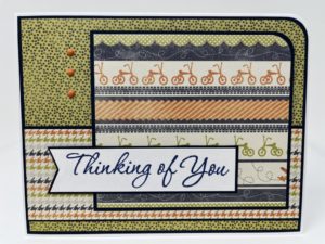
For the first card I knew I wanted to use the tricycle print as the focal panel.  I paired this with the green/blue dot print as the background and the blue diamond print for the horizontal strip across the card.  Once all of the pieces were assembled, the top of the card looked too empty.  I thought about adding some brads or enamel dots but there was already a lot going on with the prints.  Also, for masculine cards I try to keep embellishments to a miniumn.  Instead I opted for a simple navy blue banner in the upper left corner.

The next card used the border strip print as the focal panel.  I again used the green/blue dot print for the background.  With the large orange stripe in the focal panel, I wanted to bring in another print with some orange.  After trying a few combinations, I liked the multi-color houndstooth print the best.  I added another bit of orange with the 3 small brads next to the focal panel.  This card used one of my favorite sketches and turned out to be my favorite card from this batch.

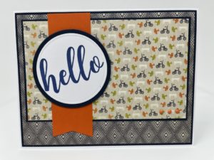
Since I had a large piece of the blue diamond print left, I decided to use it as a background.  As my choices of prints was limited I used more of the tricycle print.  For the banner, I used orange cardstock.  With the focal print being so busy bringing in another print for the banner would have been too much.  A large “hello” sentiment and a few more small orange brads on the bottom corner of the focal panel finished the card.

After using the paper pad, I have to say I found it a bit challenging.  At first glance I thought there were several prints that I could use as focal panels.  Once I got started I realized that some of the images (cut-aparts, newpaper print) that while cute, wouldn’t work for the type of cards I wanted to make.  Once those were eliminated as focal panels I was left with mainly busier prints.  The prints worked as background panels but could be a bit much if more than 2 were combined on a single card.  By using larger blocks of the prints I think I was able to make it work and really do like how the cards turned out.

Carta Bella Home Again 6×6 Paper Pad

Carta Bella Home Again 6×6 Paper Pad

For me, some of the hardest cards to make are sympathy cards.  I find it a challenge to balance the solemn nature of the card with an uplifting paper, embellishment and layout.  I tend to skip using all dark or very bright colors and lots of shine and sparkle.  After flipping through my paper pads, I pulled Carta Bella’s Home Again which has a nice mix of pretty floral papers and more muted or tone-on-tone designs.
For the first card, I used a wood panel print for the background and a floral print for the focal panel.  To soften the edges of the focal panel I used a border punch to create a scallop border from white cardstock.  On the opposite edge I added the thinest width Love from Lizi peel-off in a teal color.  The sentiment is stamped using Versafine Vintage Sepia ink on a die cut oval and matted with dark teal cardstock.  To add some dimension but keep the card easily mail-able, I added 2 taupe buttons that coordinated with the background paper.

I used the same layout for the next card.  Instead of a scalloped border I used a white chiffon ribbon to soften the left edge of the focal panel.  The right edge features a gold Love from Lizi peel-off.  For additional embellishment I added a few pearls.

I think both cards turned out well and are appropriate for the occasion.  The colors and prints worked well for sympathy cards but I think paired with brighter colors and different layouts the Home Again collection could be used for any type of card.

Echo Park Dino Friends 6×6 Paper Pad

Echo Park Dino Friends 6×6 Paper Pad

I have moved on to bright colors and dinosaurs.  I’ve had these dinosaur stickers in my craft room for several years.  I found them at the Dollar Tree (when it was still $1) and thought they’d be perfect for kid cards.  The only problem was I didn’t have any paper that “matched”.  Yes, I have plenty of bold bright color papers but I wanted something specifically dinosaur.  And then I found Echo Park Dino Friends.  It was perfect!  Along with the paper and stickers I also used a Recollections stamp/die set from their Cheeky Modern Pop collection.

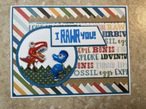
I now had everything I needed to get started on my dinosaur cards.  The first card uses a bold diagonal stripe and a dinosaur word paper.  To ensure the dinosaurs were the focal point, I added them to a die cut circle panel.  I didn’t want them just floating around so I used some green polka dot paper and a zig zag border die to create “grass”.  The sentiment is from the Recollections stamp/die set.

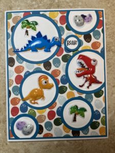
This card is based on a sketch I remember seeing in one of my many card idea books/magazines.  It was perfect for featuring several of the dinosaurs and the coordinating palm tree and dino egg stickers.  The small “Roar” sentiment is from the Recollection stamp set.

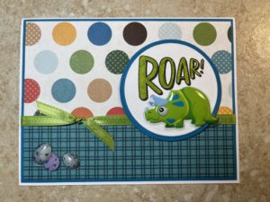
The last card is a simple way to use up longer paper strips.  Keeping with the polka dot paper, I used a circle for the sentiment panel.  I only had a few dinosaur stickers left.  By chance, one was a perfect fit underneath the “Roar!” sentiment.  Some green ribbon to match the dinosaur and the last of the dino eggs finished the card.

I’m now wishing I had bought another set of the dinosaur stickers.  I made at least 2 of each card and while I still have plenty of paper, I’ve used most of the stickers.

Carta Bella Winter Market 6×6 Paper Pad

Carta Bella Winter Market 6×6 Paper Pad

I’m not sure why but I don’t seem to make many winter themed general sentiment cards.  Maybe after making a bunch of Christmas cards I’m ready to move on to warm weather colors and images?  But…

As I was flipping through my 6×6 paper pads I came across Carta Bella’s Winter Market.  It’s a pretty paper pad with lots of blues, greens and hints of peach.  With fun images like skiers, snowmen, hats and mittens, it was perfect for general sentiment winter cards.

The first card features snowflakes and skiers.  With all the blues in the paper, it was easy to find a blue cardstock for the matting.  I didn’t have a matching blue ink, but Versafine’s Smokey Gray ink matched the muted tones of the papers.  For a finishing touch, I added a few silver brads.

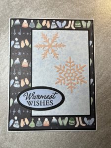
For this card I used the hats and mittens paper and a tone-on-tone snowflake print.  Normally I would use the tone-on-tone paper as the background but it just seemed too pale with the darker background of the hats and mittens print.  Also, by switching the papers you can really see the snowflakes die cut from DCWV peach glitter cardstock.  Keeping with the blue scheme, the sentiment is stamped on light blue cardstock.

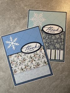
For these cards, I wanted to try out a new coverplate die I had ordered from Amazon.  I have ordered dies before and found they can be a bit hit or miss – some work really well and others not so much.  This die came as a 2 pack along with a diagonal strip coverplate.  Both worked really well and the price was very reasonable.  On the cards I used a smooth solid color cardstock as the background so the “quilt” pattern would really show up.  For the pattern paper I used scrap pieces left over from other cards.  For a bit of sparkle I added snowflakes cut from DCWV white glitter cardstock and Love from Lizi peel-offs.

While I only made a few cards it was a nice transition from Christmas into spring and general themed cards.

Echo Park Little Lumberjack 6×6 Paper Pad

Echo Park Little Lumberjack 6×6 Paper Pad

Not only didn’t I get my Christmas card posts done in December, but I’m off to a slow start in the new year.  While I haven’t been posting, I have been making cards.  I made several using Echo Park’s Little Lumberjack.  I liked the colors and many of the prints and it was perfect for some masculine, outdoorsy themed cards.

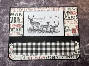
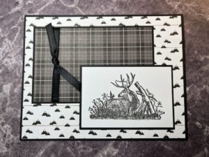
I made 2 of each card – 1 to sell and 1 to donate.  I put the first batch in my antique booth and they sold quite quickly.  I ended up taking several from the set I had planned to donate out to my booth as well.  Unfortunately I forgot to get pictures first.  These cards are the few I have left.  The deer stamps are from Stampin’ Up.  I’m sure they were part of a set at some point, but I have no idea what set.

In keeping with the masculine feel, I kept the embellishments to a minimum.  The first card includes a punched parantheses border and a black Love from Lizi peel-off.  The second features a thin black ribbon tied around the plaid panel.  Everything is matted with black cardstock and the images are stamped with Versafine Onyx Black ink.

There are still a few sheets of paper left.  Based on how popular the cards were, I’ll definitely be making more.  I might have to see if I can pick up another Little Lumberjack paper pad or at least something with a similar look/feel to use with these stamps.

Christmas Cards from 6×6 Paper Pads

Christmas Cards from 6×6 Paper Pads

I was still working on using up some partial paper pads.  These cards feature a mix of papers from several different paper pads – Authentique’s Colorful Christmas, My Mind’s Eye Cozy Christmas and Recollections North Pole News.  There was at least 1 other partial paper pad but I can’t remember the name or manufacturer.  I also added in papers from a couple American Crafts 6×6 paper pads to fill in where needed.

I know the background for this card was from the Authentique paper pad but I’m not sure where the floral paper was from.  As both papers were somewhat busy, I kept the layout simple by cutting the floral paper into a large banner and stamping a bold sentiment in bright green ink.  In an effort to use up older embellishments, I added 3 green brads under the banner.

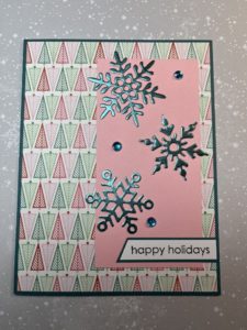
The background for this card is also from the Authentique paper pad.  As it features non-traditional colors, I wasn’t able to pair it with paper from any of the other partial paper pads.  Instead I added a pink cardstock panel and snowflakes die cut from aqua satin mirror cardstock that matched the colors of the trees in the pattern paper.   A few aqua rhinestones added some more sparkle.

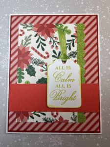
I’m not sure where either of the pattern papers on this card are from.  They may have been from the same paper pad, but if not they matched really well.  To keep the card from being too red, I used green glitter cardstock from an American Crafts paper pad and punched a scalloped border.  To bring in more green, the sentiment is stamped using Momento Pear Tart ink.  I also inked the edges of the sentiment tag instead of matting.

This is actually one of my favorite cards.  I like the clean uncluttered look.  There was only a small piece of the deer print from the Authentique paper pad but I couldn’t throw it away.  I paired it with a polka dot background that may be from an American Crafts paper pad.  A simple sentiment and a few gold sequins finished the card.

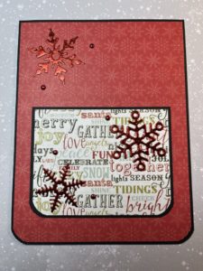
I’m not sure where these papers are from, but I belive they were from the same paper pad.  I don’t know why I hadn’t used the red tone-on-tone background paper before as it’s a great color and print.  With all the holiday sentiments on the focal panel, I skipped adding a separate sentiment panel.  A few snowflakes die cut from red mirror cardstock and several tiny red brads completed the card.

The newsprint paper and the garland border on this card both came from Recollections North Pole News paper pad.  I’m not sure where the plaid paper is from but the colors and faint text in the background were perfect with the newsprint paper.  Still trying to use up older supplies, I pulled out a Tattered Angels Glimmer Mist.  The colors had separated but after some shaking it was fine.  I stamped the sentiment and once dry sprayed the entire tag with glimmer mist.  The red isn’t a perfect match but I think it works.

I believe these papers came from My Mind’s Eye Cozy Christmas.  To separate the 2 prints I used a thin strip of red glitter paper from an American Crafts paper pad.  The large sentiment panel is stamped in Versafine Olympia Green ink to match the striped paper.  A couple red die cut snowflakes finished up the card.

There are still a couple full sheets and some scraps from the various paper pads, but overall I think I did a pretty good job using up my supplies.  I could probably have made a few more cards, but with so little to choose from I put the paper away for now.  I’ll pull it out again when I’ve accumulated a few more partial paper pads to work with.

American Crafts Cozy & Bright 6×6 Paper Pad

American Crafts Cozy & Bright 6×6 Paper Pad

Continuing my goal to use up partial paper pads I pulled out the Cozy & Bright paper pad by American Crafts.  Since this was a larger 6×6 paper pad, 36 sheets instead of the usual 24, I knew I wouldn’t finish it but could at least thin it down some.  And, after the more muted tones of the Happy Pawlidays paper pad, the Cozy & Bright paper pad was a nice pop of traditional red and green Christmas color.

I like looking at card sketches and magazines for inspiration and pulled out an old Cards magazine (by Northridge Publishing).  I won’t be able to add the different layers and dimension featured on their cards (I need to keep my cards fairly flat) but I still find the magazine a great source of ideas.

I thought this layout would work well when using a busy paper for the background.  The size and the muted prints on the sentiment panel keep the holly pattern from being too overwhelming.  I also liked that the sentiment panel is easily modified to accomodate different sized sentiments.  I choose this sentiment as the font matched the whimsical feel of the paper pad.  It also worked for adding a small die cut heart, cut from red mirror cardstock and popped up with foam tape.

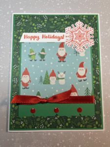
The paper pad has many cute prints including this Santa and elves.  The pattern would pair with almost any of the tone-on-tone prints but I went with my favorite, the red gingham.  Instead of just matting the printed paper, I used a punch to create the fun scalloped border.  A green satin bow added some texture and instead of matting the sentiment I placed it over the top of a die cut pine tree.

There were a few scraps of the Santa and elves paper left and I decided to pair it with green for this card.  The green tone-on-tone holly print was perfect.  The focal panel features a parentheses punched border, red satin ribbon and a few enamel dots.  As I was looking through my Christmas stamps for a sentiment, I realized I hadn’t used this snowflake stamp/die set.  I like that the snowflake is more solid and that I could stamp it to match the color of the sentiment.

As many of the cards will be donated, glitter is not allowed.  This card features two of the non-glitter pattern papers.  It is a very simple layout, but adding a trio of die cut pine trees adds interest.  Also, by popping up the trees with varying thicknesses of foam tape and including one tree die cut from green mirror cardstock there is nice dimension and a bit of shine.

With more paper to work with, I was able to make duplicates of some of the cards and multiples of all the cards just by varying the prints and patterns.  While this did slim down the paper pad there is still plenty of paper left to make many more cards.  I guess I’ll be revisiting this paper pad again next year.

Craft Smart Happy Pawlidays 6×6 Paper Pad

Craft Smart Happy Pawlidays 6×6 Paper Pad

I can’t believe it’s only a little over a week before Christmas and I haven’t posted any Christmas cards.  I have been busy making them.  I took the first batch to my little antique booth in early November and have made several more small batches to keep up with purchases.

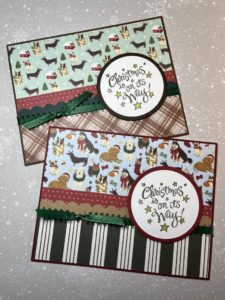
I started making Christmas cards in late October/early November and found it hard to get into the holiday mood.  Since I work better with a project, I challenged myself to use up some of the partial 6×6 paper pads in my Christmas paper stash.  One of the first paper pads I pulled out was Happy Pawlidays by Craft Smart which features several fun cat and dog images.

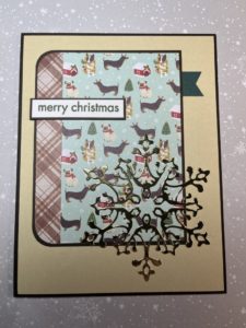
Since there were still several full 6×6 sheets, I focused on layouts that included larger panels.  For the first card I used a tone-on-tone plaid for the background and a dog print for the focal panel.  As part of my “challenge” I had also pulled out some older supplies for embellishments which for this card was baker’s twine.  The tan and white matched the color of several of the dogs in the pattern paper and fit the feel of the card.  The sentiment is stamped with Versafine Vintage Sepia ink and popped up with foam tape to sit nicely over the baker’s twine.

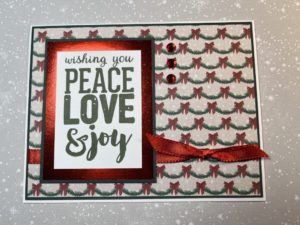
One of the things I liked about this paper pad is that it included several papers that weren’t pet specific which made them easy to use by themselves or paired with non-pet prints.  For this card, the pine garland print was used as the background.  The large sentiment, stamped in Versafine Olympia Green ink, was made even larger by double matting it on red metallic paper and then again on dark green cardstock.  Embellishments on this card include some red satin ribbon and a few red rhinestones.

I wasn’t sure about this card.  There wasn’t a large enough paper from the paper pad to use for the background.  I tried some red and green cardstock from my stash but couldn’t find one I liked.  I also tried a white shimmer paper but it washed out the green pattern paper.  I ended up using a tan sandy color that coordinated with the brown plaid.  The card sketch featured a large embellishment in the lower right corner of the card.  I used my go-to Christmas embellishment –  a die cut snowflake.  The gold metallic paper added some much needed shine to the card.

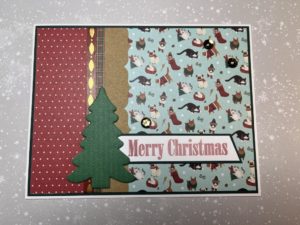
I didn’t realize it until I was working on this post but this is the only card that featured a cat print.  I’m not sure if I had already used up most of the cat paper or if it just happened to be the flip side of the tone-on-tone papers that I used.  A kraft parentheses border separates the cat print and the tiny polka dot print.  In an effort to use some older embellishments, I also added a couple strips of washi tape that I’ve had in my craft room for years.  To keep the sentiment strip from just “floating” on the card, I tucked it behind a die cut pine tree.

I was now down to small pieces and longer strips.  After much rearranging, I was able to pair up several of the longer pieces to use for this simple design.  Along with the red polka dot print, a scalloped border and green satin ribbon separated the 2 busier prints.  To brighten up the sentiment panel, I colored the stars on the panel using a gold metallic pen.

At this point I’m calling the paper pad done.  There are a few smaller pieces that I’ll toss in my scrap box.  I may try and use them for some Christmas scrap cards but will more likely use the flip sides which are non-pet and non-Christmas prints like the polka dot and plaid for some general cards.


Recollections Pinkaboo 6×6 Paper Pad

Recollections Pinkaboo 6×6 Paper Pad

Do you ever feel like you have too many craft supplies?  I didn’t think that was possible, but as I was thinking about my next project I realized I’m spoiled for choice.  I have so many paper pads, card kits, collection kits, etc. that I struggle to pick something to work with.  It would be easy to pull out something new, but I decided to challenge myself to finish something – a paper pad or kit.  Since I needed Halloween cards that narrowed down my choices to a few paper pads.  I picked the Recollections Pinkaboo 6×6 paper pad I had started a couple years ago.  While not traditional Halloween colors, it does include ghosts, spiders and skulls, but in pretty pink and purple images.

I ended up making 12 cards, 2 of each design.  This works well for me as I take 1 set of cards to my little antique booth and another set will be donated to Cards for Soldiers.

The first card uses papers from both paper pads.  The background is a twinkle star print from the 12×12 paper pad and the metallic skull paper is from the 6×6 paper pad.  The hombre ink used for the sentiment is from Recollections Backyard Table collection.  The pink to purple color was perfect with the Pinkaboo papers.  I stamped the sentiment on the left side of the panel and added a purple spider die cut.  The spider was a bit flat but adding Bubble bling from Queen & Co. fixed that.  I liked the look and decided to add a few more “Bubble spiders”.
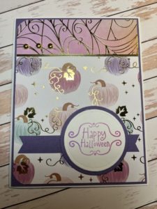
The layout for this card is one of my favorites for featuring pattern paper – the gold foil spiderweb.  I used a leftover strip of the skull print, edged with gold Love from Lizi peel-offs, for the horizontal panel across the card.  I added a die cut spider, actually several die cuts stacked together, to give it some dimension.  A few more Queen & Co Bubbles finished the card.

This is my favorite card from the set.  The pumpkin image is from the corner of a sheet of the 6×6 paper.  It worked great for the large panel and had room to stamp the sentiment without covering any of the image.  For the smaller purple panel smudging some black ink around the edges softened the look and gave the panel a bit of age.  The background paper is a spider print from the 12×12 paper pad.  Not a lot of the background is visible, but it adds just enough pattern to offset the smooth look of the rest of the papers.

The focal panel on this card is another corner from a sheet of 6×6 paper.  I was able to stamp and heat emboss the sentiment directly on the panel without covering any of the image.  The skull background paper is one of the few full sheets of 6×6 paper remaining.  The purple horizontal strip adds color and separation between the printed papers.  A few Queen & Co Bubbles for dimension and this card is complete.

This card uses 2 of my favorite papers from the collection.  A leftover scrap of the spiderweb print used for the top panel is paired with the pumpkin print.  Both papers have a gold foil finish so the card is really shiny.  A gold Love from Lizi peel-off separates the pattern papers.  Recollections Backyard Table hombe ink was used for the sentiment.  A spider die cut didn’t seem like the right accent so I added a few gold brads instead.

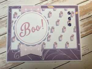
This was a fun card to do.  It was all about the cutting.  The background is from a 12×12 sheet that featured a full 12×12 image.  I liked the spiderweb print along the edges and was determined to use it.  The large panel with the cute ghost print covers any of the unwanted text from the 12×12 sheet.  A scrap of the twinkle star paper is used for the fishtail tag.  The sentiment is a cut-apart from the 12×12 paper pad that I was able to cut down using a Spellbinders circle die.  A few purple bubbles on the right side balances out the card.

The good news is I finished off the 6×6 paper pad.  The bad news is I still have almost the complete 12×12 version of the paper pad left.  Yikes!  I liked the challenge of using up some supplies but really want to use something new.  Instead of breaking out another paper pad, I think I’ll use a partial 6×6 paper pad and try out one of the new Honeybee Stamps stamp and die sets I purchased recently.

Pebbles Woodland Forest 6×6 Paper Pad

Pebbles Woodland Forest 6×6 Paper Pad

Although the last kit had a fall feel, I felt like I needed some more traditional fall cards to add in my antique booth.  I have been alternating between kits and standalone paper pads, which has been working well for me.  Since “standalone” was up next, I flipped through my 6×6 paper pads and settled on Woodland Forest by Pebbles.  I had purchased this paper pad several years ago but hadn’t gotten around to using it.  I like the colors and many of the prints and there were also a few cut-aparts that would work for cards.  One thing I found “challenging” about the paper pad is the number of sheets.  It’s a 36 sheet paper pad, but unlike most, there are not 2 of each print.  As I planned to make duplicates of each card (one to sell, one to donate), I needed to select 2 paper combinations for some of the cards.

I did make several cards but these are a few of my favorites.

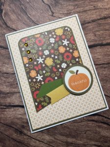
I have used this sketch before and quite like it, especially if I have something fun to use for the circle element.  This “thankful”pumpkin sentiment was a rectangular cut-apart that I used a die to cut down to the perfect size for this card.  I wasn’t sure about pairing the tiny tile-like background paper with the busy floral print, but I think the repetitive tile almost works like a tone-on-tone paper.  I used a couple cardstock scraps for the banners which pick up the colors in the floral print paper.  For sparkle, I pulled out some rhinestones that have been hanging out in my craft room for far to long.

This card was all about the paper.  A fall floral background that matched the sentiment cut-apart paired with the acorn print as the focal panel.  A brown satin ribbon tied across the card and a few rhinestones under the sentiment panel completed the card.

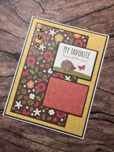
For this card I looked for a sketch that would work with the size of the cut-aparts.  I liked that I was able to mix 3 different pattern papers – a tone-on-tone print for the background, a bright and busy pattern for the large panel and another tone-on-tone print for the smaller panel.  Add in a few rhinestones and the cute hedgehog sentiment cut-apart and I think this card turned out well.

I did make duplicates of these 3 cards, along with several others.  With 36 sheets in the paper pad there are still several sheets left and I do need a few more autumn cards.