Browsed by
Category: General

We R Memory Keepers Jet Set 12×12 Paper Pad

We R Memory Keepers Jet Set 12×12 Paper Pad

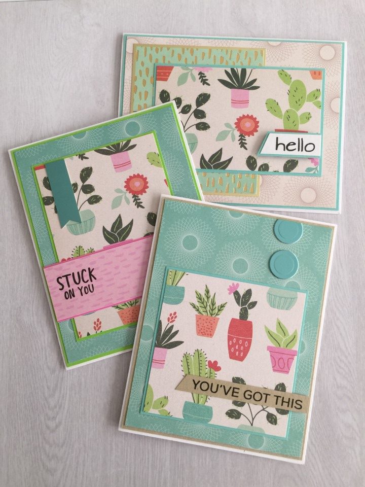
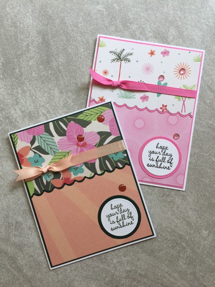
I’ve really been neglecting my blog.  I can’t believe it’s been almost 2 months since my last post.  While I haven’t been posting pictures, I was keeping busy making cards.  I even managed to make a small batch of Halloween cards and a 2nd set of Christmas cards, but before I post those…  Here are a few cards I made after the first set of Christmas cards.

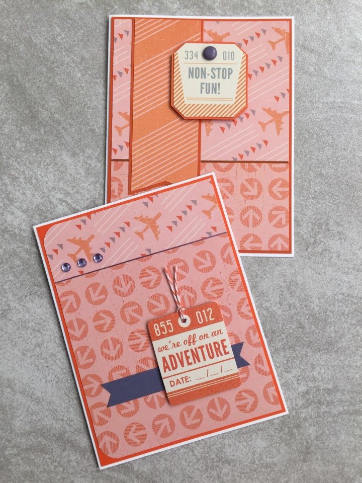
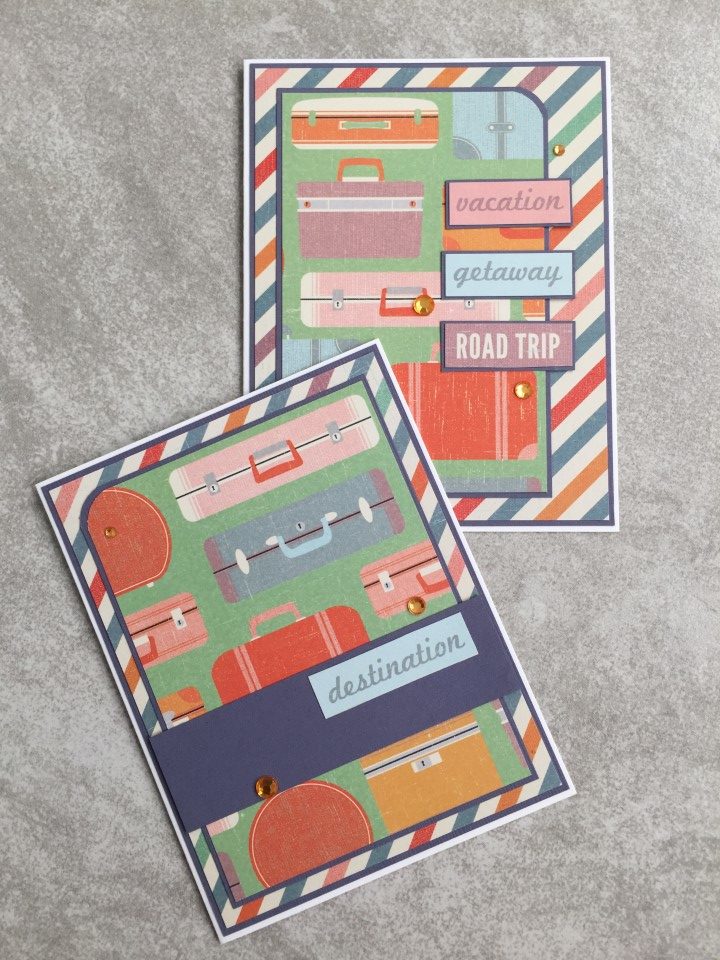
I wanted to do something with a completely different theme and colors.  After flipping through a few paper pads I selected the Jet Set paper pad.  It has a travel/transportation theme done in muted shades of orange, purple, blue, green and mustard yellow.  Along with the fun suitcase and airplane prints there was also a sheet of travel themed tags.  I’m not a fan of fussy cutting, but most of the tags had straight edges so it didn’t take too long to cut them all out.  The paper pad also included a sheet of borders, some of which were strips of travel themed words.  Instead of skipping the paper or trying to use larger pieces of the borders, I trimmed them into individual words and used them along with the tags as the sentiments on the cards.

To get started I separated the papers into different color groups.  The papers are all the same theme, but some prints and colors coordinated better than others.  For the first several cards I used orange and peachy pink papers.  To pull out the hint of purple in the airplane print, I used purple cardstock for some of the matting and embellishments (brads, rhinestones and Love from Lizi peel-offs).

Using the same papers…  I added the airplane themed tags featuring fun sentiments like  “Non-stop fun!” and “We’re off on an Adventure”.  Some of the tags even include space where you can write in the date of your travels.

For the next set of cards I used the fun suitcase print and multi-color stripe and polka dot print for the backgrounds.  Because both papers had a busy print, I kept the layouts simple and used solid color cardstock to break up the busyness.  For several of the cards I used the travel themed words trimmed from the borders as sentiments.

On other cards I added tags in place of small focal panels or added smaller tags to cardstock banners.  Although the papers included many colors, for some reason I really liked the orange color and used orange rhinestones for all of the embellishments.

There were still a couple more color groups to go, but I saved those for later and moved on to another batch of Christmas cards.

Craft Smith Palm Springs 12×12 Paper Pad

Craft Smith Palm Springs 12×12 Paper Pad

If you’re like me you can’t pass up a cute paper pad.  That’s how I ended up with the Craft Smith Palm Springs paper pad.  The colors are gorgeous, the prints are fun and it was on sale.  My inability to pass up cute and sale, was even worse with this paper pad since there was also a coordinating tube of washi tape.

Unfortunately not passing on cute paper pads mean I have more paper than time to use it.  In an effort to thin down my printed paper stash, I’m pulling out older paper pads that I haven’t gotten around to using or have only used a couple of sheets.  I plan to make a few sets of cards from each paper pad and whatever I can’t/don’t use I’ll be adding to the “for sale” stack.

As I was gathering supplies to get started I ran across my container of brads, not to be confused with a package of brads.  This container holds 20+ packages of brads with 80-100 brads per package.  Yes, there was a sale incident where each package was only 25 cents.  How could I pass that up?

So with an abundance of paper, washi tape and brads, I got started on my first set of cards.  I made at least 3 cards with each paper/layout combination.  The first set of cards used one of my favorite sketches, #218 from OWH.  I liked the paper combo so much I decided to make another set of cards using the same paper but switching to OWH sketch #227.  The orange “Sunny State of Mind” sentiment is some of the coordinating washi tape that I placed on white paper and then cut to size.

OWH sketch #218 worked so well that I decided to just switch up the colors of the background, matting and brads and make another set of cards.  This time using the washi tape for the small banner.  After making a set of 3 cards I ran out of the “Sunny State of Mind” paper but since there was still enough of the orange background paper for a more cards I pulled out a floral print and kept going with the same sketch.  I decided to skip the brads on this set of cards since the floral focal panel is quite busy.

There was now a partial sheet of the floral paper so I thumbed through the paper pad and found the green starburst print to pair it with.  This set of cards uses new-to-me sketch #259 from OWH.  For a punch of color I used bright pink cardstock for the strip across the bottom of the card and the brads in the upper right corner.  There was still some of the floral print paper left.  So for the next set of cards I paired it with an off-white print and the leftover strip of green starburst paper.  I used another OWH sketch also labeled #227.

For the last 3 sets of cards I pulled out a cactus print paper to use for the focal panels.  The first set (OWH sketch #20) uses the rest of the off-white print for the background and a gold foil print paper also from the Palm Springs paper pad.  The last 2 sets of cards (MFT sketches #516 and #503) use a turquoise print paper for the background and feature turquoise satin mirror paper for the banner and circle embellishments.

I ended up making 30 cards using the Palm Springs paper before I got bored.  There are still some papers that I’d like to use, but I did find several sheets that I know I won’t use so I’ve put those aside to sell.

Scrap Cards

Scrap Cards

After struggling with the last batch of cards I decided to work on something really easy.  Scrap cards!

I’ve used this layout several times in the past and it’s great for using up scrap paper.  To get started I quickly sorted through the pattern paper scraps and pulled out the pieces that could work (i.e. were at least 4 inches long and 1 inch wide).  Once I had a pile of “possibles” I started pairing up papers that would work together.  I then flipped through my cardstock scraps for pieces that matched the pattern papers.

The process for assembling all of the cards was the same.  A coordinating cardstock was selected for the card base and cut to 4 1/8 x 5 3/8 inches.  The pattern paper, trimmed to 1 inch wide and no more than 4 1/2 inches long, were lined up and attached to the bottom of the card base.  Using a few different border punches, strips of the same cardstock were cut and attached to the bottom of the cardstock scraps which were then attached to the top of the card base.  That completed the basic assembly for all of the cards.

I thought the brown and rust colors in the first few sets of scraps would work well for masculine birthday cards.  I stamped the birthday sentiment directly on the cardstock scraps.  To embellish the card I added some bakers twine and coordinating brads.

The next few sets of scraps were bright and cheerful colors.  More bakers twine and ribbon were used.  Mini brads were used to attach the iridescent flower embellishments.

The last few sets of scraps were all blues and greens.  I added a “Thanks” sentiment to one of the cards but left the other 2 blank.  Some more brads and a few paper flowers were used for embellishment.

This was a quick and easy way to make several cards and use up some paper.  I also tried to use a few of the other supplies, ribbon, brads and other flower embellishments, that have been hanging around in my craft room for way too long.

Market Square Collection

Market Square Collection

I purchased the Market Square collection by Farm House Paper Company over a year ago and have only managed to use 1-2 sheets.  It’s not my usual style at all but there was something about the muted colors and vintage feel that said I needed to buy it.  I knew it would be a challenge for me but would also help expand my crafting horizons.  LOL.  After watching a favorite YouTube crafter use a “not my style” paper pad I got motivated to pull this out and try again.

Although it’s an urban theme, the newspaper print made me think of farmhouse and… chickens???  I paired the newspaper print with polka dots and scalloped die cuts which I think kept with the farmhouse theme.  Since the paper and images weren’t specific to any holiday or occasion, I went with a simple “Just Saying Hello” sentiment.

Having already used a sheet of the larger floral print, I knew it was best to stick with larger pieces so that the pattern didn’t get lost.  I used a chocolate brown cardstock as matting for the first couple of cards and added matte gold Love from Lizi peel-offs and Nuvo drops as embellishments.  I liked the subtle shine of the embellishments and decided to use some gold metallic cardstock for the next few cards.  And although only a small amount of the cardstock is visible, it definitely brightens up the cards.

While all of the paper in the Market Square collection is the same theme, not all of the papers work well together color or pattern-wise.  I still had a partial sheet of the polka dot paper left and after trying it with the remaining paper decided to pair it with the diagonal stripe.  The stripe paper also had some of the teal color and the patterns didn’t compete with each other.

I liked the polka dot and stripe combination and decided to use it again, only this time using the stripe paper as the background.  Centering the polka dot panel on the card and adding a solid color banner helped keep the stripe from being overwhelming.  To keep the card from being too flat an off-white twill ribbon was added around the top of the card.

Once I found a layout and paper combination that I liked, I made several of each card.  For some layouts I was able to make 9 cards and others only 3.  I still have a few full sheets and some scraps but I’m quite happy with the progress I made on this collection.

Sympathy Cards

Sympathy Cards

I usually keep a few cards on hand for most occasions.  Unfortunately my husband has needed a few sympathy cards in the past couple of months.  I find sympathy cards some of the hardest to make and even more difficult to make when they are needed.  So although I hope I will not need them any time soon, I decided to make a few cards to have on hand.

After flipping through several paper pads I pulled 3 sheets from the Authentique Gathering 12×12 paper pad.  I didn’t want the paper to be too bright and thought the off-white and pale blue colors with the subtle floral prints had a softer feel to them.

For the first card I used the blue paper for the background and the 2 floral prints for the focal panels.  The card seemed a bit flat but I didn’t want to over do the embellishments.  I think the small blue buttons matched the background and added a bit of dimension without changing the feel of the card.

The next couple of cards used the larger floral print for the background.  A blue fish-tailed banner was added for some subtle color.  The sentiment was stamped with Versafine Vintage Sepia ink and popped up with thin foam tape.  For a little interest gold Love from Lizi peel-offs were added to the top of the banner and across the bottom of the card.

The same floral print was used as a background for the next card as well.  The smaller floral print was used for the focal panel with the pale blue paper used for the strip across the card.  A pale blue ribbon was added as embellishment and the sentiment panel was again popped up with thin foam tape.

The flip-side of one of the floral papers was used as the background on the next card.  The focal panel featured the smaller floral print.  Since the background was quite plain a few more embellishments were added — Love from Lizi peel-offs and a pale blue ribbon were added to the horizontal blue strip and a few Nuvo drops on the focal panel.

By using both sides of the double-sided paper there was enough to make 3 more cards – each with a solid background and a floral focal panel.  The remaining paper was used for the strips running across the cards.  For embellishments, Love from Lizi peel-offs were added to the horizontal strips and Nuvo drops were added next to the focal panels.

I didn’t have a specific number of cards in mind, so decided to make cards until all or at least most of the paper was used.  Since the paper is double sided by using the flip sides the paper stretched to 10 cards.  The paper pad was a bit of an impulse purchase but now that I’ve actually used some of the paper I’m really glad I didn’t talk myself out of buying it.

Scrap Cards

Scrap Cards

I’m still catching up on blog posts…

After using so many different paper pads recently the scrap bin was starting to get full.  After flipping through some card sketches I decided to use a new-to-me sketch.  I thought the 4 rectangles would be a great opportunity to use up some of the smaller scraps.

It was fun sorting through the pieces and finding papers that coordinate.  To get started I sorted the scraps into piles based on color.  I then pulled out pieces with multiple colors or specific themes and began looking for coordinating paper.  Smaller piles were made as possible matches were found.   The difficult part ended up finding paper to use for the background.  The paper needed to work with multiple different colors and prints, so I stuck with solid colors which even if not a exact match didn’t compete with the printed papers.

One of my favorite paper combos included the pink margarita paper.  With all of the colors it included it was easy to find coordinating scraps.  After trying a few different combinations I decided on a pink/yellow color scheme.  I didn’t have pink or yellow cardstock that would work for the background so instead used a white shimmer cardstock which also added a bit of sparkle.  To keep the card from being too flat, the “Party” sentiment was popped up with foam tape and a few pink epoxy dots were added.

There were a several longer strips of cactus print paper left over from a Ms. Sparkle paper pad.  Instead of using different prints for the rectangles I cut the longer strips into 2 rectangles and used the top portion from 4 strips on 1 card and the bottom portion on another card.  I thought about mixing in other prints but decided using identical scraps created a nice look.  To complete the card, the sentiment is popped up with foam tape and green epoxy dots were added.

There were only a few pieces of Halloween themed paper, not enough for all 4 rectangles.  Instead of tossing the paper back into the scrap bin, I found a few pieces of green check paper (not a Halloween print at all) which were a nice color match.  Purple cardstock, which picked up one of the colors in the Halloween print, was used for the background.

Like with the Halloween card, there were only a few Valentine themed scraps.  I paired them with a pastel pink check which may have come from the same paper pad.  Once the pieces were added to a white shimmer paper background the pastel pink check seemed too bland.  To keep it from fading into the background a few Valentine stickers were added.  A fun sentiment was stamped onto die cut hearts and popped up with foam tape.

Although neither of these papers are specifically baby themed, I thought the blue and yellow had a baby feel to them.  A slightly brighter blue cardstock was used for the background and a matching yellow cardstock was used to mat the entire panel.  For dimension, a couple yellow buttons were added to the upper right corner of the card.

The pirate card with the bold color scheme was one of my favorites.  Although not from a pirate themed paper pad, the black/white print was the perfect match since “X” marks the spot on a pirate treasure map.  No embellishments were added as both papers were quite busy.  The sentiment is from the Echo Park Ahoy Mateys stamp set that I’ve been able to use much more than I expected.

This sketch was a great use of scraps.  Unfortunately, I started to lose interest before using up all of the scraps that I had matched up.  Instead of tossing them back I decided to assemble just the card faces – no card bases, sentiments or embellishments.  Now I have a stack of card faces that I can pull out when I just want a quick and easy project.

DCWV The Pets Stack 12×12 Paper Pad

DCWV The Pets Stack 12×12 Paper Pad

I’m continuing to try and use up some older 12×12 paper pads and pulled out DCWV’s The Pets Stack.  I’ve had this paper for so long I can’t even remember why I bought it.  The prints are all very cute, but tend to be on the larger size for card making.  The 48 sheet paper pad includes 2 sheets of each design.  I knew there was no way I could use the entire paper pad in one sitting so I pulled out 1 sheet of a few different prints.

The paper pad does not include any tone-on-tone paper that I tend to use for backgrounds, so I looked for paper with a smaller print.  The paper with the cute pet names would work as a background, but when I paired it with other prints felt it worked better as a focal panel.  Since the background paper is a circle print I decided to keep with that theme and used a circle die to cut out the focal panel.  The cat and dog images were stamped, colored with alcohol markers and then fussy cut.  Scrap cardstock in coordinating colors was cut into small strips for the banners where the cat and dog images were placed.  To finish the cards a few paw print stickers, from a Michael’s mystery box, were added to the banners.

Since I am a “dog person”…  I tended to like the dog themed prints and used those for most of the cards.  The paper pad had 2 sheets which could be cut into long strips.  With some careful trimming I cut the strips into sizes that worked great as focal panels.  Since they were all dog themed I paired them with the cute dog bone print, which although hard to see in the pictures has a pretty spot gloss finish on the dog bones.  For the sentiments I used Echo Park’s Lucky Dog stamp set.

The paper pad also included 2 sheets of 3×3 inch images that I really wanted to use.  I flipped through some card sketches and other than tweaking the size of the focal panel, #435 from Mojo Monday was perfect.  I used gray, kraft and green cardstock from my craft room for the backgrounds.  The dog bone print and the red/green diagonal stripe prints are both from the Pets Stack paper pad.  The black/white polka dot paper was from my craft room.  I added sentiments from the Lucky Dog stamp set, my favorite being “Bad to the Bone” paired with the bright red dog bone focal image.

I only used a few sheets of paper but was able to make over 25 cards.  Cutting the background paper to 4 x 5 1/4 inches makes it easy to make 6 cards from one 12×12 sheet of paper.

It was fun to make something with a less common theme and not the usual birthday, hello, thinking of you sentiments.  I’ll be donating these cards and hopefully the recipients will enjoy the theme and find something to send home to a friend or family member (human or pet).

Ms. Sparkle and Co. Aviary Garden

Ms. Sparkle and Co. Aviary Garden

This was another 5.5 x 7.5 inch paper pad I picked up at Joann’s for less than $1.  Like The Greenery paper pad I used a few weeks ago, this is paper and not cardstock.  The papers are nice and bright and most had several colors to work with when choosing coordinating prints and cardstock.  For something different I decided to try using only 2 layouts.

I decided there were only 2 patterns that I liked for backgrounds – the bold black and white stripe and the large pink and white polka dot.  After looking at the possible paper combinations I paired the stripe with the swan print and the polka dot with the turquoise floral print.  With 4 sheets of each print, there was enough paper for 4 stripe and 4 polka dot backgrounds.  The larger paper size allowed for 2 focal panels to be cut from each sheet.  To create the additional backgrounds needed I pulled in some additional paper from my stash.  With all the different colors, it was easy to find cardstock for the horizontal piece running across the card.  Instead of matting the horizontal piece I used several different Love from Lizi peel-offs which created a little separation and added some sparkle and shine.  I kept the sentiments simple with “Thinking of  you” and “Happy Thoughts”.

The remaining 2 pattern papers, both colorful bird prints, were easy to pair up with several different colors and prints for the backgrounds.  For the paper with the white background I used a yellow gingham print and a multi-color polka dot print.  For the paper with a green background I used a black print and a blue on blue print.  With more open space on the focal panels adding a few rhinestones along with the peel-offs gave the cards some more sparkle.  In keeping with the bird theme, the “a little birdie told me…” sentiment was perfect.

After completing the first layout I was left with several 2 inch wide strips of paper.  For the first few cards I was able to pair up strips using paper from the paper pad.  A few more of the strips were paired with papers used for backgrounds.  For the final strips I pulled in some additional paper from my stash.  Since I like to have some separation between printed papers, a strip of washi tape was added down the center of the card.  To break up all of the straight lines, the sentiment was stamped on a die-cut circle which was matted and popped up with foam tape.  Depending on the print, rhinestones and epoxy dots were added on a few of the cards.  While not the most exciting layout, it worked well with the remaining paper and left few scraps.

By using only 2 layouts it was quick and easy to make several cards.  Not a lot of time had to be spent figuring out the different measurements.  I don’t know that using so few layouts would work all the time, but it seemed to work out well for this paper pad.

Triptych Stamped Image

Triptych Stamped Image

After the scrap cards I was a bit bored with pattern paper so I decided to use a stamped image as the main focal point.  I didn’t want to use an image that I would have to color and after rummaging through my stamps I found an image that could be stamped in a single color.  Since I still had some of the scrap paper out, I looked for pieces that could be used for the background.

The first paper I selected was bright green with a tiny white print.  I knew I had some ink that would match this paper perfectly.  Using the Misti stamping tool, I stamped the image multiple times on white cardstock to get a nice clean impression.  I then cut the image into 3 pieces and matted them with black cardstock.  The “hello” sentiment is stamped on black cardstock, with Versamark watermark ink, and heat embossed with white embossing powder.  For a bit of dimension the sentiment is popped up with some foam tape.

I liked the way the green cards turned out and decided to try it again with a different color combination.  Flipping through more scrap paper I found a piece of pink tone-on-tone pattern paper.  The shade of pink was a nice match to a pink ink pad that I have.  I stamped the image several times to get a good impression, matted the 3 pieces with black cardstock and heat embossed the same “hello” sentiment.

For something a little different, I used a busy black and white pattern paper for the background.  At first I thought the pattern might be too much, but the stamped image covers quite a bit of it.  Pink and black is one of my favorite color combinations and I think this card might be my favorite.

For the last few cards I pulled out a yellow and white pattern paper for the background.  I tried stamping the image with yellow ink but it just seemed to fade into the background paper.  So I tried an orange ink which provided a nice contrast to the yellow paper.  In keeping with the scheme of 3 colors per card, I used orange cardstock for the matting.  I was also able to find some orange embossing powder in my stash to create the sentiment.

Overall the cards are quite simple and use a minimum number of supplies.  I like the look of the cards but wonder if there is something I could do to add more “pop”.  Maybe use foam tape on one of the 3 image panels for more dimension.  Maybe stamp the image in 3 different colors of ink and use 1 piece of each color to create the full image.  Or it might be interesting to use 3 shades of a single color ink to create an hombre effect.  It could also be interesting to cut the image horizontally instead of vertically.  I think I’ll have to make a note and try this again in the future using a few of these ideas.

Scrap Cards

Scrap Cards

I still couldn’t decide what to work on so I pulled out the “large scrap” paper drawer.  It’s full of partial sheets of 8×8, 8 1/2 x 11 and 12×12 papers and full sheets of 6×6 papers.  The papers are from different paper pads, one off single sheets, leftovers from kit collections, etc.  So basically nothing was intended to “match”.  For a bit of a challenge I decided to only use the printed papers (other than cardstock for matting) that were in the scrap drawer.

To get an idea of what papers I had to work with, I spread the paper out on the floor – grouping it by color, print and theme.  After sifting through the paper I ended up with 10-15 possible “matches”.  Since these were larger scraps I was able to make at least 2 of most of the cards.  To get started I went with a combo I think I many have used in the past – a pink and yellow scallop print paired with a large yellow polka dot.

For the next set of cards I used a new-to-me card sketch.  The papers are all brightly colored with stripes, polka dots and floral print.  I used a scalloped border punch on the striped paper to create a “softer” seam with the polka dot paper.  For more scallops, I used a scalloped circle punch for the matting on the sentiment panel.

The pink floral paper on the next group of cards was part of an 8×8 sheet.  The print ran diagonally across the paper.  With some strategic cutting I was able to get three 3×3 inch squares.  I paired the floral with a pink, white and green stripe for the background and a green print for the strip running across the card.  For the embellishments I used an idea I saw in an old Stampers Sampler Take Ten magazine – a small brad in the center of a die cut circle.

The next batch of cards used paper from a couple different Recollections 12×12 paper pads – one a tropical theme and the other a desert theme.  I again used the scalloped border punch on the seam between the printed papers but it got “lost”, especially on the tropical print paper.  By adding some matting, the scallops are more noticeable.  To finish the cards I added ribbon and a few rhinestones/epoxy dots.

The last group of cards used some of the smaller scraps.  None of the scraps were big enough for a full background but using a simple half and half layout worked great.  I liked the look of the border punched paper and matting from the previous cards and I decided to do that again.  In addition to the scalloped border punch I used a parentheses border punch on a few of the cards.

I still had a couple potential “matches” left but they weren’t my favorites so I decided to move on to a new project.  I’m constantly adding new scraps to the paper drawer so I’m sure there will be lots more paper combinations to try in the future.