Browsed by
Category: General

Farm House Paper Company Market Square

Farm House Paper Company Market Square

I wasn’t in the mood to start another big project so decided to pull out some random paper and see what I came up with.  I used a 12×12 sheet of paper from a package I picked up a couple months ago at Tuesday Morning.  The paper is from the Farm House Paper Company’s Market Square collection.  I liked the vintage look and thought with the colors and prints it would be good for masculine cards.

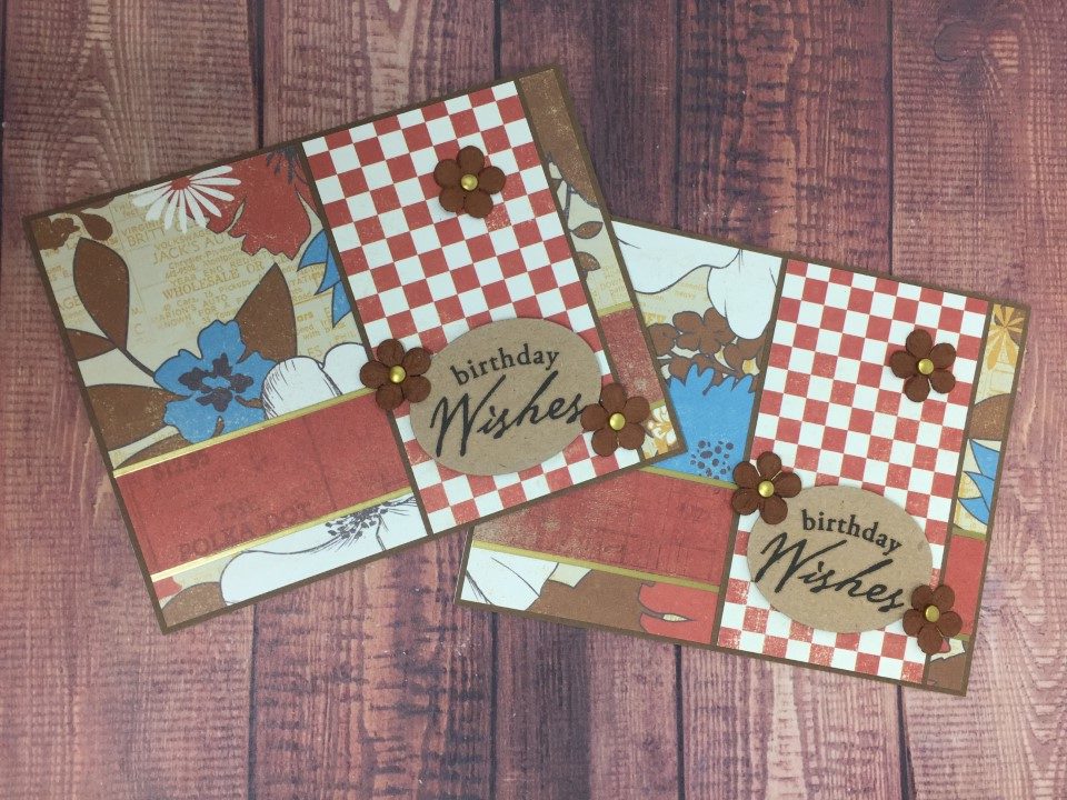
The paper is double sided and I ended up using most of 1 sheet to make 4 cards.  I used the muted floral print as the background on all the cards.  It was a large print, but I think it worked.  The flip side of the floral is the red/white checked print.  Brown cardstock was used for the matting.

The first 2 cards used the red/white checked print for a horizontal panel.  I stamped the sentiment on off-white paper but it looked too “bright” with the other papers.  I then stamped the sentiment on kraft cardstock using VersaFine Onyx Black ink and think it matches much better.  I popped up the sentiment with foam tape and added a few brown paper flowers on the left side.

For the next 2 cards I used the same printed papers and added a thin strip of rusty red paper from the same collection.  I used Love from Lizi matte gold peel-offs to mat the red horizontal strip and added a few more brown paper flowers.  An oval die was used to cut the sentiment panel.

I really like the papers in this collection and think it will be easy to pull out a sheet or 2 when I’m in the mood to make a few quick cards.

Craft Smith Ooh La La 6×6 Paper Pad

Craft Smith Ooh La La 6×6 Paper Pad

After taking a break from kits and collections, I decided to use a 6×6 paper pad I picked up last year on clearance at Michaels.  It’s a cute pink and very girly paper pad called Ooh La La.  I was able to use most of the paper but there were a few sheets with images too large for cards and I didn’t care for some of the cut-aparts.

There weren’t any tone-on-tone papers in the paper pad, but with so many different shades of pink I thought I’d have no problem finding coordinating cardstock in my stash.  But…  the pinks in the paper pad had a slight peach tint which made it difficult to match.  I did find 1 sheet of pink cardstock to match and ended up using peach and gray cardstock on several cards.

For the stamped sentiments I used a stamp set I had picked up last month at the Scrapbook Mega Meet.  I have a habit of buying stamp sets which end up sitting in my craft room unused, but I was determined to use the new stamps.

I made a total of 27 cards using the Ooh La La paper pad.  Here are some of my favorites…

For these cards I used a simple layout.  To add some interest, I used a Fiskars scalloped border punch on the matting and added some Love From Lizi peel-offs.  The sentiment is stamped on one of the cut-aparts that came in the paper pad.  To keep the cards from being too flat, I added paper flowers using a brad for the center.

I was thumbing through some card sketches and found one that inspired me to try using one of the larger print papers.  The paper had a large pink circle in the center and smaller images on the top and bottom edges of the circle.  By cutting the paper in half and trimming down the sides I was able to use half of each circle to make 2 cards.  I think they actually turned out quite nice.

Since the floral panel on the next cards were 3×3 in size, I was able to make 4 cards from 1 sheet of printed paper.  I used some green and white polka dot paper from the paper pad for the horizontal strip.  As black cardstock looked too stark with the paper’s muted colors, I used a gray cardstock instead.  For a bit of shine, I added a white chiffon ribbon and some iridescent Love From Lizi peel-offs.

For the next cards I paired some of the smaller scraps with solid color cardstock that I embossed using the Cuttlebug Swiss Dot embossing folder.  I popped up a couple of the sentiment cut-aparts with foam tape and added some more paper flowers.

Here are the rest of the cards I created.  I was able to use a few more of the cut-aparts and several of the sentiments from the new stamp set.

Craft Smith Palm Springs Paper Pad

Craft Smith Palm Springs Paper Pad

So after doing an entire kit, I decided to just pick a few pieces of paper from one of my “older” paper pads.  For something completely different I picked the Palm Springs 12×12 paper pad which is all about florals, cactus and palm trees.  I was able to use a couple of the cut-aparts that were small enough to fit on a card.

I really liked the cactus print paper and had a specific card sketch in mind before I even got started.  I paired the cactus paper with a pink tone-on-tone paper from the same collection.  To keep the cards nice and bright I used some aqua cardstock for the strip across the card.  For the sentiment I pulled out a Craft Smart cactus themed stamp set that I’ve never used.  For a bit of sparkle I “colored” the plant containers with Wink of Stella and added a few rhinestones and Queen and Company Goosebumps.

For the next couple cards I used some palm tree paper.  The print is a bit spread out so I made sure to use a larger piece of paper.  To add some interest, I added a scalloped border on the matting.  For the peach background paper I was able to cut around a large sentiment on a 12×12 sheet included in the collection.  For the sentiment panel, I stamped a palm tree and the “Paradise” sentiment.  To keep the palm tree image from being too bold I stamped it twice, once on a scrap piece of paper and then on the sentiment panel without re-inking.  As a final touch I added a couple small flags in the upper left corner.

The next cards use some of the floral print paper and cut-aparts in the paper pad.  I used a few different embellishments, rhinestones, bakers twine, pearls and Love From Lizi peel-offs, to add some interest.

The next couple cards used some scraps of the palm tree and cactus print papers.  For the background I used some more tone-on-tone papers from the collection.  For some sparkle and shine I added a Love from Lizi peel-off and Wink of Stella on the focal panel.

For the last card I thought I’d try using some of my abundance of washi tape.  LOL.  I cut a strip of white paper to put the washi tape on as I didn’t want the background pattern to show through.  I used a cactus print washi tape as the main image and surrounded it with some coordinating gold and aqua tapes.  I used another cactus themed stamp set for the cactus image and sentiment.

I ended up making 12 cards and barely made a dent in the 48 sheet 12×12 paper pad.  I have plenty of paper left to make many more cards.

Carta Bella Space Academy Kit

Carta Bella Space Academy Kit

I purchased this kit last year at the Scrapbook Mega Meet.  It was getting late on the last day of the event and a vendor was running a sale.  So, I picked up 10 kits for $4 each.  Not a bad deal since I’ve seen them retail for 3 times that amount.  This wouldn’t normally be a kit I’d buy but…   The charity where I donate most of my cards has said that children’s cards are very popular and I thought this kit might work.

The kit included 12 double sided sheets of paper and a sticker sheet.  Since this was a scrapbook kit, a few of the prints were too large for cards but luckily the prints on the reverse sides were usable.  I was also able to trim down some of the cut-aparts to use as well.  In fact for the first card I trimmed down a cut-apart and used the rocket as the focal point.  I don’t have any specific space themed stamps but I did find an older Recollections set with robots.  I was able to use a couple of the sentiments like “Blast Off” and “Zap” but for most of the cards I just went with a generic birthday or hello sentiment.

Because the paper was 12×12 size, I was easily able to make at least 2 of each card.  I used Recollections black cardstock for all the matting and Versafine Onyx Black ink for any stamping.  Here are a few of my favorites.

I ended up with a total of 34 cards.  I kept the cards fairly flat so that they can be mailed without the need for extra postage.  Most embellishments were either cardstock or the included stickers.

Here’s a picture of the rest of the 34 cards.

There were 2 full sheets of 12×12 paper that I didn’t use.  The prints on 1 side of each sheet weren’t specifically space themed and I figure I can use them with other papers in my stash.  I was able to use most of the stickers although there were a few that were too big to fit on A2 sized cards.

A One Sheet Wonder, Sort of..

A One Sheet Wonder, Sort of..

Before starting a new paper pad I thought I’d take a break and do a quick one sheet wonder.  It’s an easy way to use up a single 12×12 sheet of paper and takes the work out of coming up with layouts.  I think this one sheet wonder works best with a non-directional smaller print so I picked a couple sheets of floral paper.  That way I’m not left with pieces where the print would be going in an odd direction.

The first cards used a 3 x 5 1/2 inch panel.  I didn’t like the panels placed directly on the white card base so I found a few sheets of colored paper to use as the background.  I matted one panel and placed it vertically.  For the other panel I placed it horizontally and added some matte gold Love From Lizi peel-offs instead of matting.

For the next cards I cut 4 1/8 x 5 3/8 panels from white cardstock and embossed them.  I matted both 3 x 3 inch floral panels.  To break up some of the “square-ness”, I used circles for the sentiment and added a few buttons.

The next cards used 2 more 3 x 5 1/2 inch panels.  This time I matted them and placed them on the left side of the card along the fold.  To add some interest, I used a scalloped border punch on one side of the matting and rounded the right side corners of the cards.

For the 2 x 5 1/2 inch panels, I did a simple scalloped matting and added a few brads. I stamped the sentiment directly onto the card base using my Misti to ensure I got a good stamped impression.

I think the next cards are my favorite.  The panels are created by cutting a 4 x 5 1/4 inch piece on a diagonal.  The suggested layouts are to use one panel in the bottom left of a card and the other panel in the top right.  I’m not a fan of placing the panel in the top right and usually end up using both panels on the bottom left.  I used washi tape and Love From Lizi peel-offs to edge the panels.  To bring more attention to the sentiments, I added some of the thinnest Love From Lizi peel-offs.

For the last 4 cards I repeated layouts I’d already used.  The panels for these cards were 5 1/4 inches in length.  I didn’t like the look of them just “floating” on the card so matted them to be a full 5 1/2 inches.  Instead of a matted scalloped border, I used 2 EK Success Paper Shaper punches to create the borders.  I again stamped the sentiments directly onto the card base using my Misti.

I believe the intent of this one sheet wonder is to make 14 cards with each 12×12 sheet.  The cards using the smaller pieces aren’t my favorites so I skipped those and tossed the pieces into a scrap box for use some other time.  One sheet wonders aren’t my favorite, but I do find the paper selection process fun and I like the challenge of trying to find new ways to make the cards more interesting.

Blue Blooms Paper Pad Round 2

Blue Blooms Paper Pad Round 2

I’m still working with the Recollections Blue Blooms 6×6 paper pad.  I found a couple card sketches that I think will work.  I also decided to try a cover-up die that I’ve had for a couple months but hadn’t used.

For the first card I used some of the scraps, pairing a darker floral print with a blue tone-on-tone piece and a foil strip from the cut-aparts.  The gray background is part of a 6×6 sheet and the “Bloom” sentiment is another cut-apart.  I don’t think it looks too bad.  I think the only change I would make would be to embellish the gray background, maybe add some texture or a subtle stamped image with watermark ink.

The next couple cards used the pink pin stripe and some more of the floral print.  The background paper is a dark gray cardstock from my stash.  I thought the pin stripe panel was a bit boring, so I used a scalloped border punch on one side of the matting.  I stamped a sentiment on some white cardstock, but I thought it looked too “stark” with all the darker colors.  I ended up stamping the sentiment in the lower corner.  To add a bit more color to the card, I found some tiny pink brads to add under the sentiment.  I think with the sentiment and color, the card could be used for several different occasions.

I made several cards using the next layout.  It’s a great layout to use when you have 2 1/4 inch wide pieces of paper.  I trimmed them down and paired them with some thinner 1 inch strips.  I used black cardstock and cut-aparts for the thin strips that run across the card.  For the background I used some more of the dark gray cardstock and a few different stamps sets for the sentiments.

For the last card I used the cover-up die.  I really like how this card turned out and it used up a lot of the small scrap pieces.  It was the most time consuming card with the die cutting and assembling of all the little pieces.  I will be getting some wider scor-tape to make the assembly process easier.  Having to tape each individual piece was not fun.  LOL.

I have 2 full sheets and a few scraps left along with another 6×6 paper pad.  I’ll store everything together and pull it all out again when the mood strikes.

Recollections Blue Blooms Paper Pad

Recollections Blue Blooms Paper Pad

I’ve moved on to new paper.  It’s the Recollections Blue Blooms 6×6 paper pad.  I liked the colors, patterns and rose gold foil treatments so much I purchased 2.  Unfortunately I’m struggling a bit.  There are a lot of busy prints which I thought could be toned down with matting.  But, trying to find the right colored cardstock for matting has been difficult and I’ve ended up using black.  I think the black works well enough with the darker papers, but I’m finding I don’t like it as well with the lighter (i.e. pink) papers.  Also, I’m finding that the foil treatments seem to “fight” each other even when separated with matting.  I’m determined to finish one of the 2 paper pads.  I figure I’ll use the first paper pad as practice for the 2nd.

I actually like the first cards (2 of the same).  The background paper is a blue with pink diagonal pin stripe.  The focal panel is a pink and blue floral print on a white background.  The sentiment is stamped in black ink on white cardstock and placed across the focal panel.  As neither paper had a foil treatment, I decided to add some shine using the medium width Love from Lizi silver peel-offs along the top and bottom edge of the sentiment panel.  If doing this layout again, I’d probably use the wider width peel-offs for more impact.

The 2nd set of cards uses a blue tone-on-tone print for the background.  The focal panel is another pink and blue floral print but on a dark background.  I’m not sure if it’s blue or black, seems to depend on the light.  The floral print has the rose gold foil treatment on the leaves.  For the sentiment I used a strip cut from one of the 6×6 sheets.  When cutting, I was careful to include the foil treatment on the sentiment.  I wanted something in the upper right corner of the card but wasn’t sure what.  I thought a small foil flag would look nice but there wasn’t a large enough piece of the foil on any of the papers.  I ended up settling on a few pearls.

The paper pad also included 2 sheets of cut-aparts.  I doubt I’ll be able to use many of them, but will try to include a few.  The next set of cards used a pink patterned paper for the background.  The pattern was done in the foil treatment which made it very busy.  A matted floral panel and cut-apart covered much of the background which helped reduce some of the busyness.

I haven’t decided if I like the next card or not.  The background is a pink tone-on-tone print.  The focal panel is another floral, but is just shades of pink on a black background.  With all the florals, I thought wedding or anniversary.  Since I came across the anniversary stamp first I went with that.  I debated about adding pearls to the floral print but thought they got “lost”.  Instead I added the pearls to the background paper in the upper right corner.

I have a few full sheets and lots of scraps left, plus another whole paper pad.  I don’t want to give up on this paper yet.  I’ll see if I can find some other card sketches that may work with this paper.

Before I put the paper pad away…

Before I put the paper pad away…

There were 2 12×12 cut-apart sheets included in the American Crafts paper pad and I wanted to use some of those before I switched to different paper.  I specifically wanted to use the 2×3 inch cut-aparts as I already had a card sketch in mind.

For the first card I used the flashcard and library card cut-aparts.  The pink background paper is part of a 12×12 sheet from the same American Crafts paper pad.  I decided to use some gray cardstock for the matting as all of the paper colors were fairly muted.  I wasn’t sure what sentiment to go with so went through my spare cards and decided I was low on “Thank You” cards.  The pink background paper had a few areas with a distressed look but they only showed on the lower left corner of the card.  The upper right corner looked a bit bare so I added a few iridescent sequins which added some interest and a bit of sparkle.

For the next card I used 2 pink patterned cut-aparts which matched the pink background paper nicely.  As this portion of the background paper did not have any of the distressed areas, I used a swiss dots embossing folder to add a little interest.  I again used the gray cardstock for matting.  With so much pink, the card had a very feminine feel.  I debated between using a baby sentiment or a general sentiment, but as I don’t use a lot of baby cards I went with the general sentiment.  And since I liked the look of the sequins on the previous card, I added a few to this card as well.

The cut-aparts for the 3rd card were a green floral and a bird print.  I’m not sure why but the bird print said “sympathy card” to me.  I went with the arrow patterned paper for the background as it picked up the green colors in the cut-aparts.  Keeping with the green scheme, I found a green cardstock to use for the matting.  The card looked a little “flat” so I added a couple sequins.  I haven’t decided if I like the sequins or not.

The last 2 cut-aparts included a bright pink checkerboard pattern and a sentiment.  I still had some of the pink and white striped paper leftover and used it for the background.  To soften the look I rounded the bottom corners.  I tried gray cardstock for matting but the colors of the printed papers overpowered and I went with black cardstock instead.  Since one of the cut-aparts included a sentiment I decided not to add another.  Without a sentiment layer the card looked really flat.  I pulled out some black and white bakers twine, wrapping it around the top of the card a few times and tying a knot.  I thought the card still needed something so I added a few pink sequins to the sentiment cut-apart.

I’ve made 20+ cards using this paper pad.  There are still several sheets left but I think I’ll move on to something different.  After all, I can always come back to this paper next year.  LOL.

A few more…

A few more…

I originally wanted to make at least 1 card using each of the larger patterned papers in this American Crafts paper pad, but…  I find I’m losing  my enthusiasm.  Instead I think I’ll try 1 or 2 more different papers and then use up some of the scraps.  For the 1st paper I chose an arrow pattern that is mainly taupe and cream colored with a few greenish arrows.  The 2nd paper is a busy print but only 2 colors, a greenish background with white outline drawings of houses.  Based on the colors I thought these papers might be used together.

The first card used the arrow patterned paper for the background.  For the focal point I wanted to use one of the houses from the other “new” paper.  I picked a circle die that was an appropriate size for the card and then matched it with one of the houses.  Black cardstock for the matting seemed too stark, so I tried a gray.  I think it looks OK.  I wasn’t sure where to go with a sentiment.  While looking through my stamps I found the “Home Sweet Home” and thought it was perfect with this paper.  I even had an inkpad that matched the greenish color in the papers.  And the green sequins in the new sequin mix I just purchased also matched.

I made 2 cards using the next layout.  Both cards used the house patterned paper as the background but different papers for the circle focal point.  One used the arrow patterned paper and the other a bit of a cut-apart.  The cut-apart was too large to use on a card so I positioned a circle die to just include the portion that I wanted – the “Built with Love & Dreams” banner.  I matted everything with gray cardstock and added a few more of the new green sequins.

The next 3 cards are all about using up scraps.  The “Thanks” card used another cut-apart, the yellow polka dots, and some of the diagonal striped paper scrap.  For something different I used a parentheses border punch on the bottom edge of the striped paper and the matting.  To cover the seam between the polka dot and striped papers I added a solid color strip and a yellow polka dot ribbon.  The “Thanks” sentiment is another of my new Queen and Company dies, which I cut 3 times and then layered for some thickness.  I was amazed at the difference layering makes.  To bring some more color to the top of the card I added a few teal pearls.

I still had a lot of the floral paper left.  I decided to use it as a background and repeat a previous layout.  I used the pink and white stripe scrap for the circle focal point and added 2 small pink and yellow flags in the upper corner.

For the last card I used more diagonal striped paper.  I still had a large piece of the floral paper and decided to focus on an individual flower.  For something different I cut the flower image into strips and then re-assembled them on a piece of black cardstock.  I wrapped the panel with teal ribbon and added a sentiment banner.  As a final touch I added a flower with a glittered brad as the center.  I made 2 of this layout which used up all but a few small scraps of these papers.

More Cards with an American Crafts paper pad

More Cards with an American Crafts paper pad

After an unexpected “vacation” for a health issue, I’m back to making cards.  Since the paper and all the supplies were still on my desk I decided to continue using the American Crafts paper pad.  The paper’s prints and colors are bright and cheerful so perfect for spring cards.

I again made 6 cards – 2 each of 3 layouts.  I liked the mix of the ticket and floral prints on a previous card, so decided to use them again.  This card is a simple design using the ticket print as the background.  A strip of the floral paper is matted on a scalloped piece of black cardstock.  I am still excited about my new Queen & Company word dies and decided to use those on another card.  “Miss You” is a requested sentiment for the cards I donate, so this die was perfect.

For the 2nd card I used the same 2 papers but flipped them to use the ticket print as the focal point.  I matted the layers with black cardstock, using a scallop punch and a corner rounder.  To highlight some of the colors in the background paper, I added a few pastel paper and rhinestone butterflies.  I wasn’t sure where to place the sentiment but knew I didn’t want to add more layers or black cardstock.  By chance there was a space on the ticket print paper that was perfect to stamp a small “thinking of you” sentiment.

For the 3rd card I decided to mix the floral paper with a diagonal stripe paper.  As both are busy prints I kept the layout very simple.  I again matted everything with black cardstock using a scallop border punch on the matting for the diagonal stripe paper.  Since I still had the “miss you” die on my desk, I decided to use it again.  I die cut the sentiment twice, once from white cardstock and again in black cardstock.  I glued the die cuts together with the black die cut slightly offset giving a shadow effect.  To finish, I added a few iridescent rhinestones that picked up the colors on the card.

I am still having fun mixing the larger scale designs and there are several prints that I haven’t tried yet.  I think it might also be fun (and help reduce my stash) to try mixing in some of the different colored cardstock that I have in my craft room.