Browsed by
Category: Holidays

Spellbinders Feeling Hoppy Card Kit

Spellbinders Feeling Hoppy Card Kit

Well…  I started the year with 2 posts each month but have completely dropped the ball in March.  In an effort to catch up a bit I’m going with some short and sweet posts that are mainly pictures and product info.

I’ve used this Spellbinders kit before and as with most of their older version card kits there was more than I could possibly use in a single card making session.  There was still quite a bit of Easter specific elements and with Easter coming up I decided to focus on those pieces.

For card one, I selected paper and ephemera pieces that matched the colors in the “Happy Easter” sentiment die cut.  I used the included die set to create the background for the butterflies and the gold flowers sprinkled around the card.

Card two is all about the paper and ephemera.  To keep the bunny and egg from blending into the background, I placed them inside the gold oval created with the included die set.

Card three used some of my favorites – the purple gingham paper and the cute egg carton.  The hearts and additional sentiment were stickers included in the kit.

Card four is all about the ephemera – die cuts, stickers and gemstones.  The carrot paper, a busy design in muted colors, was the perfect background for all of the ephemera.

I think the cards are all quite cute and I used up quite a bit of the Easter specific items.

Christmas Cards from 6×6 Paper Pads

Christmas Cards from 6×6 Paper Pads

I was still working on using up some partial paper pads.  These cards feature a mix of papers from several different paper pads – Authentique’s Colorful Christmas, My Mind’s Eye Cozy Christmas and Recollections North Pole News.  There was at least 1 other partial paper pad but I can’t remember the name or manufacturer.  I also added in papers from a couple American Crafts 6×6 paper pads to fill in where needed.

I know the background for this card was from the Authentique paper pad but I’m not sure where the floral paper was from.  As both papers were somewhat busy, I kept the layout simple by cutting the floral paper into a large banner and stamping a bold sentiment in bright green ink.  In an effort to use up older embellishments, I added 3 green brads under the banner.

The background for this card is also from the Authentique paper pad.  As it features non-traditional colors, I wasn’t able to pair it with paper from any of the other partial paper pads.  Instead I added a pink cardstock panel and snowflakes die cut from aqua satin mirror cardstock that matched the colors of the trees in the pattern paper.   A few aqua rhinestones added some more sparkle.

I’m not sure where either of the pattern papers on this card are from.  They may have been from the same paper pad, but if not they matched really well.  To keep the card from being too red, I used green glitter cardstock from an American Crafts paper pad and punched a scalloped border.  To bring in more green, the sentiment is stamped using Momento Pear Tart ink.  I also inked the edges of the sentiment tag instead of matting.

This is actually one of my favorite cards.  I like the clean uncluttered look.  There was only a small piece of the deer print from the Authentique paper pad but I couldn’t throw it away.  I paired it with a polka dot background that may be from an American Crafts paper pad.  A simple sentiment and a few gold sequins finished the card.

I’m not sure where these papers are from, but I belive they were from the same paper pad.  I don’t know why I hadn’t used the red tone-on-tone background paper before as it’s a great color and print.  With all the holiday sentiments on the focal panel, I skipped adding a separate sentiment panel.  A few snowflakes die cut from red mirror cardstock and several tiny red brads completed the card.

The newsprint paper and the garland border on this card both came from Recollections North Pole News paper pad.  I’m not sure where the plaid paper is from but the colors and faint text in the background were perfect with the newsprint paper.  Still trying to use up older supplies, I pulled out a Tattered Angels Glimmer Mist.  The colors had separated but after some shaking it was fine.  I stamped the sentiment and once dry sprayed the entire tag with glimmer mist.  The red isn’t a perfect match but I think it works.

I believe these papers came from My Mind’s Eye Cozy Christmas.  To separate the 2 prints I used a thin strip of red glitter paper from an American Crafts paper pad.  The large sentiment panel is stamped in Versafine Olympia Green ink to match the striped paper.  A couple red die cut snowflakes finished up the card.

There are still a couple full sheets and some scraps from the various paper pads, but overall I think I did a pretty good job using up my supplies.  I could probably have made a few more cards, but with so little to choose from I put the paper away for now.  I’ll pull it out again when I’ve accumulated a few more partial paper pads to work with.

American Crafts Cozy & Bright 6×6 Paper Pad

American Crafts Cozy & Bright 6×6 Paper Pad

Continuing my goal to use up partial paper pads I pulled out the Cozy & Bright paper pad by American Crafts.  Since this was a larger 6×6 paper pad, 36 sheets instead of the usual 24, I knew I wouldn’t finish it but could at least thin it down some.  And, after the more muted tones of the Happy Pawlidays paper pad, the Cozy & Bright paper pad was a nice pop of traditional red and green Christmas color.

I like looking at card sketches and magazines for inspiration and pulled out an old Cards magazine (by Northridge Publishing).  I won’t be able to add the different layers and dimension featured on their cards (I need to keep my cards fairly flat) but I still find the magazine a great source of ideas.

I thought this layout would work well when using a busy paper for the background.  The size and the muted prints on the sentiment panel keep the holly pattern from being too overwhelming.  I also liked that the sentiment panel is easily modified to accomodate different sized sentiments.  I choose this sentiment as the font matched the whimsical feel of the paper pad.  It also worked for adding a small die cut heart, cut from red mirror cardstock and popped up with foam tape.

The paper pad has many cute prints including this Santa and elves.  The pattern would pair with almost any of the tone-on-tone prints but I went with my favorite, the red gingham.  Instead of just matting the printed paper, I used a punch to create the fun scalloped border.  A green satin bow added some texture and instead of matting the sentiment I placed it over the top of a die cut pine tree.

There were a few scraps of the Santa and elves paper left and I decided to pair it with green for this card.  The green tone-on-tone holly print was perfect.  The focal panel features a parentheses punched border, red satin ribbon and a few enamel dots.  As I was looking through my Christmas stamps for a sentiment, I realized I hadn’t used this snowflake stamp/die set.  I like that the snowflake is more solid and that I could stamp it to match the color of the sentiment.

As many of the cards will be donated, glitter is not allowed.  This card features two of the non-glitter pattern papers.  It is a very simple layout, but adding a trio of die cut pine trees adds interest.  Also, by popping up the trees with varying thicknesses of foam tape and including one tree die cut from green mirror cardstock there is nice dimension and a bit of shine.

With more paper to work with, I was able to make duplicates of some of the cards and multiples of all the cards just by varying the prints and patterns.  While this did slim down the paper pad there is still plenty of paper left to make many more cards.  I guess I’ll be revisiting this paper pad again next year.

Craft Smart Happy Pawlidays 6×6 Paper Pad

Craft Smart Happy Pawlidays 6×6 Paper Pad

I can’t believe it’s only a little over a week before Christmas and I haven’t posted any Christmas cards.  I have been busy making them.  I took the first batch to my little antique booth in early November and have made several more small batches to keep up with purchases.

I started making Christmas cards in late October/early November and found it hard to get into the holiday mood.  Since I work better with a project, I challenged myself to use up some of the partial 6×6 paper pads in my Christmas paper stash.  One of the first paper pads I pulled out was Happy Pawlidays by Craft Smart which features several fun cat and dog images.

Since there were still several full 6×6 sheets, I focused on layouts that included larger panels.  For the first card I used a tone-on-tone plaid for the background and a dog print for the focal panel.  As part of my “challenge” I had also pulled out some older supplies for embellishments which for this card was baker’s twine.  The tan and white matched the color of several of the dogs in the pattern paper and fit the feel of the card.  The sentiment is stamped with Versafine Vintage Sepia ink and popped up with foam tape to sit nicely over the baker’s twine.

One of the things I liked about this paper pad is that it included several papers that weren’t pet specific which made them easy to use by themselves or paired with non-pet prints.  For this card, the pine garland print was used as the background.  The large sentiment, stamped in Versafine Olympia Green ink, was made even larger by double matting it on red metallic paper and then again on dark green cardstock.  Embellishments on this card include some red satin ribbon and a few red rhinestones.

I wasn’t sure about this card.  There wasn’t a large enough paper from the paper pad to use for the background.  I tried some red and green cardstock from my stash but couldn’t find one I liked.  I also tried a white shimmer paper but it washed out the green pattern paper.  I ended up using a tan sandy color that coordinated with the brown plaid.  The card sketch featured a large embellishment in the lower right corner of the card.  I used my go-to Christmas embellishment –  a die cut snowflake.  The gold metallic paper added some much needed shine to the card.

I didn’t realize it until I was working on this post but this is the only card that featured a cat print.  I’m not sure if I had already used up most of the cat paper or if it just happened to be the flip side of the tone-on-tone papers that I used.  A kraft parentheses border separates the cat print and the tiny polka dot print.  In an effort to use some older embellishments, I also added a couple strips of washi tape that I’ve had in my craft room for years.  To keep the sentiment strip from just “floating” on the card, I tucked it behind a die cut pine tree.

I was now down to small pieces and longer strips.  After much rearranging, I was able to pair up several of the longer pieces to use for this simple design.  Along with the red polka dot print, a scalloped border and green satin ribbon separated the 2 busier prints.  To brighten up the sentiment panel, I colored the stars on the panel using a gold metallic pen.

At this point I’m calling the paper pad done.  There are a few smaller pieces that I’ll toss in my scrap box.  I may try and use them for some Christmas scrap cards but will more likely use the flip sides which are non-pet and non-Christmas prints like the polka dot and plaid for some general cards.


Recollections Pinkaboo 6×6 Paper Pad

Recollections Pinkaboo 6×6 Paper Pad

Do you ever feel like you have too many craft supplies?  I didn’t think that was possible, but as I was thinking about my next project I realized I’m spoiled for choice.  I have so many paper pads, card kits, collection kits, etc. that I struggle to pick something to work with.  It would be easy to pull out something new, but I decided to challenge myself to finish something – a paper pad or kit.  Since I needed Halloween cards that narrowed down my choices to a few paper pads.  I picked the Recollections Pinkaboo 6×6 paper pad I had started a couple years ago.  While not traditional Halloween colors, it does include ghosts, spiders and skulls, but in pretty pink and purple images.

I ended up making 12 cards, 2 of each design.  This works well for me as I take 1 set of cards to my little antique booth and another set will be donated to Cards for Soldiers.

The first card uses papers from both paper pads.  The background is a twinkle star print from the 12×12 paper pad and the metallic skull paper is from the 6×6 paper pad.  The hombre ink used for the sentiment is from Recollections Backyard Table collection.  The pink to purple color was perfect with the Pinkaboo papers.  I stamped the sentiment on the left side of the panel and added a purple spider die cut.  The spider was a bit flat but adding Bubble bling from Queen & Co. fixed that.  I liked the look and decided to add a few more “Bubble spiders”.

The layout for this card is one of my favorites for featuring pattern paper – the gold foil spiderweb.  I used a leftover strip of the skull print, edged with gold Love from Lizi peel-offs, for the horizontal panel across the card.  I added a die cut spider, actually several die cuts stacked together, to give it some dimension.  A few more Queen & Co Bubbles finished the card.

This is my favorite card from the set.  The pumpkin image is from the corner of a sheet of the 6×6 paper.  It worked great for the large panel and had room to stamp the sentiment without covering any of the image.  For the smaller purple panel smudging some black ink around the edges softened the look and gave the panel a bit of age.  The background paper is a spider print from the 12×12 paper pad.  Not a lot of the background is visible, but it adds just enough pattern to offset the smooth look of the rest of the papers.

The focal panel on this card is another corner from a sheet of 6×6 paper.  I was able to stamp and heat emboss the sentiment directly on the panel without covering any of the image.  The skull background paper is one of the few full sheets of 6×6 paper remaining.  The purple horizontal strip adds color and separation between the printed papers.  A few Queen & Co Bubbles for dimension and this card is complete.

This card uses 2 of my favorite papers from the collection.  A leftover scrap of the spiderweb print used for the top panel is paired with the pumpkin print.  Both papers have a gold foil finish so the card is really shiny.  A gold Love from Lizi peel-off separates the pattern papers.  Recollections Backyard Table hombe ink was used for the sentiment.  A spider die cut didn’t seem like the right accent so I added a few gold brads instead.

This was a fun card to do.  It was all about the cutting.  The background is from a 12×12 sheet that featured a full 12×12 image.  I liked the spiderweb print along the edges and was determined to use it.  The large panel with the cute ghost print covers any of the unwanted text from the 12×12 sheet.  A scrap of the twinkle star paper is used for the fishtail tag.  The sentiment is a cut-apart from the 12×12 paper pad that I was able to cut down using a Spellbinders circle die.  A few purple bubbles on the right side balances out the card.

The good news is I finished off the 6×6 paper pad.  The bad news is I still have almost the complete 12×12 version of the paper pad left.  Yikes!  I liked the challenge of using up some supplies but really want to use something new.  Instead of breaking out another paper pad, I think I’ll use a partial 6×6 paper pad and try out one of the new Honeybee Stamps stamp and die sets I purchased recently.

Echo Park Hello Easter 6×6 Paper Pad

Echo Park Hello Easter 6×6 Paper Pad

I’ve had the cards done for quite awhile but just haven’t gotten around to posting them.  With Easter just days away I needed to stop procrastinating.

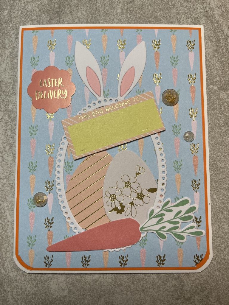
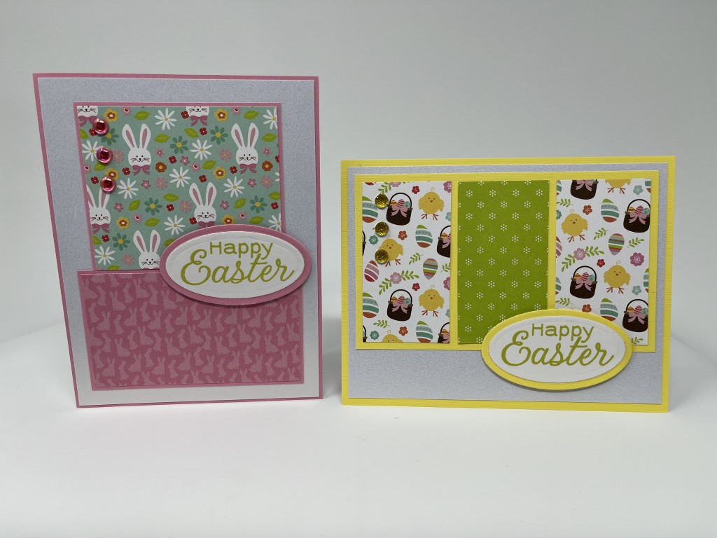
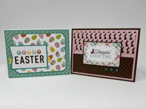
I have several spring paper collections, but only 1 that was specifically Easter – Echo Park’s Hello Easter.  The 6×6 paper pad included 2 sheets of 2×3 inch sentiment cut-aparts and I decided to use those first.  Besides the traditional “Happy Easter” there were several other cute sentiments that coordinated with the pattern paper.

For the first few cards I used patterned paper for the backgrounds.  As you’ll see in the later cards, I pulled in solid colored cardstock and shimmer paper for the backgrounds.  Other than fish-tailing or rounding the corners I left the sentiment cut-aparts at 2×3 inches.  As most of the papers were bright colors with busy prints I only included 1-2 different patterned papers on each cards.  As I expect most of the cards will be mailed, I wanted to keep them fairly flat so that no extra postage would be required.  With that in mind, I used Love from Lizi peel-offs and smaller “bling” from Queen and Co. to add some sparkle and shine to the cards.

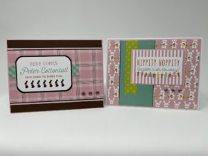
One of my favorite papers was the Easter eggs with all the bright happy colors.  I tried to use it as the focal panel on several of the cards.  Another paper I really liked was the chocolate bunnies.  All of the bunnies had bright colored bows, but with the pink background I tended to pair it with the tiny brown and pink print paper.

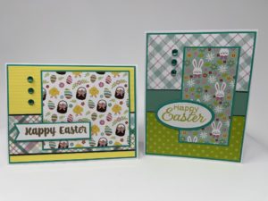
The next 2 cards both use a busy graphic print for the backgrounds.  Initially I thought that might be too much with the focal panels, but I think it worked.

The next card is very “clean” using only the pink plaid paper and a small strip of a tone-on-tone gingham print.  It turned out to be one of my favorite cards.  The second card also only used one patterned paper and a small strip of a tone-on-tone green print but has quite a different feel to it.

After making 12 cards and using all of the sentiment cut-aparts, there weren’t any full sheets of paper that I liked for backgrounds.  Instead I pulled in some cardstock.  I still had full sheets of the chick print paper and decided to use one of my go-to sketches.  The sketch features a large focal panel perfect for highlighting a patterned paper.  The second card uses a layout where multiple different papers created the background.  Other than the matting, all of the papers were pieces from the paper pad.

I’m not sure why, but I struggled with this bunny print.  I ended up pairing it with the pink tone-on-tone paper on a white shimmer paper background.  The next card was a great way to use up smaller pieces and feature different papers.  This was just one of a few cards I made  using this layout.

For the last 2 cards, I only had a couple larger pieces of paper and several small scraps left.  I was able to pair up a few of the larger pieces to make the second card.  For the remaining pieces, I paired them with several of the smaller scraps to create the first card.  I actually quite like the mix of all the different papers.  It could easily get too clutter but I think separating the busy prints with tone-on-tone papers made it work.


In addition to the sentiment cut-aparts, I also used stamp sets by Paper Tray Ink and Recollections.  Along with the paper pad I used several sheets of cardstock and shimmer paper which allowed me to stretch the paper pad to over 35 cards.  A few have already made it to my antique booth, but the rest will be donated to Cards for Soldiers.

Recollections Classic Christmas 12×12 Paper Pad

Recollections Classic Christmas 12×12 Paper Pad

As I was sitting down to work on a new post, I found this Christmas card post that I didn’t get around to sharing in December.  So, it’s a bit late but better late than never.  And I plan to have a new non-Christmas themed post out soon.

—-

This batch of Christmas cards features Recollections Classic Christmas 12×12 paper pad.  I think I picked it up last year during an after Christmas sale.  It has the traditional red/green color and also includes a nice range for patterns including whimsical gifts and ornaments along with elegant florals and nature designs.

Since most of the cards I had made this season felt a bit more serious I decided to start with the fun gift and ornament patterns for something different.  I also chose a layout that I think has a more casual look to it with the photo corner on the focal panel and arrow shaped sentiment panel.  I used a red tone-on-tone paper for the background on both cards.  For the card featuring the gift pattern I stuck with red for the matting and the metallic cardstock strip across the card.  For the ornament pattern, the red just didn’t work and I switched the matting and strip to a bright Christmas green.

I really should do heat embossing more often.  I think the “A very Merry Christmas” sentiment looks great embossed with gold embossing powder and matted on gold metallic cardstock.  The gold sentiment and bits of gold foiling on the stocking are just enough to add a bit of interest and shine to the very traditional plaid and tone-on-tone foliage background prints.

The papers on the second card feature traditional red and green on a bright white background.  Since both patterns are quite bold I thought a clean and simple background was needed.  A white background was too stark and I didn’t like red or green.  I decided to try kraft cardstock which I think gives the card a bit of a rustic feel.  A red metallic cardstock strip and a “Season’s Greetings” sentiment finished the card.

The papers on the next 2 cards both feature poinsettias but have a very different feel.  The wreath pattern on the first card has a traditional feel so I went with a more traditional design and sentiment.  For the second card, since the paper is quite bold, I kept it very simple using a “Merry Christmas” cut apart included in the paper pad and a few Love from Lizi peel-off strips.

These 2 cards feature my favorite papers in the paper pad – the poinsettia floral and the winter birds.  I’ve used this layout before and really like how it allows the pretty paper to be the star of the card.  Both papers are paired with a plaid print – a muted tone-on-tone plaid with the poinsettia floral and a green/cream plaid with the winter birds.  To add just a bit of interest to the bottom panel I added a couple Love from Lizi peel-offs on both cards.  Gold metallic on one and a clear iridescent on the other.  A holiday sentiment, matted and popped up, complete both cards.

I used the same layout for the next 2 cards but just switching up the papers, sentiment and ink colors give the cards a completely different feel.  The first card uses more of the fun ornament paper this time paired it with a tone-on-tone pine tree design.  For the small horizontal strip I used more of the Christmas green metallic cardstock and keeping with the green theme, the sentiment is stamped using a bright green ink.

For the 2nd card I went for a more formal feel.  When I was working on the previous cards I flip flopped on which plaid paper to pair with the poinsettia floral print.  I ended up choosing the muted plaid, but still wanted to try the poinsettia floral with the bolder green/cream plaid.  I think this combination also worked well.  To keep the feel more formal I used gold metallic cardstock for the small strip across the focal panel.

I’m getting a bit burnt out on Christmas cards so I think I’ll take a break and my next project will be something non-Christmas.

Spellbinders Joyful Christmas Card Kit

Spellbinders Joyful Christmas Card Kit

Recently Spellbinders had a warehouse sale and I just couldn’t resist.  I was tempted to get their Colossal Cardmaking Bundle (7 complete card kits) but managed to stay in control and only picked up 3 kits along with some stamp and die sets. I did purchase an extra 6×6 paper pad that coordinates with 1 of the kits.  Spellbinders kits always include a huge amount of ephemera (die cuts, stickers, chipboard, etc.) and I wanted to make sure I had enough paper.

With the holidays coming up I decided to work with the Joyful Christmas kit, Spellbinders November 2021 card kit of the month.  I usually start a kit by making the card on the instruction sheet but as I was flipping through the paper pad I really liked the sheet music and decided to start with that.  I paired it with the soft pink diagonal stripe paper and some pale pink and gold metallic cardstock.  The kit includes cardstock but as I only needed small pieces I just used some pink and gold scraps from my craft room.  For some more pink I added a poinsettia ephemera piece and to go along with the music theme I added the ballerina.  A couple of pink/gold bell enamel dots finished the card.

There were several Christmas stocking ephemera pieces included in the kit.  I thought it would be fun to use several together and “hang” them as if they were on a mantel.  I used the wood bark print for the asymmetrical focal panel and matted it with gold metallic cardstock.  Since the stocking needed something to “hang” from I added a gold Love from Lizi peel-off towards the top of the panel.  For some dimension I popped up the stockings.  To bring some gold to the lower portion of the card I added a couple more gold Love from Lizi peel-offs.  There didn’t seem to be a good spot to add a sentiment panel so instead I stamped “Merry Christmas” directly onto the focal panel under the stockings.

As the first 2 cards were very pink I switched it up with the next card.  I was going to use the pine tree paper as the vertical strip but once I laid out the ephemera pieces the print was too busy and the ephemera didn’t really stand out.  Instead I swapped the papers and used the pine trees as the background and the more muted wood bark print for the vertical strip.  There’s just enough of a print to add interest but not so much that the pine tree and cute animal ephemera pieces get lost.  Instead of matting the vertical strip, I added gold Love from Lizi peel-offs that pick up the gold foiling on the ephemera and the background paper.  A few snowflake enamel dots that were included with the kit and a simple sentiment completed the card.

I liked the poinsettia print paper but found it to be a bit busy.  To tone it down I paired it with a horizontal stripe paper and added a large sentiment panel.  To keep the card from being too flat I popped up several of the poinsettia and foliage ephemera pieces on the corners of the sentiment panel and added some sparkle with a gold Love from Lizi peel-off and a few of the gold/pink enamel dots.

And now back to a pink card… The ballet print paper was really cute but I had already used the ballerina ephemera pieces.  After sorting through the remaining ephemera (there is still a ton left) I found the nutcracker and the swan.  I couldn’t decide which to use so I used both of them.  I matted the ballet paper, leaving a wide border, on some gray cardstock from my craft room.  The bottom panel is the remaining stripe paper left over from the first card.  A strip of gold metallic cardstock separates the top and bottom panels.  To keep the ephemera pieces from blending into the ballet paper, I added them to a large circle die cut from white shimmer cardstock.  For a sentiment I used one of the puffy sentiment stickers included in the kit.

Even after making 2 of each card I still have tons of supplies from the Joyful Christmas kit and I haven’t even used the die set yet.  In looking at the Christmas cards I have made so far many of them are non-traditional colors.  Since most people tend to like the standard red/green colors and traditional images I am going to move on to another collection, but I will definitely come back to the Joyful Christmas kit.  Also, Spellbinders Colossal Cardmaking Bundle is still available and it’s getting pretty hard to resist especially since several of the kits would be perfect for Valentines and spring cards.

Recollections Wrapped With Care 12×12 Paper Pad

Recollections Wrapped With Care 12×12 Paper Pad

Recollections Wrapped with Care was another paper pad I had used a few sheets from last year.  Like the Bright Night paper pad I struggled with this paper.  I like the pine trees, presents and wreath prints but for some reason I struggled to make them work for me.  With the red/green colors and wreath and pine tree prints it is a more traditional color palette and theme and will provide some variety when displayed in my booth.

Since I enjoyed using the strips/borders in the previous paper pad I decided to look at those first.  I thought the “Peace and Cheer” strip would work great as a sentiment panel and it already included a nice gold border.  To bring out the small red berries on the wreaths I added a few red metallic brads.  For the second card I used some more kraft cardstock as the background.  I think it gives the card a rustic/country feel.  I added a scalloped border on one side of the vertical strip and a couple gold die cut snowflakes for a little shine.

If I had to pick a favorite paper, I think it might be the present print.  It was a bit difficult to work with since the presents were spaced out quite a bit but with some strategic trimming I was able to get a focal panel I was happy with.  I paired this with the green/white ribbon stripe.  To brighten everything up I added a Christmas red strip across the card and a few red textured rhinestones.

I liked the layout on the next 2 cards but I’m not sure I choose the best prints to feature.  I like the bright red stripes on the card on the right but I think the card on the left was more successful.  I used a scalloped border on both cards to separate the papers – red on one, gold metallic on the other.  For a bit of texture I sprinkled on a few brads, again red on one card and gold on the other.

I only ended up making 10 cards – 2 of each.  I really can’t figure out how to use the paper, so instead of struggling on I’m going to move to something different. It is pretty paper but might just be better suited to scrapbooking than cardmaking.  It is a nice heavy weight paper so it might end up for sale in my booth.


Recollections Bright Night – Part 2

Recollections Bright Night – Part 2

I’m still going with the Recollections Bright Night paper pad.  There was a lot of paper I wanted to use, especially more of the strips/borders.

The next 2 cards, my favorites, both used a border along the bottom of the card.  The layout is the same for both but I modified the size of the striped panels to accommodate the width of the borders.  I used a narrower sentiment panel on the gray/white stripe card so as not to cover up too much of the ornament border.  I was able to use a larger sentiment panel with the snowflake border.  For embellishment I added a gold Love from Lizi peel-off to separate the borders from the striped papers and a coordinating die cut – a gold ornament that I offset on a black ornament and a gold snowflake.

I used the same layout on the next 2 cards.  I paired the black/white snowflake paper with the last of the knit print paper.  As the papers were all black, white and gray I thought it needed something to brighten it up.  I added a metallic silver strip behind the focal panel and 2 die cut silver snowflakes.  The knit print made me think of sweaters, scarves and staying warm, so I used the “Warmest Wishes” sentiment.  Since I had only used the bow paper once there was still almost 1 full sheet.  I tried it with other papers but only liked it paired with the gray/white stripe.  So instead of making something I didn’t like I used that combo again.  A black strip behind the focal panel and a die cut silver metallic bow completed the card.

For the next few cards I had looked for a layout where I could use 2 inch strips of paper.  I’m used to having 2 inch strips when using 6×6 paper but I’m not sure why I ended up with so many when using 12×12 paper?  The backgrounds are all papers from the Bright Night paper pad.  The backgrounds were actually portions of 12×12 sheets which featured large images along the top or bottom edges of the paper.  I added a couple Love from Lizi peel-offs across the card and although you only see a small portion of them, they do add a bit of interest and shine.

The last few cards I made used quite a bit of the sentiment paper – as a background on 1 card and the focal panel on another.  I was also able to use 1 more border, the poinsettias, along the top of the striped card.  With the sentiment paper as the focal panel, I skipped adding another sentiment and just added a few snowflakes die cut from gold metallic paper.  The sentiment paper also worked well as a background for the poinsettia paper (my favorite).  I added another die cut gold metallic snowflake and some gold Love from Lizi peel-offs.  For this card I did add a small sentiment in the lower corner of the focal panel.

For all of the cards, I made a least 2 using each layout and paper combination.  This gives me one card to use/sell and another that I’ll save and donate to the Cards for Soldiers program.  The cards I plan to sell will be displayed on the card display board in my booth.  I don’t want the cards to all look the same and I want to offer a nice variety.  I know that these papers won’t be to everyone’s taste.  So even though there is still paper left, I am moving on to another paper pad which will bring in some more color and patterns.