Browsed by
Category: Holidays

Recollections Bright Night 12 x 12 Paper Pad

Recollections Bright Night 12 x 12 Paper Pad

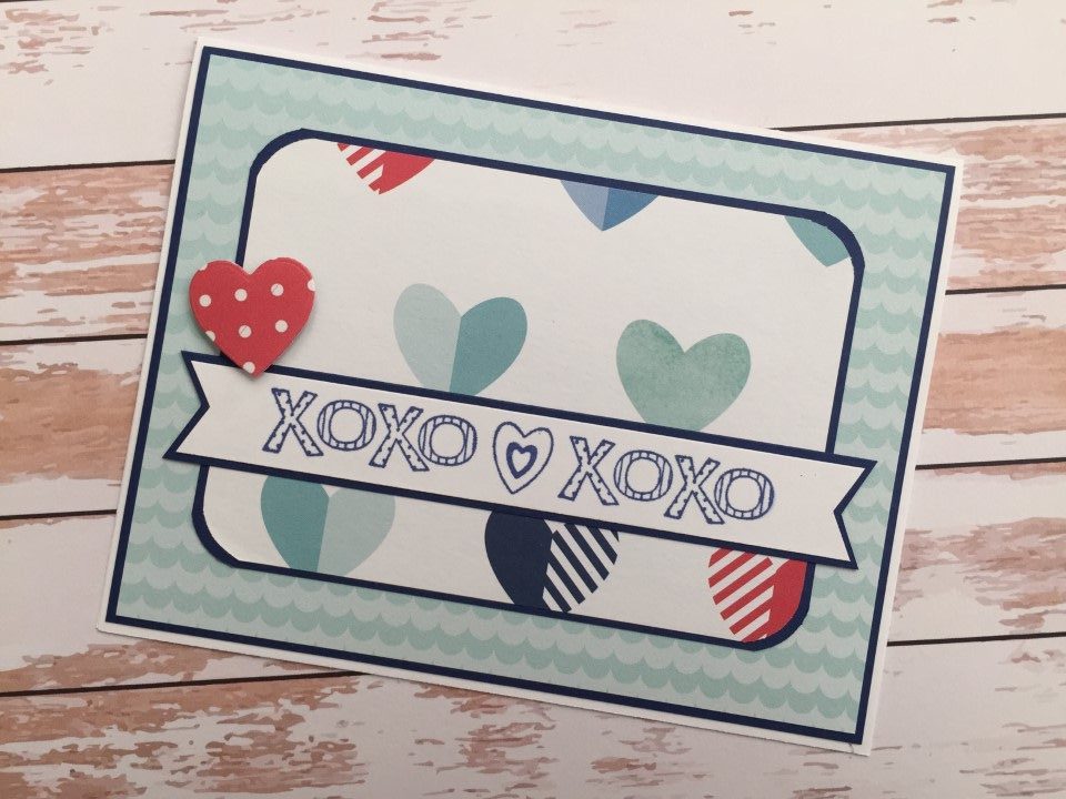
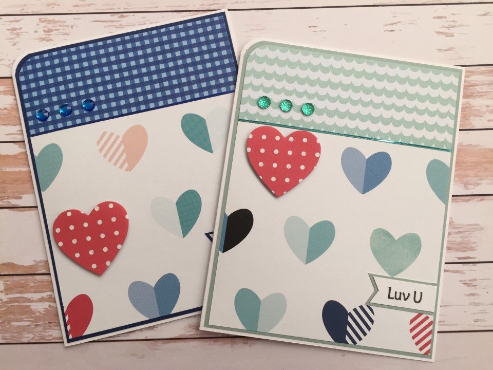
Do you ever get bored with your hobbies?  I’ve had a hard time getting interested in card making lately.  Other than a few Halloween and Thanksgiving cards to put in my antique booth I haven’t made any new cards.

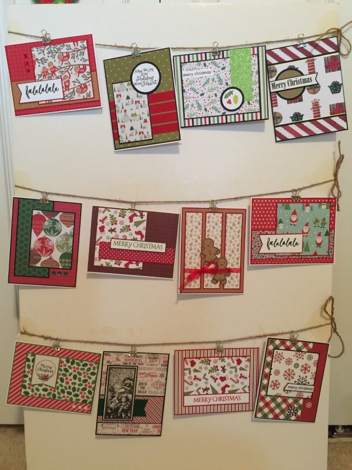
For the last few weeks I have been busy getting Christmas items ready for the booth – pricing and tagging everything from ornaments to books, kitchenware to collectibles.  I’m amazed at how much Christmas “stuff” I’ve accumulated.  Although this has been time consuming and sometimes tedious, it did get me motivated to make Christmas cards.  I don’t want to have my booth all done up for Christmas and not have any Christmas cards.

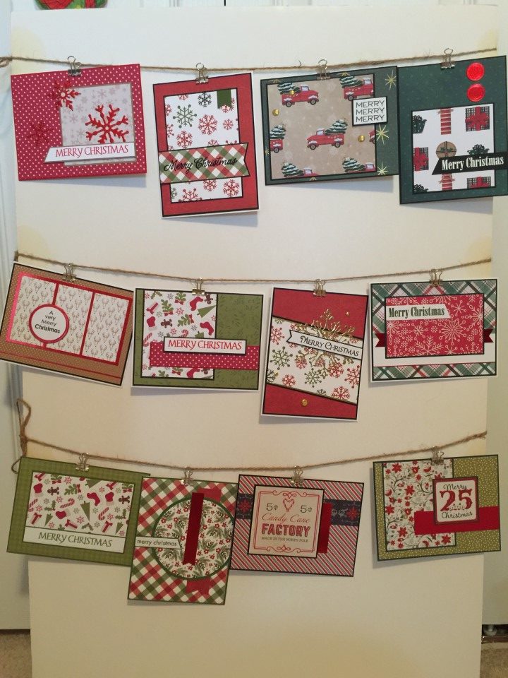
So, I pulled out a couple older Recollections 12×12 paper pads.  I used a few sheets out of each pad last year but with 48 12×12 sheets it takes me forever to use up 1 paper pad.  I decided to start with Recollections Bright Night.  I thought it may be a bit of a challenge since I had a hard time with this paper last year, but surprisingly I found it much easier to work with this time around.

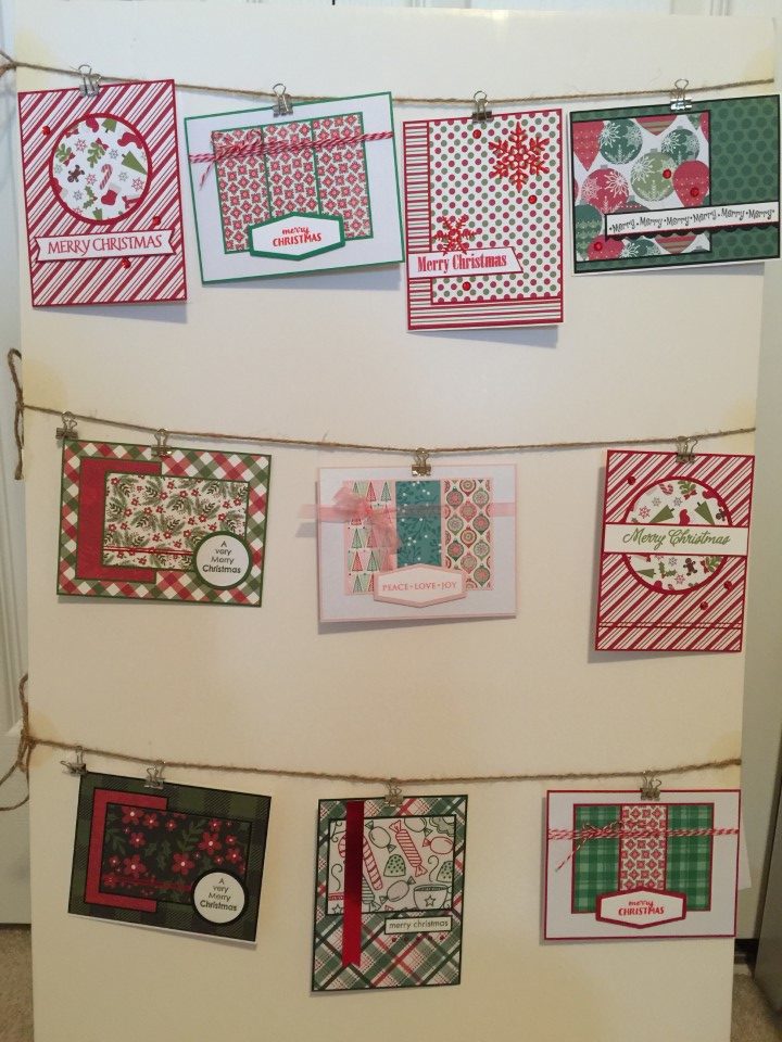
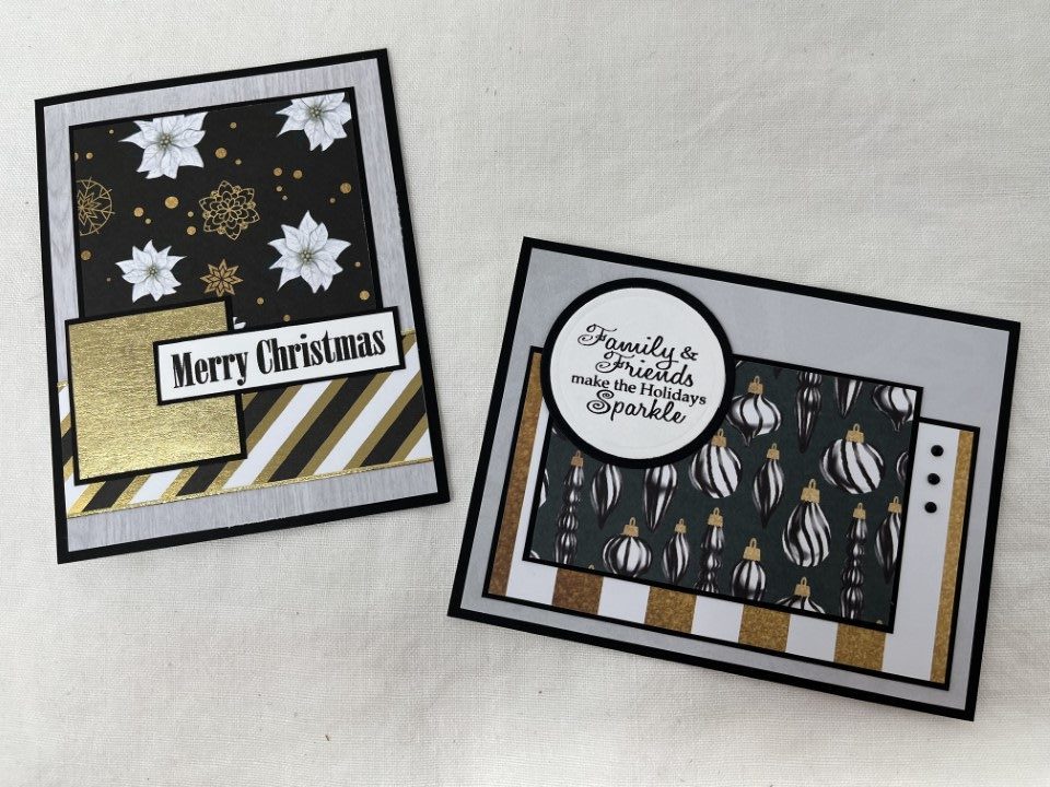
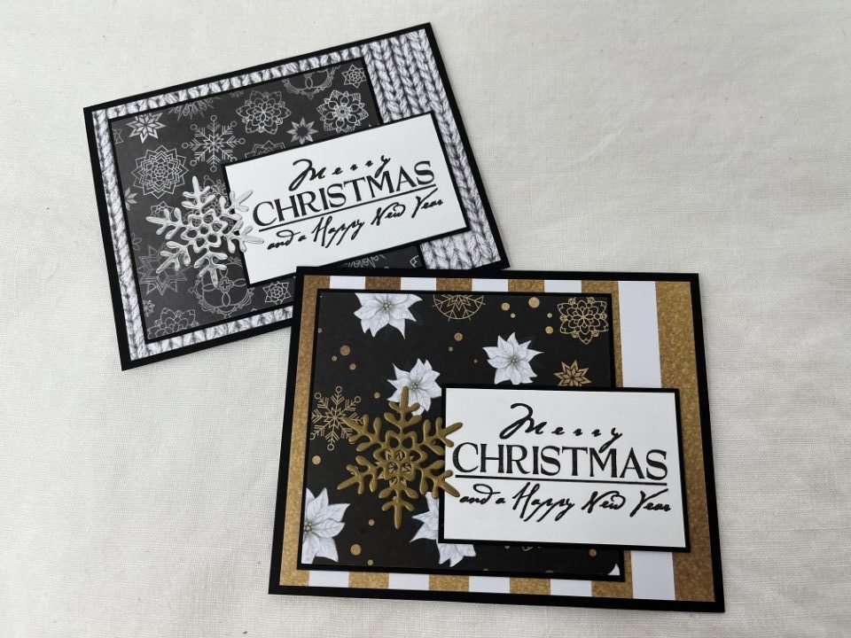
One of my favorite papers in the paper pad is the white poinsettias on the black background.  With the gold snowflakes and the sharp contrast it is a beautiful paper.  I paired it with the black, white and metallic gold diagonal stripe paper and added a small square of gold metallic paper from my stash to anchor the sentiment.  For the background I used a gray woodgrain print also from the Bright Night paper pad.  With all the metallic gold, the only embellishment I added were some Love from Lizi peel-offs along the striped paper.

For the second card I used nothing shiny.  I think the gold and white stripe paper is meant to look like glitter but there’s actually no glitter on it.  The focal panel features a black/white/gold ornament print.  The bit of gold on the ornament caps coordinates nicely with the gold stripe.  The background is some more gray paper from the Bright Night paper pad.  For embellishment I added a few black mini brads.

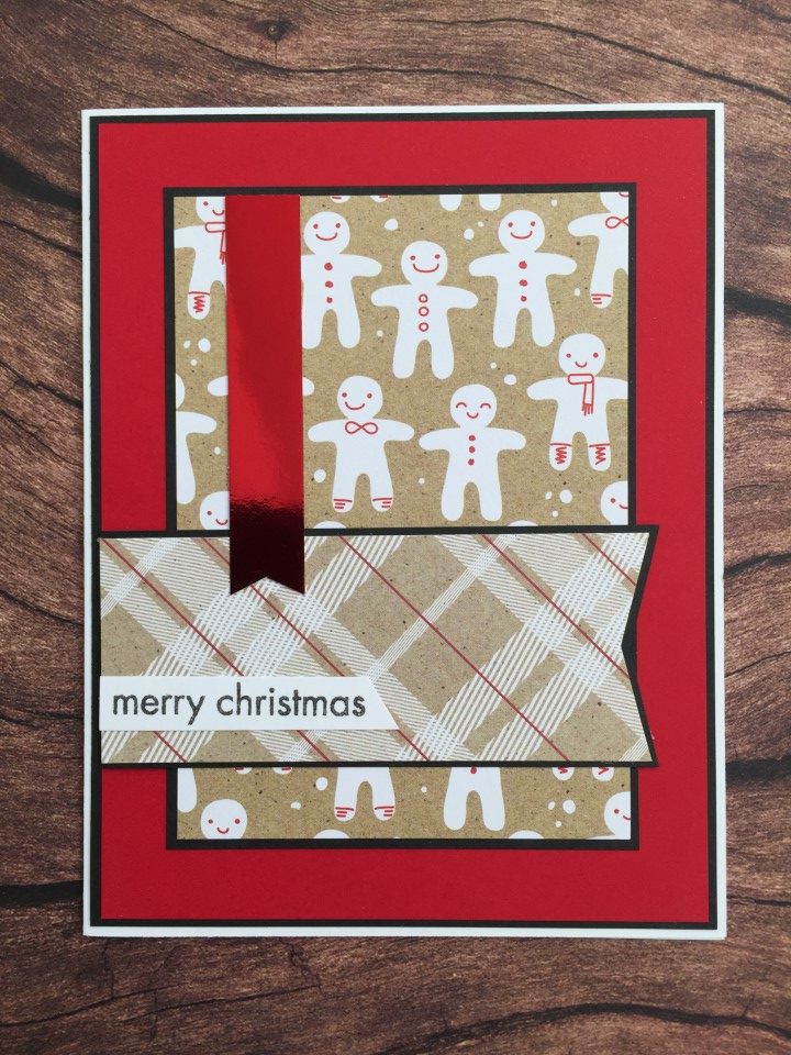
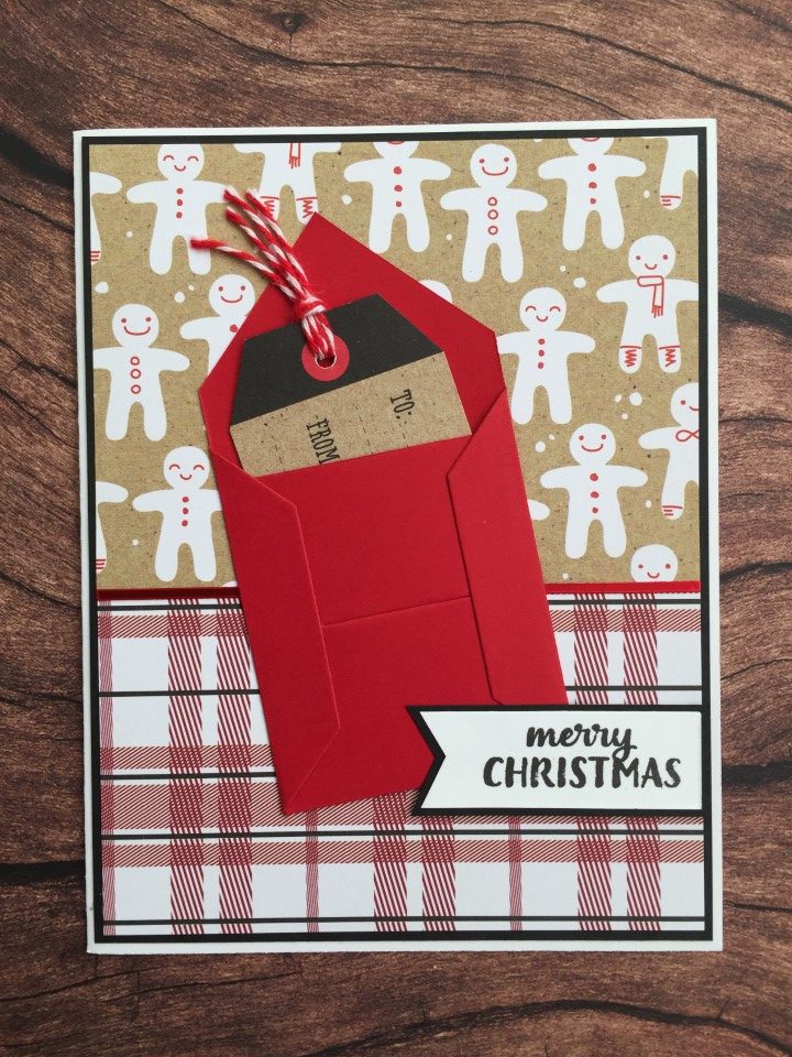
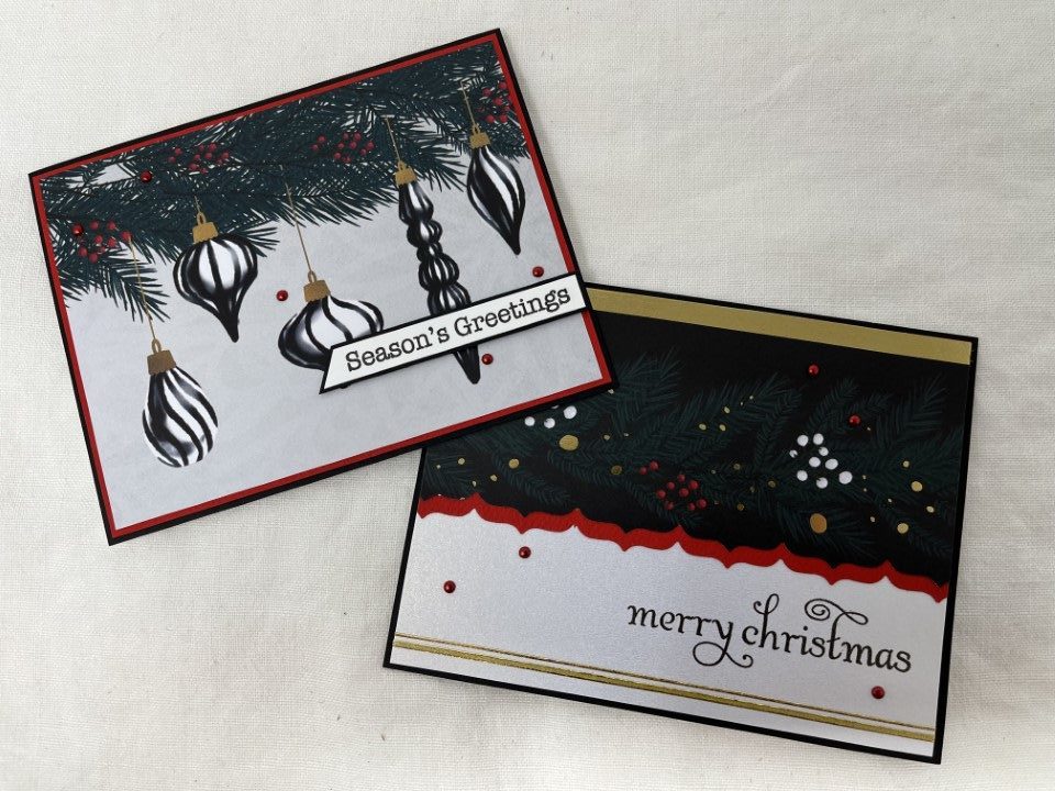
The next 2 cards allows the paper to do all the work.  For the first card the entire print is the top portion of a 12×12 sheet of paper.  I simply trimmed the top 4 inches off the paper, centered the ornaments and trimmed to 5 1/4 inches.  To highlight the small red berries in the greenery, I added a double matting of bright red and black cardstock.  A few metallic red mini brads, a sentiment and this card was complete.

The paper pad included a 12×12 sheet with several strips/borders.  For the second card I used one of the wider borders for the top portion of the card.  The border already included the metallic gold stripe and I added a few gold Love from Lizi peel-offs to the bottom of the card to bring in some more gold.  I used a parentheses border punch and red cardstock to add some interest against the white paper.  The sentiment is stamped directly on the white shimmer paper and heat embossed to ensure it doesn’t smear.  I added a few more metallic red mini brads to finish the card.

The next two cards are a bit muted with all of the gray, but I think they have an elegant look to them.  The first card uses some more of the ornament paper.  I contemplated using the sentiment paper as the background but thought it might be too much.  Instead I trimmed a strip and used it behind the ornament focal panel.  A separate sentiment wasn’t necessary but stamping in on white paper with no matting breaks up some of the busyness of the ornament paper.

The second card used a simple layout and gave me a chance to feature the bow print paper.  I matted the bow paper with black cardstock and added a scalloped border down one side of the panel.  A thin black/silver ribbon tied around the panel added a bit of dimension.  A few clear rhinestones added some sparkle and a crisp Merry Christmas sentiment completed the card.

The next two cards use the same layout and snowflake die cut but have a very different feel just by switching up the paper.  The first card is completely monochromatic using only black, white and gray papers.  To keep it from being too boring a very shiny silver metallic paper is used for the die cut snowflake.  The second card also only includes 3 colors but the black, white and gold is much brighter.  The snowflake die cut on this card is cut from a matte gold metallic paper.

To get me started with this paper pad I had pulled out 1 sheet (or partial sheet) of each of the different papers.  I didn’t plan on using all of the paper but wanted to see what was available.  Even after making over 16 cards I still had quite a bit of paper left that I wanted to use and paper combinations I wanted to try.  Since I was still having fun I decided to continue on.  I’ll post the rest of the cards I made using the Bright Night paper soon.

First Client Christmas Cards for 2021

First Client Christmas Cards for 2021

I completed my first client Christmas card order for the season.  I really enjoy having a specific project to work on and this project was great.  Other than a “Merry Christmas” sentiment and traditional red and green color scheme, my client was open to any design.  The one special request was a sentiment on the inside of the card.  After going through my Christmas stamps, the traditional “Merry Christmas and a Happy New Year” was selected.

I got started by pulling out all of my “Merry Christmas” sentiment stamps and Christmas paper pads and collection kits.  I used multiple different layouts, sentiments and embellishments on the 30+ cards I initially created.  Once I had a decent number of cards completed, I hung them on my “display” board (foam board with binder clips) and sent my client a few pictures of the completed cards.

A couple of her favorites were the snowflake and vintage truck cards.  When buying paper I usually only buy 1 of each pad or kit.  So… I have lots of papers to choose from, but can only make a few of the same cards.  The first card used paper from Echo Park’s A Perfect Christmas collection kit so there was only 1 sheet of each print.  Based on the layout there was plenty of the red/green snowflake paper and I was able to use 2 different red tone-on-tone papers from the kit for the background.  A gold mirror die cut snowflake, a few gold brads and some Love from Lizi gold mirror peel-offs added just the right amount of shine to the card.

The second card used paper was from the Recollections Wrapped with Care 12×12 paper pad.  With 2 sheets of each print, there was plenty of the cute vintage truck with Christmas tree paper and gold mirror star paper to make several more of these cards.  To match the “clean” layout, I kept the embellishments to a minimum adding just a few gold Nuvo drops sprinkled around the card.

I placed some of the extra cards in my little antique booth and have already started on my next order.

Recollections Mystic Moon and Pinkaboo Paper Pads

Recollections Mystic Moon and Pinkaboo Paper Pads

I’m falling behind in my posts again.  With 3 sales in roughly 6 weeks at my booth, I’ve been busy making a few more Halloween cards, a bunch of Christmas cards and generally just getting “stuff” ready.

Here are some of the Halloween cards I completed for the first sale in September.  I used a couple different Recollections paper pads that I had picked up after Halloween a few years ago.

The first few cards used the Mystic Moon 8×8 paper pad.  It’s not my usual style of paper but I wanted to have a wide selection of cards.  The paper pad is quite dark (lots of gray, green and purple) with a scarier feel.  In keeping with the scary feel, I skipped the “Happy Halloween” sentiment and went for sentiments that I think more matched the feel of the cards.  For embellishments, I used silver metallic Love from Lizi peel-offs on one set of cards and some die cut spiders with black rhinestone bodies on the other.

For the next several cards I used a go-to sketch which features a 3×3 inch panel.  This sketch is great for using the corner pieces of papers with full page images.  I paired the corner floral piece with a coordinating floral background, adding some shine with the gold shimmer paper.  For the corner piece featuring a spider web, I added a small die cut spider.  There was enough room on all of the 3×3 inch panels to add different versions of the “Happy Halloween” sentiment.

Since this was an 8×8 inch paper pad, I was able to make several of each card.

After the dark and scary, I switched to Recollections Pinkaboo 6×6 paper pad.  This paper is about as opposite as you can get from Mystic Moon.  While the Pinkaboo paper also featured ghosts and skeletons, they were far less scary when done in pinks, purples and gold foil.  The paper pad included a sheet of border strips that I definitely wanted to use.  The first few cards used a textured purple cardstock for the background and a pretty pastel pumpkin print for the image panel.  The next cards used another textured cardstock for the background and a pink and black skull print for the image panel.  Both sets used border strips for the panels running across the card.

I really liked the paper I used for the image panels and decided to use them for a few more cards.  This time I paired the pastel pumpkins with an hombre pink sky pattern and more textured cardstock.  For the pink and black skeletons, I pulled out a sheet of the gold foil skulls paper.  This paper is really fun with the skulls also having an hombre effect, changing from pink to purple.  The last few cards featured the pink and lavender ghosts.  They were too cute not to use and I was also able to use the last of the border strips for the horizontal panels under the sentiment.

Both paper pads were fun to use but for my next batch of Halloween cards I focused on the more traditional orange and black color scheme.

Queen and Co. Happy Holly Days 6×6 Paper Pad

Queen and Co. Happy Holly Days 6×6 Paper Pad

For the 2nd set of Christmas cards I made earlier this summer, I used Queen and Company’s Happy Holly Days paper pad.  I’ve had this paper for a couple years and just haven’t gotten around to using it.  There’s a lot of red and green, but also some non-traditional brown and beige.  Like most Queen and Company paper pads only a few of the prints are holiday/season specific.  Several of the papers, like the houndstooth and polka dot prints, could be used for any occasion.

I went with a favorite sketch for the first card.  I used the green houndstooth print for the background and the very Christmas-y print for the focal panel.  The red banner across the card is another paper from the paper pad, a red tone-on-tone print.  Everything is matted in a dark brown cardstock.

The candy cane stripe paper is very cute, but a bit busy.  To break up some of the lines, I added 2 Love from Lizi peel-offs in the red mirror color.  It’s a small change but made a big difference in the look of the card.  For a bit of sparkle I added a few red rhinestones.

For the next card I replaced the circles shown on a card sketch with snowflakes.  I used the snowflake dies I purchased last year after Christmas and red mirror cardstock by Recollections.  The color coordinated with the red polka dot paper perfectly and added a bit of shine to the card.

I liked the busy Christmas print paired with a muted design.  As I was out of the green houndstooth so used the brown tone-on-tone check instead.  I also used some of the leftover red polka dot paper for the strip across the card.

I wasn’t sure what to do with the red and green polka dot paper.  I didn’t like it as a focal panel but it seemed too busy to use as a background.  After flipping through the remaining paper, I tried pairing it with a scrap of the green houndstooth.  The houndstooth was “just enough” to break up the busy polka dot print.  Since neither paper was a Christmas or winter theme, I added a few red snowflakes and went with a more general Season’s Greetings sentiment.

I am a fan of stripes and really liked the red/green stripe paper, but it was a bit intense.  I knew I would need to use it in small doses or with a larger focal panel.  I ended up using a very simple layout with the Christmas print paper and a sentiment as the single focal panel.

I made multiples of most of the cards as the paper pad included 4 sheets of each design.  It was another good sized batch of cards that I will have ready for donation and for sale at my booth.

American Crafts Cozy & Bright 6×6 Paper Pad

American Crafts Cozy & Bright 6×6 Paper Pad

Wow!  I knew it had been a while since my last post but I didn’t realize it had been a month.  At least I’ve been busy making cards.

A few weeks ago I started on my first batch of Christmas cards for the year.  Between cards for donation and hopefully cards for my booth, I will be needing quite a few Christmas cards this year.  To avoid the last minute rush I’ve set a goal to make 1 batch, at least 25, Christmas cards every month, with a few double batches later in the year.

For my first batch of Christmas cards I pulled out the Cozy & Bright paper pad.  It’s a 36 sheet paper pad so I figured I could easily make at least 25 cards.  The paper pad has a lot of red and green with a little blue and some fun gnomes and sloth prints.  The paper pad also included 2 sheets of cut-aparts which was great so I didn’t need to pull out a bunch of Christmas sentiment stamps.

A couple of the cut-aparts featured a circular design which worked great for a sketch I wanted to try.  The sketch features 2 circle panels and the cut-aparts were the perfect size for the smaller panel.  For a bit of sparkle, I used light green glitter paper and red mirror paper for the scalloped borders and accent strips.

With so many sheets of paper in the paper pad, there were several to choose from for backgrounds.  I used some of the busier prints for the focal panels (my favorite is the sloth) and more of the cut-aparts for the sentiments.  I added some simple embellishments like white epoxy dots on the red stripe/holly print, rhinestones on the gingham/floral print and clear iridescent peel-offs on the snowflake/sloth print.

For the next couple of cards I pulled out a go-to sketch that features a large focal panel that I could use with the sloth and cute gnome prints.  Also since the gnome print included a lot of blue, I wanted to use it while there was still some of the blue floral paper to pair it with.  Both the sloth and gnome prints featured a glittered finish, so I kept any additional embellishments minimal with a few red rhinestones and peel-offs.  I did have to pull out a Christmas stamp set as the cut-aparts did not work with this sketch.

Since there was still some of the blue floral print, I paired it with the last of the gnomes.  Some white shimmer paper for the background and a few rhinestones hearts and the card was  complete.  I wasn’t sure what to do with the black/white Christmas song paper.  It was the only black/white paper in the paper pad and I was struggling a bit with what to pair it with.  I decided to use it as a “neutral” and pair it with some red and green prints.  To tie in the black, I used a cut-apart with a black background.  And to keep it from looking too boring, I added a banner in red mirror cardstock.

For the first several cards I was able to make 2 cards using the same papers.  As I accumulated more scraps I still made multiple cards of each design by adding white shimmer paper and kraft cardstock for the backgrounds and switching up the papers used for the different panels.  I also used up the last of the cut-aparts.

There were still a few good sized pieces of the forest print paper.  Instead of throwing them in my box of scraps, I decided to make a few more cards.  By using the polka dot scraps and some plain green and kraft cardstock I was able to make 2 more cards.  I used a “Happy Holidays” stamp featuring a fun font that I think matched the feel of the card.  A few rhinestones for embellishment and this set of cards is complete.

So…  31 cards done and many more to go.

Recollection’s Love and Devotion

Recollection’s Love and Devotion

Now for the red, pink, hearts and flowers Valentine cards…

I used Recollection’s Love and Devotion 12×12 paper pad.  All of the papers are the traditional red and pink with lots of heart and flowers.  It’s a pretty paper pad with some sheets having a glitter or mirror accent.  Since there is so much paper, I tried to use only papers from this paper pad for all of the backgrounds and focal panels.  But, there were a couple cards where none of the papers worked for the background and I did end up using some white shimmer paper.

Along with the cut-aparts, I used a few Valentine and love sentiment stamps.  All of the cut-aparts were square or rectangular, but a few worked well for die-cutting into circles.  I also used a few dies to cut hearts for the sentiment panel and embellishments.

My favorite card uses Mojo Monday sketch #370.  I’ve used this sketch in the past and really like how you can mix multiple pattern papers.  For this card I only used 2 patterns since the “Love” background and the tic-tac-toe focal panel are both a bit busy.  For the other card, I used another of the cut-aparts as the main focal panel.  More of the floral print and polka dot papers were used for the other panels.  Since adding another print would have been too much, white shimmer paper was used for the background.  For embellishment, a pale pink chiffon ribbon was tied around the card front.

The next 2 cards used a couple of sketches that I have been using quite a bit lately.  The first card used another of the “Love” pattern papers for the focal panel.  For some separation from the background, the focal panel is matted on white cardstock with a scalloped border.  For the second card more of the tic-tac-toe paper was used for the focal panel.  Die cut hearts, rhinestone hearts and red mirror Love from Lizi peel-offs were used as embellishments.

After making over 40 cards, I’m ready to move on to something new.  There is still tons of paper left including several prints that I didn’t even use.  I’ll have plenty of paper for Valentine cards for next year.

More Valentine Cards

More Valentine Cards

I still wasn’t ready for the full blown red, pink, hearts and flowers Valentine cards.  Instead I pulled out a couple sheets of non-Valentine paper from Pink Fresh Studio’s Felicity collection.  One features a modern take on a heart print in red, gray and peach.  The other small colorful hearts sprinkled across a white background.

The first set of cards paired the red, gray and peach heart print with a peach/red polka dot paper from my craft room.  I used a simple layout that I had used for the previous batch of Valentine cards.  The heart print paper is used for the focal panel and the polka dot paper is used for the background.  To ensure as many “hearts” as possible are visible, some of the cards are done vertically and others horizontally.  A simple Valentine sentiment is stamped and trimmed into a banner shape.  For the vertical cards, a couple red heart shaped rhinestones were added in the upper right hand corner.

The next couple cards used a new-to-me sketch and an old favorite.  The new sketch features the focal panel trimmed into a banner.  A large die cut heart was added towards the top of the banner and the sentiment strip was popped up over the lower portion of the die cut.  For some sparkle, a couple red rhinestone hearts were added.  The second card used one of my favorite sketches.  The heart print is again used for the focal panel.  To add some interest to the right side of the card, a couple heart rhinestones were added.

At this point there were only a few strips of the polka dot paper left.  I looked for sketches where I could use the strips instead of a full sheet of paper for the background.  The first card used a panel of the heart print paper across the card and the second used a panel down the center of the card, both panels covered the edges of the polka dot strips.  Instead of matting the heart panels, red mirror Love from Lizi peel-offs edged the panels and a couple of die cut hearts were added for embellishment.

The second group of cards pairs the colorful heart print with a teal geometric print also from the Felicity collection.  So far the focal panel on all of the cards were square or rectangular.  For something different, I used a circle focal panel.  A simple “Love” sentiment was stamped and added across the lower portion of the circle.  And for embellishment, a small die cut heart and clear heart shaped rhinestone were added to the end of the sentiment strip.

The next set of cards used a couple of my favorite sketches.  Both cards feature a single large focal panel perfect for featuring the heart print paper.  The first card has a large fish-tailed sentiment banner and a long thin flag cut from a scrap of teal satin mirror cardstock.  The second card features a small die cut heart stamped with a Valentine greeting, making it look like a candy conversation heart.  A few clear heart shaped rhinestones were added next to the focal panel for a little bit of sparkle.

Using the leftover strips of background paper worked so well that I decided to try it again.  The first card used one of the same sketches, but instead of a vertical card, I flipped it horizontally to work with the direction of the heart paper.  Love from Lizi peel-offs, a large die cut heart and a few clear heart shaped rhinestones finish the card.  The second card uses a similar layout, but the vertical strips of the geometric print are different sizes.  The heart paper is matted with some of the teal cardstock and edged with 2 different sizes of Love from Lizi peel-offs.  Instead of a sentiment panel, a few fun Valentine greetings were stamped on small die cut “candy conversation hearts”.

Even though the cards were made for Valentines Day, I think they would work any time of the year.

Valentine Cards

Valentine Cards

After a short break it was time to get going on Valentine cards.  To get started I pulled out all the Valentine specific paper.  As I was doing this I noticed a few sheets of heart print paper that I had picked up with the intention of making “Miss You” cards.  Instead I decided to use the paper for Valentine’s Day cards.  Not every Valentine needs to be red and pink, right?

Since the hearts are mainly shades of blue with just a couple peachy pinks and rosy reds, I decided to focus on the blue hearts.  I found a soft blue-green scallop print and a partial sheet of bright royal blue check print to pair with the heart paper.  Keeping with the non-traditional theme none of the sentiments were specifically “Happy Valentine’s Day” and all of the sentiments were stamped using Ranger Cobalt Blue ink.

Because of the scale of the heart paper, a single large focal panel was used to ensure multiple colors of hearts were visible on each card. The first couple cards used the scallop print for the background.  To bring in just a touch of valentine color, a scrap of rosy red/white polka dot print was used for the strip across the card.  The sentiment was popped up with foam tape to add a bit of dimension.

The next set of cards again used the scallop print for the background.  A long “XOXO” sentiment was stamped and the ends were cut into a fish tail.  A small heart was die cut from more of the polka dot paper and popped up with foam tape.  The heart was placed at different spots along the sentiment depending on the location of the hearts on the focal panel.

For the next few cards, I pulled out some washi tape that has been hanging out in my craft room for quite some time.  The colors of several stripes in the washi tape also appear in the heart paper.  For some of the cards the washi tape appears to be taping the focal panel to the card.  For others, the washi tape covers the seam between the pattern papers.

The next group of cards used the blue check print for the background.  The size of the focal panel on the cards is the same but the pattern is vertical on one and horizontal on the other.  The same sentiment is used for both layouts.  On the vertical card the sentiment panel has fish-tailed ends and is popped up for some dimension.  On the horizontal card a die cut heart, popped up with foam tape, has been added to one end of the sentiment panel.

The last couple cards used up the rest of the scallop and check print papers.  To separate the printed papers, Love from Lizi peel-offs were used.  A small “Luv U” sentiment was added to the bottom corner of the cards.  The last of the polka dot paper was used to die cut a few hearts which were popped up with foam tape for some dimension.  As a final embellishment, a few rhinestones were added for some sparkle.

I really like how these cards turned out.  I think they would work for masculine or feminine Valentine Cards.  Or with the non-traditional colors and prints could also be used any time of year.  I still have a couple sheets of the heart print paper left and may eventually get around to using it for “Missing You” cards.

American Crafts Hot Cocoa 6×6 Paper Pad

American Crafts Hot Cocoa 6×6 Paper Pad

And now for the last of the Christmas cards…

It’s after Christmas but there was still one more paper pad I wanted to use.  Also, I had purchased a few new dies after Christmas and I didn’t want to wait until next Christmas to try them out.

The paper pad was not specifically Christmas but the prints all had a winter feel to them so I decided to use holiday sentiments.  There were only 4 colors in the paper pad – black, white, red and kraft, which made it easy to pick coordinating cardstock.  I used red and black cardstock for the matting and red, kraft and white shimmer papers for the backgrounds.

I used sketch #516 from MFT on the last batch of cards and decided to use it again.  Solid colored cardstock was used for the background and printed paper was used for the focal panel and the horizontal banner.  Red mirror cardstock was used for the banner on the left side of the card.

The next few cards used two of my new dies – a deer silhouette and a snowflake.  I cut both images out of red cardstock.  The deer is paired with a red/white/kraft tree print and the snowflake is paired with a kraft/white snowflake print.  Everything was matted with more of the red cardstock.  I really liked how these cards turned out and know I’ll get a lot of use out of these dies in the future.

The paper pad included a couple sheets of cut-aparts, some of which were small tags.  I really liked the tags and thought it might be fun for the sender to personalize the To/From tags.  Using a die, I created a small envelope for each tag.  A bit of coordinating twine was added to each tag and then they were placed into the envelopes.

These next few cards used only black and white prints with a pop of red.  Both cards used more of the new dies.  The deer die cut, being a more solid image was easily visible on the black/white tree paper but the snowflake seemed to get lost on the same print.  To ensure the snowflake was visible, I die cut several snowflakes and stacked them together, which gave the snowflake some dimension.

With the scraps, I decided to do a slightly different take on an OWH sketch.  Using an old punch and the scraps, I punched several scalloped squares.  I also punched several squares out of some kraft cardstock.  For the kraft squares I added a red or white snowflake die cut with one of the new dies.  A coordinating ribbon was added across the bottom of the card.  I didn’t want to cover up too much of the scalloped squares and decided to skip the sentiment.

The paper pad included 36 sheets so I knew I would probably make more cards than usual but 50+ cards was a lot.  This put my total to over 200 Christmas cards this season and I’m going to call it done.  The charity where I donate my cards starts packaging/shipping Christmas cards in July so I have plenty of time to drop these off before then.  Now I’ll take a short break before starting on Valentine cards.

Christmas Cards from Scraps

Christmas Cards from Scraps

Before moving on to the next paper pad, I decided to use up the scraps from the Jingle All the Way paper pad.  With all the different colors and patterns in the paper pad there weren’t any scraps that could be combined.  So I pulled out some scraps from the Authentique Colorful Christmas paper pad which also included pinks and teals.  By mixing scraps from both paper pads I was able to make a few more cards.

This card pairs the red plaid from Jingle All the Way with a tree print from Colorful Christmas.  After trying a few options for the background I decided to go with the pastel pink.  I think the non-traditional color is a nice compliment to the more traditional plaid and tree prints.

For the next couple cards I paired the multi-colored ornaments from Jingle All the Way with a print from Colorful Christmas.  Both papers include the same colors and if I didn’t know better would think they came from the same paper pad/collection.  I selected sketches that worked with the size and shape of the Colorful Christmas paper scraps.  The layout for the first card worked best with a vertical pattern scrap.  The focal panel was created with a die set from Gina Marie designs.

The layout for the second card featured a horizontal pattern scrap.  A small scrap of the Jingle All the Way ornament paper was used for the focal panel.  To add some texture to the aqua background, the cardstock was embossed using a swiss dot embossing folder.  For a little shine, a thin strip of teal satin mirror cardstock was added under the Colorful Christmas paper.

For the last couple cards I used the red polka dot print from Jingle All the Way with the deer print from Colorful Christmas.  Kraft paper, which matches the color of the deer print, was used as the background for the first card.  The red polka dot print picks up the color of the deer noses.  To bring in more red, a red cardstock was used for the matting.

I liked the look of the deer print with the kraft cardstock but without another print to pair it with thought it was too plain.  Combining the kraft color with a print, I pulled out a sheet of gold foil kraft cardstock from the DCWV Kraft & Gold paper pad.  The tiny gold polka dots are just enough.  To finish the card a few circles die cut from red mirror cardstock were added to the upper right corner.

By combining the scraps from these 2 paper pads I was able to make several cards.  With their non-traditional colors and Christmas themed prints, I think it would have been difficult to use these papers with anything else.