Browsed by
Category: Spellbinders

Spellbinders Always Remember Card Kit

Spellbinders Always Remember Card Kit

I’m still working my way through my collection of Spellbinders card kits.  This is the February 2022 kit and is filled with pretty pastel colors, lots of florals and fun spring images.  I hadn’t used the Always Remember kit before so I knew I wouldn’t be finishing or even making a dent in the kit.

To get started I used one of the sample cards for inspiration.  As I tend to like a “cleaner” look, I used fewer pieces of ephemera on the card.  I still like the look and with duplicates of most of the ephemera pieces, I was able to make 2 cards.

The next card is also based on a sample.  I switched up some of the sentiment pieces and included fewer hearts which keeps the card general enough so that it could be used for a birthday or wedding.

For the last card I used a sketch for inspiration.  The larger vase of flowers fit nicely on the vertical panel.  Using the floral print for the strip across the card added more flowers and color.  A Fiskars border punch was used to create the matting for the floral print.  A few of the included sequins added some sparkle and finished the card.

No surprise I still have tons of ephemera left and haven’t tried the included stamp and die sets yet.  I’ve put the kit away for now as I have plenty of spring cards to take to my antique booth.  It’s definitely a go-to kit for spring, wedding or feminine themed cards.

Spellbinders Around the World Card Kit

Spellbinders Around the World Card Kit

This batch of cards was created using Spellbinders August 2020 card kit – Around the World.  I had used the kit before and still had plenty of epherema to use up.  The goal was to use as much of the ephemera as possible without being too over the top.

I decided to try a “structured” collage look for the first card.  Instead of overlapping the different pieces of ephemera I loosely aligned the pieces leaving some of the background visible.  I started by grouping the ephemera by color and by mixing the pink and aqua ephemera pieces was able to come up with a layout that I liked.  It did take a bit of auditioning to select pieces that included a nice mix of shapes and sizes.  To give the piece some dimension, I also popped up a couple of pieces like “Sydney” and “Tokyo”.  I’m sure this style won’t appeal to everyone, but as I tend to lean more towards the clean, linear look this worked really well for me.

In fact, I liked the first card so much I decided to do another collage piece.  This time I focused on blue and peach ephemera pieces.  Instead of a white background I used a blue tone-on-tone map print which matched the color and theme of the ephemera.  Including pieces with different profiles (zig zag edge on the map, rounded edge on the pins) as well as paper die cut and chipboard pieces make the layout more interesting.  Popping up a couple pieces, like the map and suitcase, added some dimension.

The focal panel on the last card features a more traditional definition of collage.  Here I selected several pieces of ephemera and overlapped them on a circle focal panel.  To keep it interesting, I trimmed the map but allowed the elephant feet and trunk to extend beyond the circle.  I added a few tags cut from pattern paper and the simple “Vacay” sentiment.

As the kit includes 2 of each die cut piece, I was able to make doubles of each card.  With the first 2 cards using about 10 ephemera pieces per card I used up quite a bit of ephemera.  There is still plenty left, but I did use enough to consolidate everything into a smaller container.  Yay!

Spellbinders Feeling Hoppy Card Kit, Again

Spellbinders Feeling Hoppy Card Kit, Again

I still had the Feeling Hoppy kit out and decided to make a couple more cards  This time focusing on non-Easter cards.  The kit included several sheets of spring color papers and floral ephemera, perfect for general sentiment spring cards.

The first card uses a fun mix of pattern paper.  The background paper, the busiest print, is toned down by the gingham and green papers used for the focal panel.  A border punch was used to create the scallop strip across the card.  A couple floral and “ticket” die cuts, a Happiness sticker and a few gemstones finish the card.

For the next card I picked out a few die cuts with coordinating colors – navy blue and bright green.  The 3 pieces were a bit small on their own.  Adding the turquoise/white flower and placing everything on the turquoise doily die cut created the perfect focal image.  A Love from Lizi peel-off separates the pattern papers and brings in a bit more of the gold from the die cuts and gemstones.

I wasn’t planning to make more Easter cards but…  There was 1 strip of the blue egg paper left so I decided to finish off the Easter specific paper.  I paired it with the purple gingham paper and added a punched border for separation.  A few die cuts, gemstones and a polka dot bunny sticker completed the card.

These cards “finished” the kit.  There is still some ephemera and a couple sheets of paper left, but I can now consolidate everything into a smaller container and free up space in my craft room.  So I can buy more fun supplies.

Spellbinders Feeling Hoppy Card Kit

Spellbinders Feeling Hoppy Card Kit

Well…  I started the year with 2 posts each month but have completely dropped the ball in March.  In an effort to catch up a bit I’m going with some short and sweet posts that are mainly pictures and product info.

I’ve used this Spellbinders kit before and as with most of their older version card kits there was more than I could possibly use in a single card making session.  There was still quite a bit of Easter specific elements and with Easter coming up I decided to focus on those pieces.

For card one, I selected paper and ephemera pieces that matched the colors in the “Happy Easter” sentiment die cut.  I used the included die set to create the background for the butterflies and the gold flowers sprinkled around the card.

Card two is all about the paper and ephemera.  To keep the bunny and egg from blending into the background, I placed them inside the gold oval created with the included die set.

Card three used some of my favorites – the purple gingham paper and the cute egg carton.  The hearts and additional sentiment were stickers included in the kit.

Card four is all about the ephemera – die cuts, stickers and gemstones.  The carrot paper, a busy design in muted colors, was the perfect background for all of the ephemera.

I think the cards are all quite cute and I used up quite a bit of the Easter specific items.

Spellbinders You Are Stellar Card Kit

Spellbinders You Are Stellar Card Kit

I had been working with several 6×6 paper pads lately and wanted to switch it up.  My choices were an Echo Park collection kit or a Spellbinder’s card kit.  I picked the Spellbinder’s October 2021 card kit – You are Stellar as I’d like to thin out my collection (and the kits are taking up too much space in my craft room).  This wasn’t a kit I would normally purchase but was included in a card kit bundle.  Unicorns and astrology aren’t really “me” but I figured I could use the unicorns on kid cards and skip the astrology ephemera.

I usually start by making one of the cards on the instruction sheet but they weren’t really my style.  Instead I used one of the cards for inspiration.  The background for the alicorn (a winged unicorn.  Who knew?)  was created using the dies included in the kit.  The constellation patterned paper was matted on gold metallic cardstock.  A cloud, stars and heart from the included die cuts were sprinked around the alicorn which was popped up for dimension.  A few sequins for a bit more sparkle and the card is complete.

This card featured another alicorn die cut.  The card started with a periwinkle grid pattern paper for the background.  A darker night sky pattern paper provided the focal panel for the alicorn.  More die cuts including a cloud and gold foil moon and stars surround the alicorn.  A die cut “dream” sentiment and a few gold puffy twinkle stars add some texture.  There isn’t anything specific but I think this card has a baby shower feel to it.

For the next card I wanted something different.  The die cuts included several pieces featuring pretty floral images which I thought would work well for an anniversary card.  The background is another periwinkle paper.  A triangle pattern paper, matted with a gold metallic cardstock scallop border, is placed across the center of the card.  I stamped and embossed an anniversary sentiment on the tag and placed the tag horizontally on the triangle paper.  A few of the floral and sprig die cuts around the tag and the card is finished.

I only made a few cards with this kit so far.  I found the kit difficult to work with since it’s just not my style.  The colors and papers are all very pretty but I’m just not a magical creature/astrology kind of girl.  I’m sure I’ll be able to use the paper, die set and stamps for other projects.

Spellbinders Time Offline Card Kit

Spellbinders Time Offline Card Kit

Spellbinders Time Offline November 2022 card kit is not specifically fall themed – no colored leaves, pumpkins, etc.  But, I thought the camping and animal images along with the forest and plaid papers work well as we head into fall.  As with all of the older Spellbinders card kits, there is tons of ephemera (die cuts, stickers, sequins) along with a stamp and die set.  The kits contain much more than I can use in a single card making session, even when spread out over several days.  With so much to choose from I find the kits can be a bit overwhelming.  To get started I either focus on the stamps/dies or the ephemera.  Since the ephemera “matches” the paper, I usually start with that.  I can always use the stamps/dies with other paper I have in my craft room.

My first card is usually inspired by a sample on the content card but this month the sample focused on the dies.  Instead I looked to one of my favorite card makers for inspiration.  I ended up using the same “set” of die cut pieces as she used on one of her cards.  I did switch up the layout but it does have a similar look and feel.

For my next card I wanted to use the pink tent ephemera piece and create a small scene.  Adding the pine tree in the background provided some depth and the moon/stars provided some “light” for the camper to read by.  The card needed a bit more color next to the sentiment.  Since the accent panel features a tone-on-tone topographical map paper a pink “you are here” pin seemed like a perfect fit.

Next 2 cards feature the same layout, style of paper and tents but have quite a different feel.  The first card focuses on color – pink plaid paper, pink tent, pink sleeping bag and pink sentiments.  The second card focuses on a theme with a nighttime sky, chipboard mountains and a squirel toasting a marshmallow, all on a blue/green plaid background.

Making multiple cards featuring the same layout can be fun, especially when you switch up the papers and ephemera.  The next 2 cards use the same striped paper for the lower panel but pair it with different papers and ephemera.  The deer silhouette with the trees and mountains against a nighttime sky has a calm and peaceful feel.  The raccoon playing in a pan of water with the mushrooms and tree stump has a more playful feel.

I did make several other cards and as usual, there is still a lot of ephemera to make more.  I was able to purchase an extra paper pad so I’ll also have plenty of coordinating paper to use with the stamps and dies the next time I pull out this kit.

Spellbinders Together is Best Card Kit

Spellbinders Together is Best Card Kit

I am so behind on my blog posts.  I’ve got cards scattered all over my craft room just waiting for me to do a post.  Once that’s done I can take a few cards to my antique booth and package up the rest for donation.  So in an effort to catch up I’ve picked out a few of my favorite cards from each “collection” and plan to do a couple short and simple posts.

This batch of cards were made using Spellbinders Together is Best September 2021 monthly card kit.  As I know I’ll never “finish” the kit in one sitting, I focused on the die cuts, stickers and other ephemera.  I’ll save the stamp and die sets for the next time I pull out the kit.

This card used a simple black and white paper as the background and a gold foiled chipboard picture frame as the center for several pink ephemera pieces.

This card features another chipboard picture frame as the center of the card.  Here I added the family of nesting dolls inside the frame to create a “family” portrait.

Here I used a green tone-on-tone paper to create a panel for several ephemera pieces so they don’t get lost on the busy floral background.

This card features the same layout but by using larger ephemera pieces and a gold puffy sticker sentiment they don’t get lost on the busy papers.

I did make a few more cards with this kit, but it didn’t even make a dent in all of the die cuts, stickers and chipboard the kit includes.  I’ll have plenty to work with the next time I pull this kit out.

Spellbinders Around the World Card Kit

Spellbinders Around the World Card Kit

Wow! It’s been awhile since my last post.  But… I have been making cards.  After making a bunch of Easter cards I wanted to work on something were I could make a few cards and not feel like I needed to finish the paper pad.  A Spellbinders monthly card kit was a great option.  With 40 sheets of paper, tons of die cuts and ephemera and stamp and die sets there was no way I could finish the kit in one “sitting.”

Having used a couple Spellbinders card kits in the past, I can’t resist picking them up when they are on sale.  This year Spellbinders changed the contents of the monthly card kit dropping the stamp and die sets.  Since I really like those components I made sure to purchase any of the “old” format kits during the last few warehouse sales.  I now have quite a collection.  I organized the kits by date and have started working my way through them.  Skipping the out of season holiday kits I started with the August 2020 Around the World card kit.  At first I thought the “around the world” theme would be limited to planes, trains, boats, etc. but the kit also includes fun tropical images, exotic animal, plants and more.

I’ve mentioned this before, but I find using the card kits challenging (in a good way).  Using all of the die cuts, ephemera and embellishments helps me step away from my usual clean, streamlined style.  To get into the layered, more is more mindset I started by making one of the sample cards shown on the instruction sheet.

I challenge myself to use at least 3 pieces of ephemera on each card.  This forces me outside of my comfort zone but keeps the cards still having a “me” feel to them.  For this card I paired the fun tropical drinks die cuts with the beach umbrella, me time ticket and relax sentiment die cuts.  For a bit more texture and shine I added a few of the pink iridescent sequins included in the kit.

I really liked the layout of the sample card and decided to try it again this time moving the circle panel to the left side of the card to accommodate the cheetah die cut.  I added 3 of the palm frond die cuts around the cheetah since they matched the theme of the background paper and added a nice pop of color.  For some more color I added the pastel camera and tiny ticket.

Focusing on the “travel” theme, the next card was all about Paris with the Eiffel Tower dies cuts and chipboard piece.  I added the scooter and the French fashion sunglasses for bring in more of the pink that appears on the Paris Eiffel Tower die cut.  For some dimension I popped up the scooter and one of the die cut pieces.

I liked all the fun colors of the mini tag paper.  It has a travel feel but would work with anything in the kit.  I paired it with the tone-on-tone pink print, using a wide gold metallic strip to separate the 2 papers.  I added the hanging plant, potted plant and stack of book die cuts as the focal point.  A subtle pink chipboard arrow and a few more sequins finished the card.

After making several cards I hadn’t even made a dent in the kit but the goal was just to make a few cards and this kit was perfect.  Everything was bright and cheerful.

Spellbinders Truly, Madly, Deeply Card Kit

Spellbinders Truly, Madly, Deeply Card Kit

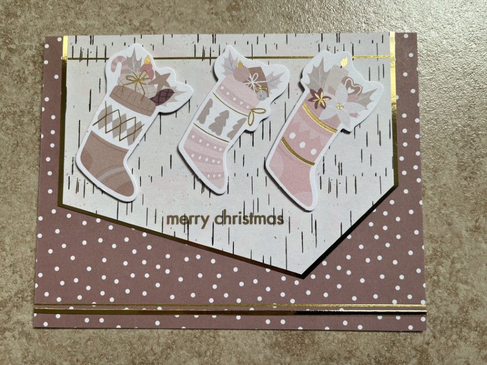
I decided I should get going on some Valentine cards, or at least something that had a “Love-ish” theme.  I started by pulling out a Recollections paper pad that I’m trying to use up, but…  the papers and colors (everything was pink and red) just weren’t working for me.  So after a couple cards I switched gears and pulled out a Spellbinders card kit.

Yes, I gave in and ordered Spellbinders Colossal Cardmaking bundle – 7 card kits!  By holding out a few more weeks, I was able to purchase the bundle at a reduced price.  Yay!  And since I know the kits come with a ton of ephemera I used the “extra” money to order a few paper pads (also on sale) that coordinated with some of the kits.

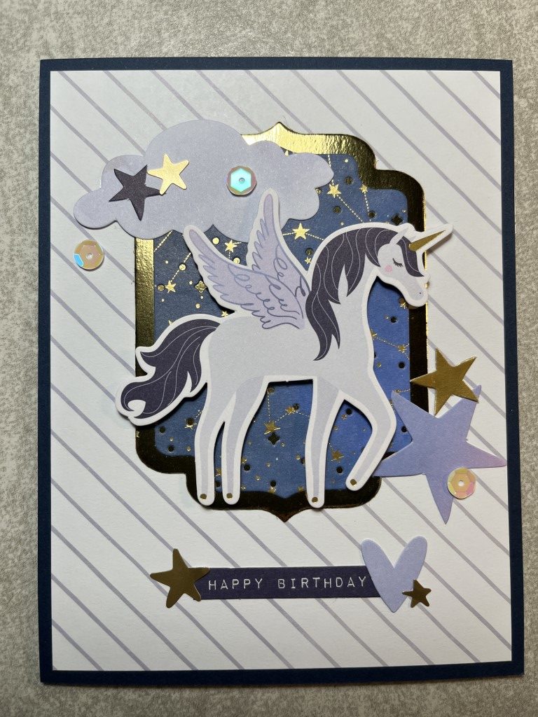
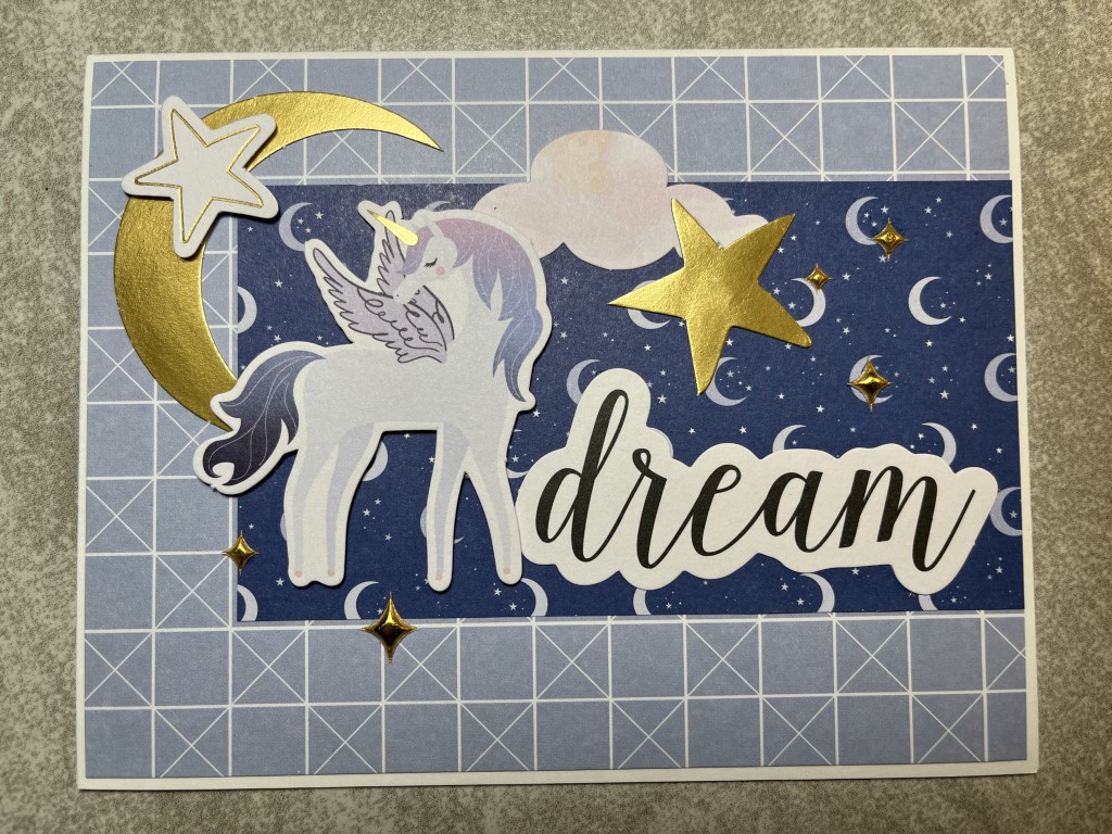
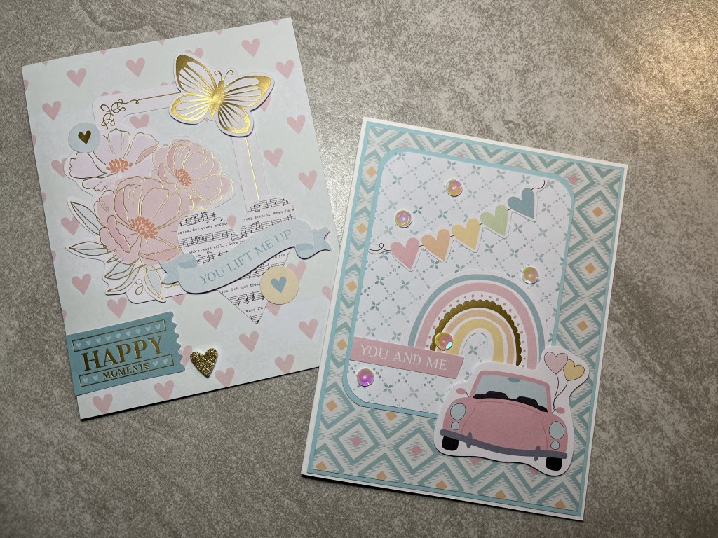
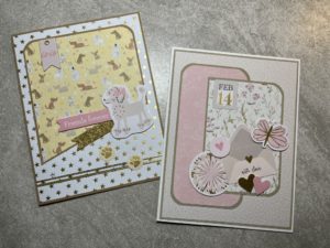
The January 2022 kit, titled Truly, Madly, Deeply, is a pretty pastel love-themed kit.  While there are pinks, hearts and a few February 14th references, the bulk of the kit is not Valentine specific and can be used any time for any audience (kids, adults, masculine, feminine).  This kit was one where I was able to purchase an extra paper pad.  So for my first batch of cards I decided to just focus on the ephemera and use the stamps and dies with the second paper pad.  As usual, I started by making one of the sample cards shown on the instruction sheet.  I’m guessing you can tell that the sample is the card on the left.  LOL.  First off, the background paper isn’t layered and secondly, there is a lot of ephemera (9 pieces!) used on the card.  I think it’s a beautiful card and the ephemera combination isn’t something I would have come up with.  The second card is definitely my creation.  It only uses 4 pieces of ephemera and a few sequins.  Also, all the paper is matted.  I like this card as well, it just has a “cleaner” look.

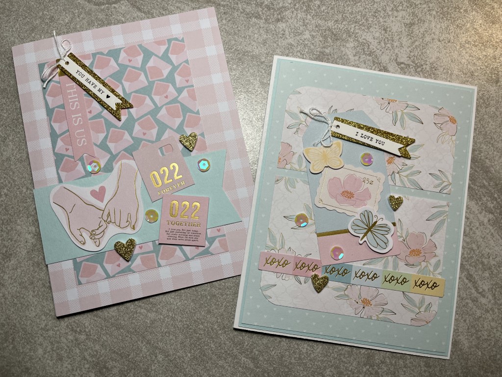
I used a couple card sketches for the next 2 cards.  Other than the Love from Lizi peel-offs along the bottom, I followed the sketch fairly closely for the first card.  There’s a chipboard sticker in the upper left corner and I dismantled one of the tag embellishments and used the glitter piece as a banner under the sentiment ephemera.  Even with the peel-offs, the bottom of the card looked a bit bare.  The paw print ephemera filled in some space and went with the paper theme.  For the second card I focused on the ephemera (7 pieces).  I think I picked out a mix of images that works well together in both color and theme.  To make this card Valentine specific, I added the small “Feb 14” banner.  To give the card a little dimension, I added some foam tape under a few of the ephemera pieces.  The Spellbinders kit includes foam squares but I opted to use foam tape from my craft room that is a bit thinner to ensure the card can be mailed without requiring extra postage.

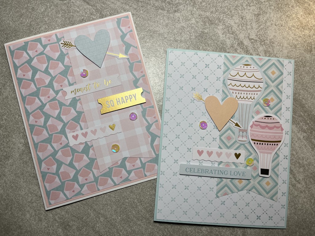
For the next set of cards I decided to skip some of the matting, like with the sample card.  I choose paper combinations where the colors and prints provided good contrast.  I continued practicing my use of ephemera and included at least 7 pieces on each card along with a few sequins.  Both cards turned out well with enough ephemera for interest but not too much to make them over the top.  I especially liked the ephemera collection on the card on the right.  To me it felt most like the sample card.

At this point I had several 2×6 inch scraps of paper.  Instead of saving them to the end of the paper pad I decided to find a sketch to use them now since I had already worked with some of the paper combinations.  I ended up selecting a simple layout that would lend itself well to adding several pieces of ephemera.  For both cards I went with the “more is more” approach and added more ephemera and embellishments than the sketch indicated.  I quite like how they both turned out, with the card on the right being one of my favorites.

I have discovered that using ephemera requires a different mind set.  I wouldn’t describe my style as clean and simple, but I do think it has a more streamlined, linear look.  Figuring out how and where to add ephemera so that it doesn’t look contrived and overdone is definitely a skill requiring practice.

As I worked through about half of the paper pad, I began to find it harder to work with the remaining paper and ephemera.  Instead of “forcing” the process, I decided to put the kit away for now and can go back to it another time.  Afterall, I still have 1 complete paper pad and even though I used multiple ephemera pieces on each card I still have most of the tag embellishments, glitter foam stickers, chipboard embellishments, sequins and about 1/2 of the die cuts left.  And I haven’t even used the stamps and dies.

Spellbinders Joyful Christmas Card Kit

Spellbinders Joyful Christmas Card Kit

Recently Spellbinders had a warehouse sale and I just couldn’t resist.  I was tempted to get their Colossal Cardmaking Bundle (7 complete card kits) but managed to stay in control and only picked up 3 kits along with some stamp and die sets. I did purchase an extra 6×6 paper pad that coordinates with 1 of the kits.  Spellbinders kits always include a huge amount of ephemera (die cuts, stickers, chipboard, etc.) and I wanted to make sure I had enough paper.

With the holidays coming up I decided to work with the Joyful Christmas kit, Spellbinders November 2021 card kit of the month.  I usually start a kit by making the card on the instruction sheet but as I was flipping through the paper pad I really liked the sheet music and decided to start with that.  I paired it with the soft pink diagonal stripe paper and some pale pink and gold metallic cardstock.  The kit includes cardstock but as I only needed small pieces I just used some pink and gold scraps from my craft room.  For some more pink I added a poinsettia ephemera piece and to go along with the music theme I added the ballerina.  A couple of pink/gold bell enamel dots finished the card.

There were several Christmas stocking ephemera pieces included in the kit.  I thought it would be fun to use several together and “hang” them as if they were on a mantel.  I used the wood bark print for the asymmetrical focal panel and matted it with gold metallic cardstock.  Since the stocking needed something to “hang” from I added a gold Love from Lizi peel-off towards the top of the panel.  For some dimension I popped up the stockings.  To bring some gold to the lower portion of the card I added a couple more gold Love from Lizi peel-offs.  There didn’t seem to be a good spot to add a sentiment panel so instead I stamped “Merry Christmas” directly onto the focal panel under the stockings.

As the first 2 cards were very pink I switched it up with the next card.  I was going to use the pine tree paper as the vertical strip but once I laid out the ephemera pieces the print was too busy and the ephemera didn’t really stand out.  Instead I swapped the papers and used the pine trees as the background and the more muted wood bark print for the vertical strip.  There’s just enough of a print to add interest but not so much that the pine tree and cute animal ephemera pieces get lost.  Instead of matting the vertical strip, I added gold Love from Lizi peel-offs that pick up the gold foiling on the ephemera and the background paper.  A few snowflake enamel dots that were included with the kit and a simple sentiment completed the card.

I liked the poinsettia print paper but found it to be a bit busy.  To tone it down I paired it with a horizontal stripe paper and added a large sentiment panel.  To keep the card from being too flat I popped up several of the poinsettia and foliage ephemera pieces on the corners of the sentiment panel and added some sparkle with a gold Love from Lizi peel-off and a few of the gold/pink enamel dots.

And now back to a pink card… The ballet print paper was really cute but I had already used the ballerina ephemera pieces.  After sorting through the remaining ephemera (there is still a ton left) I found the nutcracker and the swan.  I couldn’t decide which to use so I used both of them.  I matted the ballet paper, leaving a wide border, on some gray cardstock from my craft room.  The bottom panel is the remaining stripe paper left over from the first card.  A strip of gold metallic cardstock separates the top and bottom panels.  To keep the ephemera pieces from blending into the ballet paper, I added them to a large circle die cut from white shimmer cardstock.  For a sentiment I used one of the puffy sentiment stickers included in the kit.

Even after making 2 of each card I still have tons of supplies from the Joyful Christmas kit and I haven’t even used the die set yet.  In looking at the Christmas cards I have made so far many of them are non-traditional colors.  Since most people tend to like the standard red/green colors and traditional images I am going to move on to another collection, but I will definitely come back to the Joyful Christmas kit.  Also, Spellbinders Colossal Cardmaking Bundle is still available and it’s getting pretty hard to resist especially since several of the kits would be perfect for Valentines and spring cards.