Tim Holtz Idea-ology Retro Grunge 12×12 Paper Pad
For something completely different I pulled out an old Tim Holtz paper pad. I’ve had the paper for many years and decided to challenge myself to use up several sheets. I like the look and colors of the paper, but since it’s not my usual style I find it difficult to figure out how to use it.
The paper pad is a mix of prints and coordinating solids in a few color groups – rusty reds, greens and khakis. I decided to use the khaki color. Since the paper has a masculine feel and an almost military color I decided to run with that.
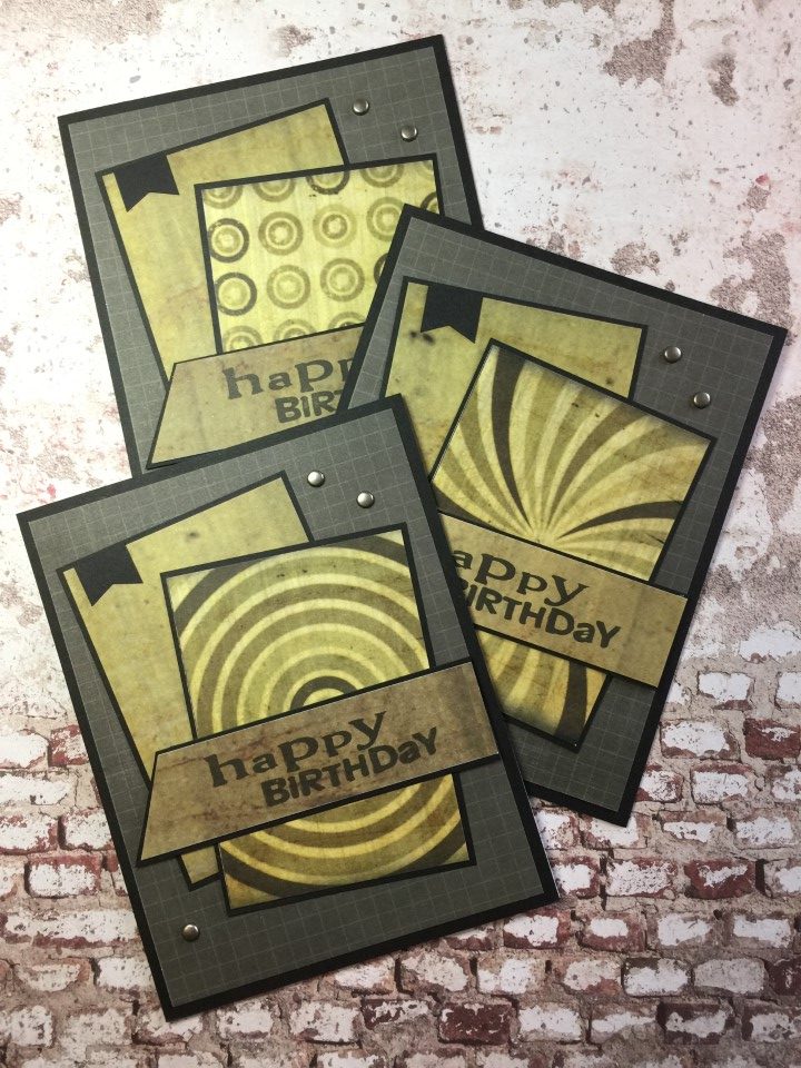
One of the 12×12 sheets had several 2 1/2 x 3 1/2 inch patterned rectangles that worked great as cut-aparts. I cut several more 2 1/2 x 3 1/2 inch pieces from a coordinating solid color sheet. For the sentiment panel I used some of the 1 x 12 inch strips from another sheet in the paper pad. To keep the card from becoming too distressed looking, I used a crisp graph paper as the background, added a small black banner and a few metallic brads to finish the cards.
The paper for these cards were from a couple of 12×12 sheets that were divided into 6×6 inch patterned panels. I trimmed the panels down to 3 1/4 x 4 1/4 inches and added a die cut of a soldier. The “Thank You” sentiment allows the cards to be used by soldiers to send home or the charity to use to send to soldiers.

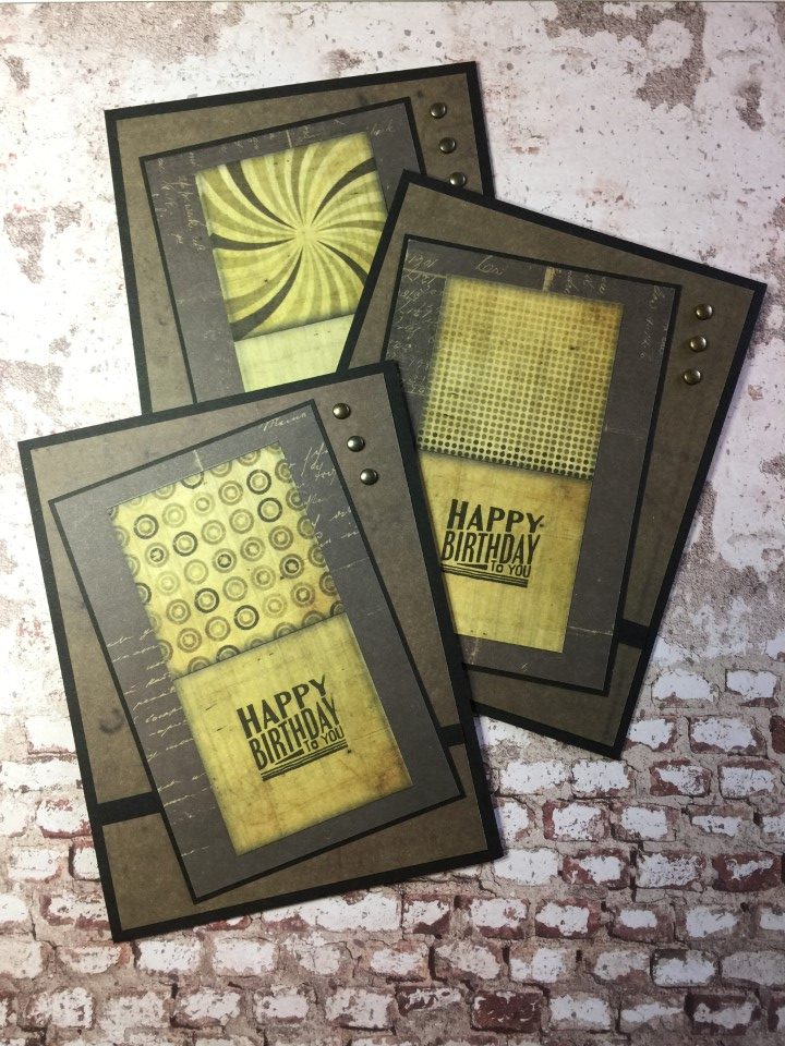
Another 12×12 sheet included 2×2 inch cut-aparts, where each patterned square bordered a solid color square. Instead of cutting the paper into 2 inch squares, I cut the paper into 2×4 inch rectangles with 1 patterned square and 1 solid square. The solid square was the perfect place for the stamped sentiment. I double matted the 2×4 piece on a charcoal paper and then black cardstock. A coordinating solid color for the background, some more metallic brands and the cards were complete.
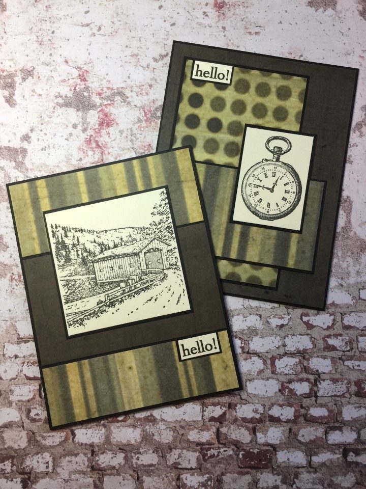
Having used up all of the cut-aparts I was now left with larger patterned prints and solids. I needed something for focal panels which kept with the masculine theme. I found a pocket watch and covered bridge stamps in my collection of wooden stamps. Neither stamp is strictly masculine, but by stamping them with black ink and pairing them with these papers I think they worked.
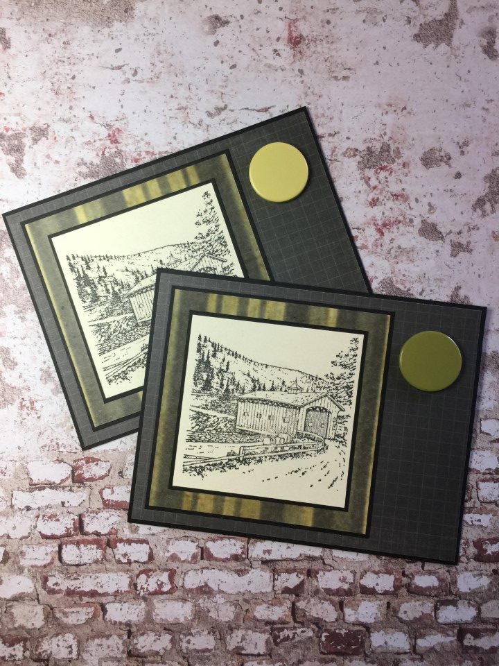
When looking for embellishments for the first few cards I stumbled across these large brads. Like a lot of things in my craft room I’ve had these brads forever and have no idea where I got them. There were only 2 of each color but they matched these papers perfectly. I kept it simple and used the covered bridge image for the focal panel and added the brads to the upper right corner.
I started with 12 sheets of 12×12 paper and ended with 2 sheets and a few scraps. Having a goal of using all 12 sheets of paper really helped motivate me when trying a style that I find challenging.