Spellbinders Time Offline Card Kit

Spellbinders Time Offline Card Kit

Spellbinders Time Offline November 2022 card kit is not specifically fall themed – no colored leaves, pumpkins, etc.  But, I thought the camping and animal images along with the forest and plaid papers work well as we head into fall.  As with all of the older Spellbinders card kits, there is tons of ephemera (die cuts, stickers, sequins) along with a stamp and die set.  The kits contain much more than I can use in a single card making session, even when spread out over several days.  With so much to choose from I find the kits can be a bit overwhelming.  To get started I either focus on the stamps/dies or the ephemera.  Since the ephemera “matches” the paper, I usually start with that.  I can always use the stamps/dies with other paper I have in my craft room.

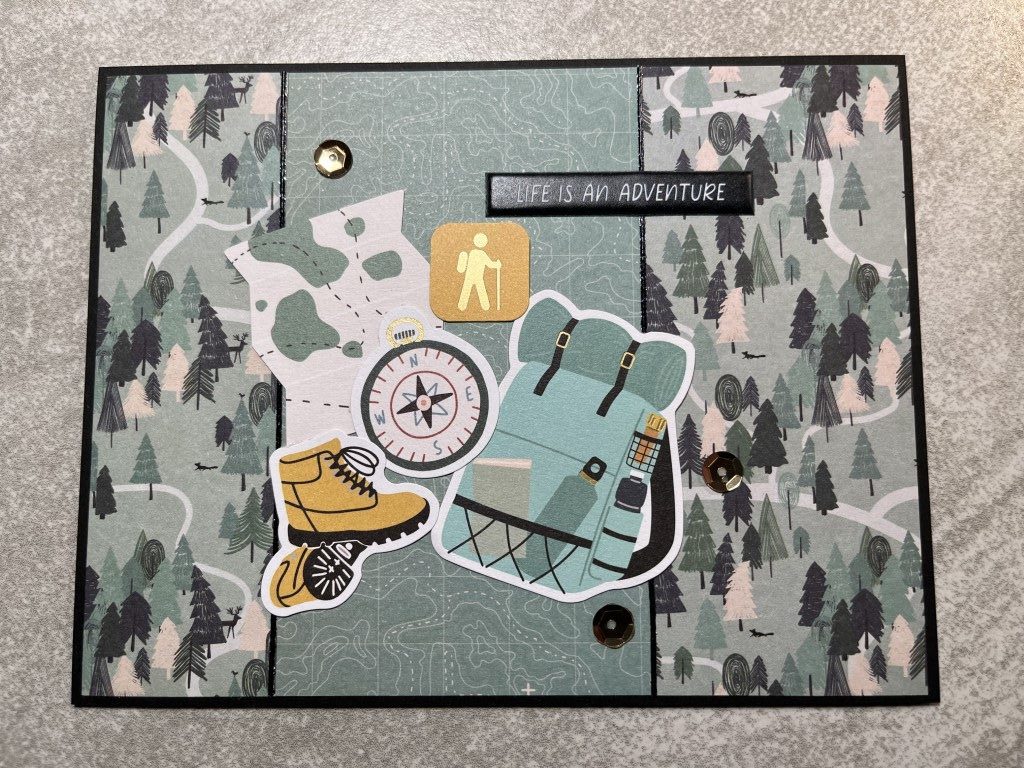
My first card is usually inspired by a sample on the content card but this month the sample focused on the dies.  Instead I looked to one of my favorite card makers for inspiration.  I ended up using the same “set” of die cut pieces as she used on one of her cards.  I did switch up the layout but it does have a similar look and feel.

For my next card I wanted to use the pink tent ephemera piece and create a small scene.  Adding the pine tree in the background provided some depth and the moon/stars provided some “light” for the camper to read by.  The card needed a bit more color next to the sentiment.  Since the accent panel features a tone-on-tone topographical map paper a pink “you are here” pin seemed like a perfect fit.

Next 2 cards feature the same layout, style of paper and tents but have quite a different feel.  The first card focuses on color – pink plaid paper, pink tent, pink sleeping bag and pink sentiments.  The second card focuses on a theme with a nighttime sky, chipboard mountains and a squirel toasting a marshmallow, all on a blue/green plaid background.

Making multiple cards featuring the same layout can be fun, especially when you switch up the papers and ephemera.  The next 2 cards use the same striped paper for the lower panel but pair it with different papers and ephemera.  The deer silhouette with the trees and mountains against a nighttime sky has a calm and peaceful feel.  The raccoon playing in a pan of water with the mushrooms and tree stump has a more playful feel.

I did make several other cards and as usual, there is still a lot of ephemera to make more.  I was able to purchase an extra paper pad so I’ll also have plenty of coordinating paper to use with the stamps and dies the next time I pull out this kit.

Echo Park A Dog’s Tail 6×6 Paper Pad

Echo Park A Dog’s Tail 6×6 Paper Pad

After the ephemera overload in the Spellbinders card kit, I wanted something simple.  I knew the Echo Park A Dog’s Tail paper pad included 2×3 inch cut-aparts which are great for making quick and easy cards.  To make it even easier, I decided to use one layout for all of the cards.

With 2 of each cut-apart, I was able to make duplicates of each card.  For the last card, I couldn’t decided if I liked the tone-on-tone paper for the background or the busy dog tag print so I made one of each.

In keeping with the quick and easy theme, I used Love from Lizi peel-offs instead of matting the horizontal panel running across each card.  For a bit of dimension, I added a few brads to each card and popped up the cut-apart panels.

Overall, a very simple project but I think the cards turned out quite cute.

This gets me caught up on blog posts that I can do until I take more pictures.  I’ve still got several stacks of cards I need to get to before my desk is cleared off and my craft room is back to a some what organized state.

Spellbinders Together is Best Card Kit

Spellbinders Together is Best Card Kit

I am so behind on my blog posts.  I’ve got cards scattered all over my craft room just waiting for me to do a post.  Once that’s done I can take a few cards to my antique booth and package up the rest for donation.  So in an effort to catch up I’ve picked out a few of my favorite cards from each “collection” and plan to do a couple short and simple posts.

This batch of cards were made using Spellbinders Together is Best September 2021 monthly card kit.  As I know I’ll never “finish” the kit in one sitting, I focused on the die cuts, stickers and other ephemera.  I’ll save the stamp and die sets for the next time I pull out the kit.

This card used a simple black and white paper as the background and a gold foiled chipboard picture frame as the center for several pink ephemera pieces.

This card features another chipboard picture frame as the center of the card.  Here I added the family of nesting dolls inside the frame to create a “family” portrait.

Here I used a green tone-on-tone paper to create a panel for several ephemera pieces so they don’t get lost on the busy floral background.

This card features the same layout but by using larger ephemera pieces and a gold puffy sticker sentiment they don’t get lost on the busy papers.

I did make a few more cards with this kit, but it didn’t even make a dent in all of the die cuts, stickers and chipboard the kit includes.  I’ll have plenty to work with the next time I pull this kit out.

Scrap Cards

Scrap Cards

After the challenge of the Spellbinders card kit I wanted to do something quick and easy.  So, I picked a simple layout and pulled out my bins of scrap paper.  I tried to use larger pieces of printed scrap for backgrounds, but if nothing worked I used cardstock scraps.  Also, if there was enough paper I made multiples of each paper combination.  For all of the cards, I used Love from Lizi peel-offs along the edges of the horizontal strips.  It added some sparkle and shine and keeps the cards nice and flat.  Other than adjusting the background measurements to allow for a bit of the white card base to show, the rest of the measurements for the components are all the same.

The first 2 cards both used older 12×12 paper pads I had purchased at Michaels several years ago – DCWV’s Bahama Mama and Craft Smith’s Palm Springs.  I’ve used both paper pads several times in the past, but using up 12×12 paper pads can take a long time.  The first card pairs a large scale tropical print with a green starburst background.  To pick up on the pink in the tropical print paper, I used a tone on tone flamingo print for the horizontal strip bordered by clear iridescent glitter Love from Lizi peel-offs.

The second card uses a tone on tone orange print for the background and a cactus print for the focal panel.  The horizontal strip is a light aqua color with a gold foil print bordered by gold mirror Love from Lizi peel-offs.

The next 2 cards truly use scrap paper.  I’m not sure where the paper was purchased or the brands but the paper combos were not part of actual collections.  The first card pairs a pastel floral print with a graphic red, gray and peach heart print.  The horizontal strip is a red/white polka dot bordered by a red mirror Love from Lizi peel-off.

For the second card gray cardstock is used for the background.  The focal panel is a black and white floral print.  The horizontal strip is a black/gray/white stripe bordered by a silver mirror Love from Lizi peel-off.

The next 2 cards both use scraps from individual Recollections 12×12 sheets – a fun fish print and a turquoise hexagon print.  The first card pairs the fish print with a white/orange grid as the background.  The horizontal strip is an orange and blue print bordered with a copper mirror Love from Lizi peel-off.

The second card pairs the hexagon print with a white and gray/green watercolor stripe for the background.  A turquoise and green leaf print is used for the focal panel.  A teal mirror Love from Lizi peel-off borders the hexagon print.

Although not planned, it turned out that there is a nice mix of colors and prints.  As all of the cards will be donated, I used general sentiments and kept the cards flat so no additional postage would be required for mailing.

Spellbinders Around the World Card Kit

Spellbinders Around the World Card Kit

Wow! It’s been awhile since my last post.  But… I have been making cards.  After making a bunch of Easter cards I wanted to work on something were I could make a few cards and not feel like I needed to finish the paper pad.  A Spellbinders monthly card kit was a great option.  With 40 sheets of paper, tons of die cuts and ephemera and stamp and die sets there was no way I could finish the kit in one “sitting.”

Having used a couple Spellbinders card kits in the past, I can’t resist picking them up when they are on sale.  This year Spellbinders changed the contents of the monthly card kit dropping the stamp and die sets.  Since I really like those components I made sure to purchase any of the “old” format kits during the last few warehouse sales.  I now have quite a collection.  I organized the kits by date and have started working my way through them.  Skipping the out of season holiday kits I started with the August 2020 Around the World card kit.  At first I thought the “around the world” theme would be limited to planes, trains, boats, etc. but the kit also includes fun tropical images, exotic animal, plants and more.

I’ve mentioned this before, but I find using the card kits challenging (in a good way).  Using all of the die cuts, ephemera and embellishments helps me step away from my usual clean, streamlined style.  To get into the layered, more is more mindset I started by making one of the sample cards shown on the instruction sheet.

I challenge myself to use at least 3 pieces of ephemera on each card.  This forces me outside of my comfort zone but keeps the cards still having a “me” feel to them.  For this card I paired the fun tropical drinks die cuts with the beach umbrella, me time ticket and relax sentiment die cuts.  For a bit more texture and shine I added a few of the pink iridescent sequins included in the kit.

I really liked the layout of the sample card and decided to try it again this time moving the circle panel to the left side of the card to accommodate the cheetah die cut.  I added 3 of the palm frond die cuts around the cheetah since they matched the theme of the background paper and added a nice pop of color.  For some more color I added the pastel camera and tiny ticket.

Focusing on the “travel” theme, the next card was all about Paris with the Eiffel Tower dies cuts and chipboard piece.  I added the scooter and the French fashion sunglasses for bring in more of the pink that appears on the Paris Eiffel Tower die cut.  For some dimension I popped up the scooter and one of the die cut pieces.

I liked all the fun colors of the mini tag paper.  It has a travel feel but would work with anything in the kit.  I paired it with the tone-on-tone pink print, using a wide gold metallic strip to separate the 2 papers.  I added the hanging plant, potted plant and stack of book die cuts as the focal point.  A subtle pink chipboard arrow and a few more sequins finished the card.

After making several cards I hadn’t even made a dent in the kit but the goal was just to make a few cards and this kit was perfect.  Everything was bright and cheerful.

Echo Park Hello Easter 6×6 Paper Pad

Echo Park Hello Easter 6×6 Paper Pad

I’ve had the cards done for quite awhile but just haven’t gotten around to posting them.  With Easter just days away I needed to stop procrastinating.

I have several spring paper collections, but only 1 that was specifically Easter – Echo Park’s Hello Easter.  The 6×6 paper pad included 2 sheets of 2×3 inch sentiment cut-aparts and I decided to use those first.  Besides the traditional “Happy Easter” there were several other cute sentiments that coordinated with the pattern paper.

For the first few cards I used patterned paper for the backgrounds.  As you’ll see in the later cards, I pulled in solid colored cardstock and shimmer paper for the backgrounds.  Other than fish-tailing or rounding the corners I left the sentiment cut-aparts at 2×3 inches.  As most of the papers were bright colors with busy prints I only included 1-2 different patterned papers on each cards.  As I expect most of the cards will be mailed, I wanted to keep them fairly flat so that no extra postage would be required.  With that in mind, I used Love from Lizi peel-offs and smaller “bling” from Queen and Co. to add some sparkle and shine to the cards.

One of my favorite papers was the Easter eggs with all the bright happy colors.  I tried to use it as the focal panel on several of the cards.  Another paper I really liked was the chocolate bunnies.  All of the bunnies had bright colored bows, but with the pink background I tended to pair it with the tiny brown and pink print paper.

The next 2 cards both use a busy graphic print for the backgrounds.  Initially I thought that might be too much with the focal panels, but I think it worked.

The next card is very “clean” using only the pink plaid paper and a small strip of a tone-on-tone gingham print.  It turned out to be one of my favorite cards.  The second card also only used one patterned paper and a small strip of a tone-on-tone green print but has quite a different feel to it.

After making 12 cards and using all of the sentiment cut-aparts, there weren’t any full sheets of paper that I liked for backgrounds.  Instead I pulled in some cardstock.  I still had full sheets of the chick print paper and decided to use one of my go-to sketches.  The sketch features a large focal panel perfect for highlighting a patterned paper.  The second card uses a layout where multiple different papers created the background.  Other than the matting, all of the papers were pieces from the paper pad.

I’m not sure why, but I struggled with this bunny print.  I ended up pairing it with the pink tone-on-tone paper on a white shimmer paper background.  The next card was a great way to use up smaller pieces and feature different papers.  This was just one of a few cards I made  using this layout.

For the last 2 cards, I only had a couple larger pieces of paper and several small scraps left.  I was able to pair up a few of the larger pieces to make the second card.  For the remaining pieces, I paired them with several of the smaller scraps to create the first card.  I actually quite like the mix of all the different papers.  It could easily get too clutter but I think separating the busy prints with tone-on-tone papers made it work.


In addition to the sentiment cut-aparts, I also used stamp sets by Paper Tray Ink and Recollections.  Along with the paper pad I used several sheets of cardstock and shimmer paper which allowed me to stretch the paper pad to over 35 cards.  A few have already made it to my antique booth, but the rest will be donated to Cards for Soldiers.

Using Up Scrap Paper

Using Up Scrap Paper

Before starting on my next project I decided to use up some of my scrap paper.  The pencil box where I throw my smaller scraps is fairly empty since I’ve been using the scraps for price tags for my antique booth.  The scrap drawer, a 12×12 drawer in one of the rolling cards I have in my craft room, is another story.  It’s been awhile since I’ve done a batch of “scrap cards” so the drawer has quite a collection of paper.

I decided to keep it simple and use 1 layout for all of the cards, that way I’d know how many different papers I’d need for each card.  I settled on sketch 516 from MFT.  I’ve used this card sketch in the past and it’s an easy sketch to use for mass production.  Everything is straight lines with easy measurements and no die cutting required.  After flipping through the paper I ended up with 14 different paper combinations.  When there was enough paper, I made multiples of the same card.  Some will go to the antique booth for sale or as give-aways and the rest will be donated to Cards For Soldiers.

To get started I cut each paper combination to the sketch measurements.  I did adjust the measurements for a few of the horizontal banners to accommodate the paper available.  I then grouped the paper combinations by the color I planned to use for the matting.  I don’t work well in chaos so I only pulled out 1 color of cardstock at a time.  I went with the easiest paper/cardstock combo first which was black cardstock.  I then moved on to brown, orange, purple and rust cardstock.  The yellow, blues and green cardstocks were last as I needed to flip through several options to find a nice match to the pattern paper.  Once all of the cards were assembled I re-grouped them based on the sentiments I planned to use.

The first cards completed were the “Heartfelt Thanks” and “Thinking of You” cards.  Since they all used the same Versamark Vintage Sepia ink for the sentiment it was easy to stamp all the sentiments at once and then cut/assemble the final cards.  As there was enough paper, I made multiples of each card.


The next group of cards were birthday cards.  Since the papers all had a fun feel to them (donuts, polka dots and fish) I selected a “happy birthday” stamp which had a whimsical feeling font.  I used black, orange and lime green inks to coordinate with the papers.

Since I had the lime green ink out, I used it to complete the final “Thinking of You” cards (I was able to make 2) and the “Just a Note” card.

I thought about using the lime green ink for the green/brown “Just Because…” cards but there wasn’t enough contrast against the green horizontal banner.  Instead I went with Versamark Vintage Sepia ink.  For the other “Just Because…” card I used Memento Love Letter ink to ensure it stood out against the bright red/white polka dot banner.

The horizontal banner on the next set of cards reminded me of confetti or fireworks.  I thought about doing another birthday card but since I have plenty of those I opted for the “Congrats!” sentiment.

By the time I got to the last set of cards I was ready to be done.  I pulled out a stamp set at random and selected the most appropriate sentiment.  Since the brown ink was still on my desk I went with that.

So, 25 cards complete.  When doing a mass batch of scrap cards I always enjoy the picking paper step and the cutting step always goes quickly.  But, by the time I get to adding the sentiment on the last cards I’m usually bored.  I thought about setting a few cards aside and completing them at a later date, but…  Based on past experience they would end up in the stack of “mostly” finished cards already sitting in my craft room.  LOL.


Spellbinders Truly, Madly, Deeply Card Kit

Spellbinders Truly, Madly, Deeply Card Kit

I decided I should get going on some Valentine cards, or at least something that had a “Love-ish” theme.  I started by pulling out a Recollections paper pad that I’m trying to use up, but…  the papers and colors (everything was pink and red) just weren’t working for me.  So after a couple cards I switched gears and pulled out a Spellbinders card kit.

Yes, I gave in and ordered Spellbinders Colossal Cardmaking bundle – 7 card kits!  By holding out a few more weeks, I was able to purchase the bundle at a reduced price.  Yay!  And since I know the kits come with a ton of ephemera I used the “extra” money to order a few paper pads (also on sale) that coordinated with some of the kits.

The January 2022 kit, titled Truly, Madly, Deeply, is a pretty pastel love-themed kit.  While there are pinks, hearts and a few February 14th references, the bulk of the kit is not Valentine specific and can be used any time for any audience (kids, adults, masculine, feminine).  This kit was one where I was able to purchase an extra paper pad.  So for my first batch of cards I decided to just focus on the ephemera and use the stamps and dies with the second paper pad.  As usual, I started by making one of the sample cards shown on the instruction sheet.  I’m guessing you can tell that the sample is the card on the left.  LOL.  First off, the background paper isn’t layered and secondly, there is a lot of ephemera (9 pieces!) used on the card.  I think it’s a beautiful card and the ephemera combination isn’t something I would have come up with.  The second card is definitely my creation.  It only uses 4 pieces of ephemera and a few sequins.  Also, all the paper is matted.  I like this card as well, it just has a “cleaner” look.

I used a couple card sketches for the next 2 cards.  Other than the Love from Lizi peel-offs along the bottom, I followed the sketch fairly closely for the first card.  There’s a chipboard sticker in the upper left corner and I dismantled one of the tag embellishments and used the glitter piece as a banner under the sentiment ephemera.  Even with the peel-offs, the bottom of the card looked a bit bare.  The paw print ephemera filled in some space and went with the paper theme.  For the second card I focused on the ephemera (7 pieces).  I think I picked out a mix of images that works well together in both color and theme.  To make this card Valentine specific, I added the small “Feb 14” banner.  To give the card a little dimension, I added some foam tape under a few of the ephemera pieces.  The Spellbinders kit includes foam squares but I opted to use foam tape from my craft room that is a bit thinner to ensure the card can be mailed without requiring extra postage.

For the next set of cards I decided to skip some of the matting, like with the sample card.  I choose paper combinations where the colors and prints provided good contrast.  I continued practicing my use of ephemera and included at least 7 pieces on each card along with a few sequins.  Both cards turned out well with enough ephemera for interest but not too much to make them over the top.  I especially liked the ephemera collection on the card on the right.  To me it felt most like the sample card.

At this point I had several 2×6 inch scraps of paper.  Instead of saving them to the end of the paper pad I decided to find a sketch to use them now since I had already worked with some of the paper combinations.  I ended up selecting a simple layout that would lend itself well to adding several pieces of ephemera.  For both cards I went with the “more is more” approach and added more ephemera and embellishments than the sketch indicated.  I quite like how they both turned out, with the card on the right being one of my favorites.

I have discovered that using ephemera requires a different mind set.  I wouldn’t describe my style as clean and simple, but I do think it has a more streamlined, linear look.  Figuring out how and where to add ephemera so that it doesn’t look contrived and overdone is definitely a skill requiring practice.

As I worked through about half of the paper pad, I began to find it harder to work with the remaining paper and ephemera.  Instead of “forcing” the process, I decided to put the kit away for now and can go back to it another time.  Afterall, I still have 1 complete paper pad and even though I used multiple ephemera pieces on each card I still have most of the tag embellishments, glitter foam stickers, chipboard embellishments, sequins and about 1/2 of the die cuts left.  And I haven’t even used the stamps and dies.

Recollections Classic Christmas 12×12 Paper Pad

Recollections Classic Christmas 12×12 Paper Pad

As I was sitting down to work on a new post, I found this Christmas card post that I didn’t get around to sharing in December.  So, it’s a bit late but better late than never.  And I plan to have a new non-Christmas themed post out soon.

—-

This batch of Christmas cards features Recollections Classic Christmas 12×12 paper pad.  I think I picked it up last year during an after Christmas sale.  It has the traditional red/green color and also includes a nice range for patterns including whimsical gifts and ornaments along with elegant florals and nature designs.

Since most of the cards I had made this season felt a bit more serious I decided to start with the fun gift and ornament patterns for something different.  I also chose a layout that I think has a more casual look to it with the photo corner on the focal panel and arrow shaped sentiment panel.  I used a red tone-on-tone paper for the background on both cards.  For the card featuring the gift pattern I stuck with red for the matting and the metallic cardstock strip across the card.  For the ornament pattern, the red just didn’t work and I switched the matting and strip to a bright Christmas green.

I really should do heat embossing more often.  I think the “A very Merry Christmas” sentiment looks great embossed with gold embossing powder and matted on gold metallic cardstock.  The gold sentiment and bits of gold foiling on the stocking are just enough to add a bit of interest and shine to the very traditional plaid and tone-on-tone foliage background prints.

The papers on the second card feature traditional red and green on a bright white background.  Since both patterns are quite bold I thought a clean and simple background was needed.  A white background was too stark and I didn’t like red or green.  I decided to try kraft cardstock which I think gives the card a bit of a rustic feel.  A red metallic cardstock strip and a “Season’s Greetings” sentiment finished the card.

The papers on the next 2 cards both feature poinsettias but have a very different feel.  The wreath pattern on the first card has a traditional feel so I went with a more traditional design and sentiment.  For the second card, since the paper is quite bold, I kept it very simple using a “Merry Christmas” cut apart included in the paper pad and a few Love from Lizi peel-off strips.

These 2 cards feature my favorite papers in the paper pad – the poinsettia floral and the winter birds.  I’ve used this layout before and really like how it allows the pretty paper to be the star of the card.  Both papers are paired with a plaid print – a muted tone-on-tone plaid with the poinsettia floral and a green/cream plaid with the winter birds.  To add just a bit of interest to the bottom panel I added a couple Love from Lizi peel-offs on both cards.  Gold metallic on one and a clear iridescent on the other.  A holiday sentiment, matted and popped up, complete both cards.

I used the same layout for the next 2 cards but just switching up the papers, sentiment and ink colors give the cards a completely different feel.  The first card uses more of the fun ornament paper this time paired it with a tone-on-tone pine tree design.  For the small horizontal strip I used more of the Christmas green metallic cardstock and keeping with the green theme, the sentiment is stamped using a bright green ink.

For the 2nd card I went for a more formal feel.  When I was working on the previous cards I flip flopped on which plaid paper to pair with the poinsettia floral print.  I ended up choosing the muted plaid, but still wanted to try the poinsettia floral with the bolder green/cream plaid.  I think this combination also worked well.  To keep the feel more formal I used gold metallic cardstock for the small strip across the focal panel.

I’m getting a bit burnt out on Christmas cards so I think I’ll take a break and my next project will be something non-Christmas.

Spellbinders Joyful Christmas Card Kit

Spellbinders Joyful Christmas Card Kit

Recently Spellbinders had a warehouse sale and I just couldn’t resist.  I was tempted to get their Colossal Cardmaking Bundle (7 complete card kits) but managed to stay in control and only picked up 3 kits along with some stamp and die sets. I did purchase an extra 6×6 paper pad that coordinates with 1 of the kits.  Spellbinders kits always include a huge amount of ephemera (die cuts, stickers, chipboard, etc.) and I wanted to make sure I had enough paper.

With the holidays coming up I decided to work with the Joyful Christmas kit, Spellbinders November 2021 card kit of the month.  I usually start a kit by making the card on the instruction sheet but as I was flipping through the paper pad I really liked the sheet music and decided to start with that.  I paired it with the soft pink diagonal stripe paper and some pale pink and gold metallic cardstock.  The kit includes cardstock but as I only needed small pieces I just used some pink and gold scraps from my craft room.  For some more pink I added a poinsettia ephemera piece and to go along with the music theme I added the ballerina.  A couple of pink/gold bell enamel dots finished the card.

There were several Christmas stocking ephemera pieces included in the kit.  I thought it would be fun to use several together and “hang” them as if they were on a mantel.  I used the wood bark print for the asymmetrical focal panel and matted it with gold metallic cardstock.  Since the stocking needed something to “hang” from I added a gold Love from Lizi peel-off towards the top of the panel.  For some dimension I popped up the stockings.  To bring some gold to the lower portion of the card I added a couple more gold Love from Lizi peel-offs.  There didn’t seem to be a good spot to add a sentiment panel so instead I stamped “Merry Christmas” directly onto the focal panel under the stockings.

As the first 2 cards were very pink I switched it up with the next card.  I was going to use the pine tree paper as the vertical strip but once I laid out the ephemera pieces the print was too busy and the ephemera didn’t really stand out.  Instead I swapped the papers and used the pine trees as the background and the more muted wood bark print for the vertical strip.  There’s just enough of a print to add interest but not so much that the pine tree and cute animal ephemera pieces get lost.  Instead of matting the vertical strip, I added gold Love from Lizi peel-offs that pick up the gold foiling on the ephemera and the background paper.  A few snowflake enamel dots that were included with the kit and a simple sentiment completed the card.

I liked the poinsettia print paper but found it to be a bit busy.  To tone it down I paired it with a horizontal stripe paper and added a large sentiment panel.  To keep the card from being too flat I popped up several of the poinsettia and foliage ephemera pieces on the corners of the sentiment panel and added some sparkle with a gold Love from Lizi peel-off and a few of the gold/pink enamel dots.

And now back to a pink card… The ballet print paper was really cute but I had already used the ballerina ephemera pieces.  After sorting through the remaining ephemera (there is still a ton left) I found the nutcracker and the swan.  I couldn’t decide which to use so I used both of them.  I matted the ballet paper, leaving a wide border, on some gray cardstock from my craft room.  The bottom panel is the remaining stripe paper left over from the first card.  A strip of gold metallic cardstock separates the top and bottom panels.  To keep the ephemera pieces from blending into the ballet paper, I added them to a large circle die cut from white shimmer cardstock.  For a sentiment I used one of the puffy sentiment stickers included in the kit.

Even after making 2 of each card I still have tons of supplies from the Joyful Christmas kit and I haven’t even used the die set yet.  In looking at the Christmas cards I have made so far many of them are non-traditional colors.  Since most people tend to like the standard red/green colors and traditional images I am going to move on to another collection, but I will definitely come back to the Joyful Christmas kit.  Also, Spellbinders Colossal Cardmaking Bundle is still available and it’s getting pretty hard to resist especially since several of the kits would be perfect for Valentines and spring cards.