Recollections Mystic Moon and Pinkaboo Paper Pads

Recollections Mystic Moon and Pinkaboo Paper Pads

I’m falling behind in my posts again.  With 3 sales in roughly 6 weeks at my booth, I’ve been busy making a few more Halloween cards, a bunch of Christmas cards and generally just getting “stuff” ready.

Here are some of the Halloween cards I completed for the first sale in September.  I used a couple different Recollections paper pads that I had picked up after Halloween a few years ago.

The first few cards used the Mystic Moon 8×8 paper pad.  It’s not my usual style of paper but I wanted to have a wide selection of cards.  The paper pad is quite dark (lots of gray, green and purple) with a scarier feel.  In keeping with the scary feel, I skipped the “Happy Halloween” sentiment and went for sentiments that I think more matched the feel of the cards.  For embellishments, I used silver metallic Love from Lizi peel-offs on one set of cards and some die cut spiders with black rhinestone bodies on the other.

For the next several cards I used a go-to sketch which features a 3×3 inch panel.  This sketch is great for using the corner pieces of papers with full page images.  I paired the corner floral piece with a coordinating floral background, adding some shine with the gold shimmer paper.  For the corner piece featuring a spider web, I added a small die cut spider.  There was enough room on all of the 3×3 inch panels to add different versions of the “Happy Halloween” sentiment.

Since this was an 8×8 inch paper pad, I was able to make several of each card.

After the dark and scary, I switched to Recollections Pinkaboo 6×6 paper pad.  This paper is about as opposite as you can get from Mystic Moon.  While the Pinkaboo paper also featured ghosts and skeletons, they were far less scary when done in pinks, purples and gold foil.  The paper pad included a sheet of border strips that I definitely wanted to use.  The first few cards used a textured purple cardstock for the background and a pretty pastel pumpkin print for the image panel.  The next cards used another textured cardstock for the background and a pink and black skull print for the image panel.  Both sets used border strips for the panels running across the card.

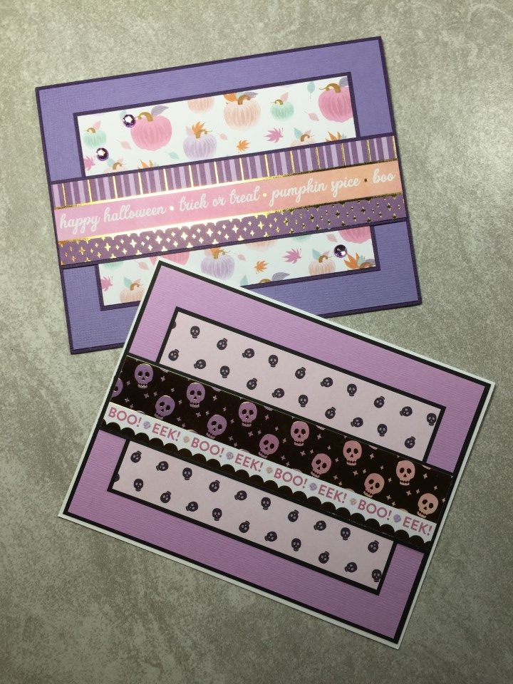
I really liked the paper I used for the image panels and decided to use them for a few more cards.  This time I paired the pastel pumpkins with an hombre pink sky pattern and more textured cardstock.  For the pink and black skeletons, I pulled out a sheet of the gold foil skulls paper.  This paper is really fun with the skulls also having an hombre effect, changing from pink to purple.  The last few cards featured the pink and lavender ghosts.  They were too cute not to use and I was also able to use the last of the border strips for the horizontal panels under the sentiment.

Both paper pads were fun to use but for my next batch of Halloween cards I focused on the more traditional orange and black color scheme.

Queen and Co. Happy Holly Days 6×6 Paper Pad

Queen and Co. Happy Holly Days 6×6 Paper Pad

For the 2nd set of Christmas cards I made earlier this summer, I used Queen and Company’s Happy Holly Days paper pad.  I’ve had this paper for a couple years and just haven’t gotten around to using it.  There’s a lot of red and green, but also some non-traditional brown and beige.  Like most Queen and Company paper pads only a few of the prints are holiday/season specific.  Several of the papers, like the houndstooth and polka dot prints, could be used for any occasion.

I went with a favorite sketch for the first card.  I used the green houndstooth print for the background and the very Christmas-y print for the focal panel.  The red banner across the card is another paper from the paper pad, a red tone-on-tone print.  Everything is matted in a dark brown cardstock.

The candy cane stripe paper is very cute, but a bit busy.  To break up some of the lines, I added 2 Love from Lizi peel-offs in the red mirror color.  It’s a small change but made a big difference in the look of the card.  For a bit of sparkle I added a few red rhinestones.

For the next card I replaced the circles shown on a card sketch with snowflakes.  I used the snowflake dies I purchased last year after Christmas and red mirror cardstock by Recollections.  The color coordinated with the red polka dot paper perfectly and added a bit of shine to the card.

I liked the busy Christmas print paired with a muted design.  As I was out of the green houndstooth so used the brown tone-on-tone check instead.  I also used some of the leftover red polka dot paper for the strip across the card.

I wasn’t sure what to do with the red and green polka dot paper.  I didn’t like it as a focal panel but it seemed too busy to use as a background.  After flipping through the remaining paper, I tried pairing it with a scrap of the green houndstooth.  The houndstooth was “just enough” to break up the busy polka dot print.  Since neither paper was a Christmas or winter theme, I added a few red snowflakes and went with a more general Season’s Greetings sentiment.

I am a fan of stripes and really liked the red/green stripe paper, but it was a bit intense.  I knew I would need to use it in small doses or with a larger focal panel.  I ended up using a very simple layout with the Christmas print paper and a sentiment as the single focal panel.

I made multiples of most of the cards as the paper pad included 4 sheets of each design.  It was another good sized batch of cards that I will have ready for donation and for sale at my booth.

We R Memory Keepers Jet Set 12×12 Paper Pad

We R Memory Keepers Jet Set 12×12 Paper Pad

I’ve really been neglecting my blog.  I can’t believe it’s been almost 2 months since my last post.  While I haven’t been posting pictures, I was keeping busy making cards.  I even managed to make a small batch of Halloween cards and a 2nd set of Christmas cards, but before I post those…  Here are a few cards I made after the first set of Christmas cards.

I wanted to do something with a completely different theme and colors.  After flipping through a few paper pads I selected the Jet Set paper pad.  It has a travel/transportation theme done in muted shades of orange, purple, blue, green and mustard yellow.  Along with the fun suitcase and airplane prints there was also a sheet of travel themed tags.  I’m not a fan of fussy cutting, but most of the tags had straight edges so it didn’t take too long to cut them all out.  The paper pad also included a sheet of borders, some of which were strips of travel themed words.  Instead of skipping the paper or trying to use larger pieces of the borders, I trimmed them into individual words and used them along with the tags as the sentiments on the cards.

To get started I separated the papers into different color groups.  The papers are all the same theme, but some prints and colors coordinated better than others.  For the first several cards I used orange and peachy pink papers.  To pull out the hint of purple in the airplane print, I used purple cardstock for some of the matting and embellishments (brads, rhinestones and Love from Lizi peel-offs).

Using the same papers…  I added the airplane themed tags featuring fun sentiments like  “Non-stop fun!” and “We’re off on an Adventure”.  Some of the tags even include space where you can write in the date of your travels.

For the next set of cards I used the fun suitcase print and multi-color stripe and polka dot print for the backgrounds.  Because both papers had a busy print, I kept the layouts simple and used solid color cardstock to break up the busyness.  For several of the cards I used the travel themed words trimmed from the borders as sentiments.

On other cards I added tags in place of small focal panels or added smaller tags to cardstock banners.  Although the papers included many colors, for some reason I really liked the orange color and used orange rhinestones for all of the embellishments.

There were still a couple more color groups to go, but I saved those for later and moved on to another batch of Christmas cards.

Wacky Week Cards

Wacky Week Cards

The antique store where I have my little card/antique booth, is having a fun summer sales week – June 23rd through June 27th.  Each day will celebrate a fun “wacky” holiday.

  • Wednesday — National Flamingo Day
  • Thursday — National Pralines Day
  • Friday — Global Beatles Day
  • Saturday — Balloon Fest (which coincides with the Michigan Challenge Balloonfest in Howell, Michigan)
  • Sunday — National Sunglasses Day

In addition to running a sale in my booth, I created a few cards “celebrating” different days of the sale.  As these holiday’s are not really card-giving occasions, I kept the cards blank or used general sentiments so they could be used any time.  My favorite cards were for Global Beatles Day.  The cards featured stamped images of beatles (the insects) colored in bright pink, yellow, orange and green, similar to the colors on a few of the actual Beatles album covers.

Most of the cards on the display are for Wacky Week but I did leave a few of the more common occasions (birthday, hello, for you) as well.  To see the cards and enjoy some fun shopping, stop by Touch of Country Mall.

American Crafts Cozy & Bright 6×6 Paper Pad

American Crafts Cozy & Bright 6×6 Paper Pad

Wow!  I knew it had been a while since my last post but I didn’t realize it had been a month.  At least I’ve been busy making cards.

A few weeks ago I started on my first batch of Christmas cards for the year.  Between cards for donation and hopefully cards for my booth, I will be needing quite a few Christmas cards this year.  To avoid the last minute rush I’ve set a goal to make 1 batch, at least 25, Christmas cards every month, with a few double batches later in the year.

For my first batch of Christmas cards I pulled out the Cozy & Bright paper pad.  It’s a 36 sheet paper pad so I figured I could easily make at least 25 cards.  The paper pad has a lot of red and green with a little blue and some fun gnomes and sloth prints.  The paper pad also included 2 sheets of cut-aparts which was great so I didn’t need to pull out a bunch of Christmas sentiment stamps.

A couple of the cut-aparts featured a circular design which worked great for a sketch I wanted to try.  The sketch features 2 circle panels and the cut-aparts were the perfect size for the smaller panel.  For a bit of sparkle, I used light green glitter paper and red mirror paper for the scalloped borders and accent strips.

With so many sheets of paper in the paper pad, there were several to choose from for backgrounds.  I used some of the busier prints for the focal panels (my favorite is the sloth) and more of the cut-aparts for the sentiments.  I added some simple embellishments like white epoxy dots on the red stripe/holly print, rhinestones on the gingham/floral print and clear iridescent peel-offs on the snowflake/sloth print.

For the next couple of cards I pulled out a go-to sketch that features a large focal panel that I could use with the sloth and cute gnome prints.  Also since the gnome print included a lot of blue, I wanted to use it while there was still some of the blue floral paper to pair it with.  Both the sloth and gnome prints featured a glittered finish, so I kept any additional embellishments minimal with a few red rhinestones and peel-offs.  I did have to pull out a Christmas stamp set as the cut-aparts did not work with this sketch.

Since there was still some of the blue floral print, I paired it with the last of the gnomes.  Some white shimmer paper for the background and a few rhinestones hearts and the card was  complete.  I wasn’t sure what to do with the black/white Christmas song paper.  It was the only black/white paper in the paper pad and I was struggling a bit with what to pair it with.  I decided to use it as a “neutral” and pair it with some red and green prints.  To tie in the black, I used a cut-apart with a black background.  And to keep it from looking too boring, I added a banner in red mirror cardstock.

For the first several cards I was able to make 2 cards using the same papers.  As I accumulated more scraps I still made multiple cards of each design by adding white shimmer paper and kraft cardstock for the backgrounds and switching up the papers used for the different panels.  I also used up the last of the cut-aparts.

There were still a few good sized pieces of the forest print paper.  Instead of throwing them in my box of scraps, I decided to make a few more cards.  By using the polka dot scraps and some plain green and kraft cardstock I was able to make 2 more cards.  I used a “Happy Holidays” stamp featuring a fun font that I think matched the feel of the card.  A few rhinestones for embellishment and this set of cards is complete.

So…  31 cards done and many more to go.

Echo Park Summer Dreams Collection Kit

Echo Park Summer Dreams Collection Kit

With Graduation and Father’s Day cards done for my booth at Touch of Country Mall, I decided it was a good time to make some cards to donate.  With summer just over a month away I pulled out the Sumer Dreams Collection kit from Echo Park.  It’s full of bright colors and fun summer images.  All of the cards, other than a couple with birthday sentiments, are either blank (no sentiment) or use summer themes like “vacation”, “stay cool”, etc.

I wanted to focus on the fun images, so I looked for sketches that featured large focal panels.  For the first card I used the bikini paper as the focal panel and a small scale aqua paper for the background.  For an embellishment I wrapped thin pink and silver ribbon around the top portion of the card.  The “Vacation” sentiment was stamped in blue ink and embossed using clear embossing powder.

One of my favorite papers was the ice cream and popsicle print.  It made me think of birthdays and was perfect for a few birthday cards.  I used a couple different dies to create the scalloped border on the printed paper and the pink cardstock.  A few aqua epoxy dots were added to the white boardwalk print to bring a bit of color to the lower portion of the card.

I think my favorite cards used a few of the ferris wheel stickers as the focal panel.  A watercolor stripe paper was used for the lower panel on the card.  A solid color cardstock, which picked up on the most prominent color on the ferris wheel stickers, was used for the upper panel.  To separate the panels a coordinating ribbon was added.  A fun “Enjoy the Ride” sticker fit perfectly under one of the ferris wheels.  A few “ticket” stickers worked great with the teal and yellow ferris wheel.  To finish the cards a couple coordinating epoxy dots and rhinestones were added.

The sticker sheet included a few “sunglasses” stickers.  I wanted to use them with the sunglasses print paper but didn’t want them to get lost on the busy print.  I decided to make the stickers the focal panel by placing them on a white die cut circle but the contrast between the stickers and the white cardstock was too much.  Using a blending tool, I applied some ink to the cardstock to tone down the contrast and add a bit of color.  I then reattached the stickers.  A few Love from Lizi peel-offs for embellishment and a simple “Relax” sentiment finished the cards.

For the next batch of cards I decided do an assembly line process and make several cards using the same layout and papers.  This wouldn’t be something I’d do for cards I’m placing in my booth, but for donation this is a great way to make a lot of cards.  And since the charity sorts the cards and creates bundles from several card makers, the recipients always receive a large selection of themes and sentiments.  For the layout I used a sketch which has 3 main pieces – a background, a focal panel and an accent strip.  It was easy to quickly cut several of each piece and the coordinating matting.  For the sentiments, more stickers were used.  As a finishing touch on all of the cards a few epoxy dots or rhinestones were added.

At this point I was ready to move on to some new paper but before I put the kit away I decided to make a few more cards with the remaining scraps of paper.  By using 3 different papers a background panel was created.  A scallop border punch was used to create a fun edge on some of the strips.  A “Stay Cool” sentiment and a few more stickers completed the cards.

Although the kit included 12 sheets of paper I ended up only using 5 sheets to make 21 cards.  There’s plenty of paper and even a few stickers left which I can pull out later to make many more cards.  While most of the cards will be donated, I’ll probably slip a couple into the booth.

Graduation Cards

Graduation Cards

Most of my recent posts have focused on what’s been going on with my little card/antique booth and this post isn’t any different.  LOL.

I haven’t really sat down and just created random cards.  Everything has been geared toward the booth – getting Mother’s Day, Father’s Day and Graduation cards made.  I’m still trying to get into the rhythm of having multiple cards available just a few weeks before the holiday/occasion.  When I make cards to donate there isn’t really a “due date” on them.  The charity starts sending out holiday cards several months in advance and if I miss the deadline, the charity just stores the cards for next year.

So far I’ve done pretty well.  The Mother’s Day cards were out at the booth 1 month in advance and Father’s Day cards are ready to go.  Based on the Easter and Mother’s Day cards a 1 month lead time might be too much.  So instead of Father’s Day cards, the next “featured” cards at the booth will be Graduation cards.  Which of course I hadn’t started on.  So the past week has been all about Graduation cards.

In fact, I was so focused on getting the graduation cards ready that I completely forgot to take pictures of the cards before I “bagged and tagged” them to put out at Touch of Country Mall.  Instead of unpackaging the cards, I took a few pictures with them in the cellophane bags.  There’s a bit of glare, but I think you can still get an idea of what will be available in the booth.

I only made 1-2 of each card as I didn’t want local graduates to possibly receive duplicates.  A few cards feature local school colors, but I kept most of them more generic.  I had a lot of fun using some glitter paper that I’ve had for several years (glitter is not allowed on the cards that I donate).  I also pulled out a few star-shaped dies and punches that I don’t frequently use.  Lots of Love from Lizi peel-offs and die cut borders were added for embellishments on many of the cards, and I did add a bit of ribbon on some of the busier prints.  For a bit of shine and texture the sentiments on several of the cards were heat embossed.  The cards are all on display in my booth and I’m looking forward to seeing which cards get the most attention.

Messages for the Inside of Cards

Messages for the Inside of Cards

While I was visiting my booth at Touch of Country Mall recently, I received a suggestion to add messages to the inside of my handmade cards.  I know it’s not always easy figuring out what to write; I struggle with this too.

I have thought about adding messages but it’s difficult to know what style of message to add.  Obviously if it’s a Mother’s Day card or Christmas card the message needs to reflect the holiday.  But what kind of  “feel” should the message have?  Some people like a serious heartfelt message while others like a light-hearted humorous message.  I decided a stick with the blank inside so the customer can add a message that is personalized for the card’s recipient.

But, understanding that a little help with a message may be appreciated I’ve decided to place a small handout of sample message in my booth.  This way customers can take one along with the card they are purchasing.  I can change the handout for the different occasions and holidays.  For now I’ve put together a handout of Graduation messages and am working on a handout for Father’s Day.  Based on the response I’ll decide if this is something I want to continue.

Here’s the handout with sample Graduation messages.  I’ve tried to include a range of sentiments so there is something for everyone.  Or, will at least give the customer a starting point to create their own message.

Ideas for Graduation messages

Congratulations on your well-deserved success.

Caps off to you, Graduate! Well done!

Congratulations on your graduation and best wishes for your next adventure!

You deserve all KINDS of high fives and hugs! You worked hard and got it done.

Hope you’ll always find yourself as happy and full of big, crazy dreams as you are today!

Sending warm thoughts and big congratulations to a graduate we’re so very proud of.

Our warmest thoughts and highest hopes are with you as you celebrate your graduation.

Always remember: There’s no limit to what you can do if you keep believing in yourself.

This calls for celebrating! Congratulations!

Congratulations today and best wishes for all your tomorrows.


To create the handout I did an internet search for “greeting card messages” and found several sites that were helpful.  My favorites were:


Booth Update and Latest Cards

Booth Update and Latest Cards

I’ve seriously missed my goal of doing a weekly blog post.  So, in an effort to catch up I’m combining a few intended posts about cards I’ve completed and the latest activity at my little booth at the Touch of Country Mall.

Based on the cards that sold the first few weeks at my booth I was thinking maybe holidays would be “the thing”.  So I had a nice batch of Mother’s Day cards done and ready to go.  I put them out at the booth earlier this month along with a few collectibles – tea cups and saucers, milk glass pieces, etc.  All things that would pair nicely with a Mother’s Day card.

Keeping with the holiday theme, I spent a week or so working on Father’s Day cards.  I want to have them ready to put out right after Mother’s Day.  Here’s a look at a few of those cards.

I’m also planning to swap out a few of the collectibles for things that have a more “Father’s Day” feel to them.  So far I have a couple vintage booklets from Ford Motor Company, some glass insulators and some vintage bottles.  I’m still figuring out what may interest the people shopping at my booth.  I definitely don’t want my display space to become stagnant so I’ve been brainstorming ways to keep the booth interesting for upcoming seasons and holidays.

In addition to the Father’s Day cards, I also made a few more general cards (Birthday, Baby, etc.) to replace those that have sold in the booth.  I really like how the baby boy card turned out.

Since I don’t know yet what cards will get the most interest, I don’t want to only focus on holidays.  With that in mind, I pulled several sheets of paper from the Authentique Seafarer 12×12 paper pad.  It is a beautiful red, white and blue nautical themed collection.  Instead of adding sentiments to the cards, I kept them blank only adding stamped images and embellishments.  The ship and lighthouse images are from a couple different stamps sets.  For several of the cards I also added red, blue or gingham ribbon.  I planned to put a few individual cards in my booth but after looking at the cards I think a set would also be a nice idea.

I ended up making over 30 cards which would be too many to put in my booth.  I continue to participate in the Cards for Soldiers program so any of the extra cards will be donated.

I’m still debating about making high school and college/university graduation cards.  If I do, I’ll need to get going on these soon as I should have them at the booth in the next week or two.  I think it will all depend on whether I have paper to match the school colors.

Adventure Update

Adventure Update

I’m disappointed that I’ve not been keeping up with my goal of a weekly blog post but…  At least for the last couple of weeks I can say it’s because I’ve been working on “stuff” for my little booth at the Touch of Country Mall.

I was very excited that several cards were purchased the first week the booth was open.  Since I wasn’t sure what people would be interested in buying I had only made a few Easter cards for the booth.  When I saw that most of the Easter cards had sold, I got busy and made a few more cards.  It’s only been a couple weeks but it looks like holiday cards might get the most interest.  So, for the last 2 weeks I’ve been busy making Mother’s Day cards which I’ll be taking to the booth this week.  Here’s a sneak peek of some of the cards.

I’ve also been busy making a few sets of 4-5 cards.  The first couple sets are initial note cards with each card using the same design/layout but in different colors.  I wasn’t sure what initials to do, so I did a quick search on Google for the most common first names.  I’ve also done a couple sets with each card featuring a cute coffee theme sentiment.

I’ve also been thinking about other items that I can include in the booth.  A few extra card making supplies like paper, stamps or ribbon will be easy enough to hang on the chicken wire display, but other items will require shelf space.  So, I enlisted my husband to make a simple 4-5 shelf display.  I helped with the painting and staining, but he did all the real work.

I’m planning to add a few small “collectibles” like vintage cups and saucers or maybe some depression glass to the booth.  They are nice by themselves, but I think pairing one of the coffee themed card sets with a vintage cup & saucer would be a cute gift.

I’ll see how the Mother’s Day cards do.  I might need to make a few more, but for now I’m getting started on Father’s Day and Graduation cards.