My New Adventure

My New Adventure

I don’t have any new cards to post this week since I’ve been getting ready for my new adventure.

I’ve thought about trying to sell some of my handmade cards but wasn’t sure how I wanted to go about it.  I had tried a craft show several years ago and although I made some sales and have a couple repeat customers, craft shows are just not my thing.  I know a lot of people sell cards online but the packaging and shipping doesn’t really appeal to me.  This narrows down my options to selling at a local shop.

After a recent visit to the Touch of Country Mall in Howell, Michigan, I decided to rent a small booth.  The store is really cute and has a great mix of antiques, collectibles and handcrafted items.  Also, everyone that I’ve met there has been very friendly and helpful.

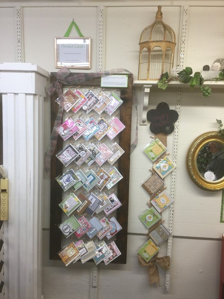
As this is a first attempt, I didn’t want to over do it and decided to start by renting some wall space.  Then it was just figuring out a way to display the cards.  I wanted it to be easy for customers to see what is available and to remove a card from the display.  I had recently added some chicken wire to an old window frame as home decor and thought something like this could work for my booth.  I didn’t have a large enough window on hand so my husband built a large frame, which we stained and then added chicken wire.  I can easily attach the cards using small clothespins and customers can just unclip the card they would like to purchase.

To fill in the empty space next to the frame, I decided to add a “featured” cards section showcasing a specific holiday or sentiment.  Since the theme would change every few weeks, the display needed to be somewhat generic.  Some burlap ribbon and a chalkboard work for now.  I can clip cards to the ribbon and easily change the message and colors on the chalkboard to match the theme.

Here is a picture of my booth.  I think it fits well with the look and feel of the store.  I’m sure it will evolve as I figure out what works best but I think this was a good start.

I’ll still be donating cards to the Cards for Soldiers Program but this will be something new and fun to try.

Craft Smith Palm Springs 12×12 Paper Pad

Craft Smith Palm Springs 12×12 Paper Pad

If you’re like me you can’t pass up a cute paper pad.  That’s how I ended up with the Craft Smith Palm Springs paper pad.  The colors are gorgeous, the prints are fun and it was on sale.  My inability to pass up cute and sale, was even worse with this paper pad since there was also a coordinating tube of washi tape.

Unfortunately not passing on cute paper pads mean I have more paper than time to use it.  In an effort to thin down my printed paper stash, I’m pulling out older paper pads that I haven’t gotten around to using or have only used a couple of sheets.  I plan to make a few sets of cards from each paper pad and whatever I can’t/don’t use I’ll be adding to the “for sale” stack.

As I was gathering supplies to get started I ran across my container of brads, not to be confused with a package of brads.  This container holds 20+ packages of brads with 80-100 brads per package.  Yes, there was a sale incident where each package was only 25 cents.  How could I pass that up?

So with an abundance of paper, washi tape and brads, I got started on my first set of cards.  I made at least 3 cards with each paper/layout combination.  The first set of cards used one of my favorite sketches, #218 from OWH.  I liked the paper combo so much I decided to make another set of cards using the same paper but switching to OWH sketch #227.  The orange “Sunny State of Mind” sentiment is some of the coordinating washi tape that I placed on white paper and then cut to size.

OWH sketch #218 worked so well that I decided to just switch up the colors of the background, matting and brads and make another set of cards.  This time using the washi tape for the small banner.  After making a set of 3 cards I ran out of the “Sunny State of Mind” paper but since there was still enough of the orange background paper for a more cards I pulled out a floral print and kept going with the same sketch.  I decided to skip the brads on this set of cards since the floral focal panel is quite busy.

There was now a partial sheet of the floral paper so I thumbed through the paper pad and found the green starburst print to pair it with.  This set of cards uses new-to-me sketch #259 from OWH.  For a punch of color I used bright pink cardstock for the strip across the bottom of the card and the brads in the upper right corner.  There was still some of the floral print paper left.  So for the next set of cards I paired it with an off-white print and the leftover strip of green starburst paper.  I used another OWH sketch also labeled #227.

For the last 3 sets of cards I pulled out a cactus print paper to use for the focal panels.  The first set (OWH sketch #20) uses the rest of the off-white print for the background and a gold foil print paper also from the Palm Springs paper pad.  The last 2 sets of cards (MFT sketches #516 and #503) use a turquoise print paper for the background and feature turquoise satin mirror paper for the banner and circle embellishments.

I ended up making 30 cards using the Palm Springs paper before I got bored.  There are still some papers that I’d like to use, but I did find several sheets that I know I won’t use so I’ve put those aside to sell.

Scrap Cards

Scrap Cards

After struggling with the last batch of cards I decided to work on something really easy.  Scrap cards!

I’ve used this layout several times in the past and it’s great for using up scrap paper.  To get started I quickly sorted through the pattern paper scraps and pulled out the pieces that could work (i.e. were at least 4 inches long and 1 inch wide).  Once I had a pile of “possibles” I started pairing up papers that would work together.  I then flipped through my cardstock scraps for pieces that matched the pattern papers.

The process for assembling all of the cards was the same.  A coordinating cardstock was selected for the card base and cut to 4 1/8 x 5 3/8 inches.  The pattern paper, trimmed to 1 inch wide and no more than 4 1/2 inches long, were lined up and attached to the bottom of the card base.  Using a few different border punches, strips of the same cardstock were cut and attached to the bottom of the cardstock scraps which were then attached to the top of the card base.  That completed the basic assembly for all of the cards.

I thought the brown and rust colors in the first few sets of scraps would work well for masculine birthday cards.  I stamped the birthday sentiment directly on the cardstock scraps.  To embellish the card I added some bakers twine and coordinating brads.

The next few sets of scraps were bright and cheerful colors.  More bakers twine and ribbon were used.  Mini brads were used to attach the iridescent flower embellishments.

The last few sets of scraps were all blues and greens.  I added a “Thanks” sentiment to one of the cards but left the other 2 blank.  Some more brads and a few paper flowers were used for embellishment.

This was a quick and easy way to make several cards and use up some paper.  I also tried to use a few of the other supplies, ribbon, brads and other flower embellishments, that have been hanging around in my craft room for way too long.

My Mind’s Eye World Traveler

My Mind’s Eye World Traveler

I had never purchased a coordinating ephemera pack but one of my favorite cardmakers uses them occasionally so I thought I’d give it a try.  Since I wasn’t sure if I’d like using the ephemera I decided to see what was available at my local Tuesday Morning store (prices of papercrafting products are usually up to 50% off retail).  There were several paper pads but only 1 had the coordinating ephemera – World Traveler by My Mind’s Eye.  I liked the colors and the prints in the paper pad and figured I could use just the paper if I didn’t like using the ephemera.

I’m sure the paper would work for birthday, miss you, etc. but I decided to skip any sentiments and only use what was included in the ephemera pack.  And with 60 ephemera pieces there was a lot to use up.

The hot air balloon was my favorite ephemera piece so I used it first.  The background uses the hot air balloon paper for the bottom portion and a bright green cardstock for the top portion.  A blue Love from Lizi peel-off was added to the seam between the 2 papers.  The balloon and “So Fun!” ephemera pieces were popped up with foam tape on the the pink/white stripe panel.  The top portion of the card looked a little plain so I wrapped the panel with blue and white bakers twine and tied a small bow.  As a finishing touch a few clear crystal drops were added around the ephemera.

The camera print paper was cute but with the white background it seemed to wash out the brightly colored papers.  Instead of trying to brighten up the camera print I decided to go with the pale color scheme, pairing it with a pale pink/white print and using a pale pink cardstock for the background.  The navy cardstock used for all the mattings highlighted the different panels.  Keeping with the pink theme, a couple pink brads and pink glitter Love from Lizi peel-offs were added as embellishment.

Another fun ephemera piece was the pink camera.  To ensure it didn’t get lost in the busyness of the two paper panels, I matted it on a blue cardstock circle.

With all of the different colors, the map ephemera should have been easy to use but…  Instead of layering it on the bright prints, it seemed to work best when layered on one of the pale pink/white prints with the bright print used as the background.

The ephemera pack included a couple of larger sized tags which I used as focal panels.  A bit of bakers twine was added to the tops of the tags and then the entire piece was matted with coordinating cardstock.  Since they were airport baggage claim tags, I paired them with the airplane print paper.

For the road sign ephemera, like the Route 66 and Detour pieces, I paired them up with the map and other road travel related paper.

I’m not sure if this was the best ephemera pack to use as a first try.  While all of the pieces were travel related, they could only realistically be paired with specific papers.  For example, the road sign ephemera wouldn’t have worked with the airplane print paper and the airplane ephemera wouldn’t have worked with the bicycle print paper.  I did manage to use up over half of the pieces but other than a couple small tags I’m not sure what I’ll do with the remaining ephemera.  I’m not giving up on using ephemera packs, but based on the experience with this collection, next time I will look for paper and ephemera with a narrower focus (i.e. only one type of travel).

Recollection’s Love and Devotion

Recollection’s Love and Devotion

Now for the red, pink, hearts and flowers Valentine cards…

I used Recollection’s Love and Devotion 12×12 paper pad.  All of the papers are the traditional red and pink with lots of heart and flowers.  It’s a pretty paper pad with some sheets having a glitter or mirror accent.  Since there is so much paper, I tried to use only papers from this paper pad for all of the backgrounds and focal panels.  But, there were a couple cards where none of the papers worked for the background and I did end up using some white shimmer paper.

Along with the cut-aparts, I used a few Valentine and love sentiment stamps.  All of the cut-aparts were square or rectangular, but a few worked well for die-cutting into circles.  I also used a few dies to cut hearts for the sentiment panel and embellishments.

My favorite card uses Mojo Monday sketch #370.  I’ve used this sketch in the past and really like how you can mix multiple pattern papers.  For this card I only used 2 patterns since the “Love” background and the tic-tac-toe focal panel are both a bit busy.  For the other card, I used another of the cut-aparts as the main focal panel.  More of the floral print and polka dot papers were used for the other panels.  Since adding another print would have been too much, white shimmer paper was used for the background.  For embellishment, a pale pink chiffon ribbon was tied around the card front.

The next 2 cards used a couple of sketches that I have been using quite a bit lately.  The first card used another of the “Love” pattern papers for the focal panel.  For some separation from the background, the focal panel is matted on white cardstock with a scalloped border.  For the second card more of the tic-tac-toe paper was used for the focal panel.  Die cut hearts, rhinestone hearts and red mirror Love from Lizi peel-offs were used as embellishments.

After making over 40 cards, I’m ready to move on to something new.  There is still tons of paper left including several prints that I didn’t even use.  I’ll have plenty of paper for Valentine cards for next year.

More Valentine Cards

More Valentine Cards

I still wasn’t ready for the full blown red, pink, hearts and flowers Valentine cards.  Instead I pulled out a couple sheets of non-Valentine paper from Pink Fresh Studio’s Felicity collection.  One features a modern take on a heart print in red, gray and peach.  The other small colorful hearts sprinkled across a white background.

The first set of cards paired the red, gray and peach heart print with a peach/red polka dot paper from my craft room.  I used a simple layout that I had used for the previous batch of Valentine cards.  The heart print paper is used for the focal panel and the polka dot paper is used for the background.  To ensure as many “hearts” as possible are visible, some of the cards are done vertically and others horizontally.  A simple Valentine sentiment is stamped and trimmed into a banner shape.  For the vertical cards, a couple red heart shaped rhinestones were added in the upper right hand corner.

The next couple cards used a new-to-me sketch and an old favorite.  The new sketch features the focal panel trimmed into a banner.  A large die cut heart was added towards the top of the banner and the sentiment strip was popped up over the lower portion of the die cut.  For some sparkle, a couple red rhinestone hearts were added.  The second card used one of my favorite sketches.  The heart print is again used for the focal panel.  To add some interest to the right side of the card, a couple heart rhinestones were added.

At this point there were only a few strips of the polka dot paper left.  I looked for sketches where I could use the strips instead of a full sheet of paper for the background.  The first card used a panel of the heart print paper across the card and the second used a panel down the center of the card, both panels covered the edges of the polka dot strips.  Instead of matting the heart panels, red mirror Love from Lizi peel-offs edged the panels and a couple of die cut hearts were added for embellishment.

The second group of cards pairs the colorful heart print with a teal geometric print also from the Felicity collection.  So far the focal panel on all of the cards were square or rectangular.  For something different, I used a circle focal panel.  A simple “Love” sentiment was stamped and added across the lower portion of the circle.  And for embellishment, a small die cut heart and clear heart shaped rhinestone were added to the end of the sentiment strip.

The next set of cards used a couple of my favorite sketches.  Both cards feature a single large focal panel perfect for featuring the heart print paper.  The first card has a large fish-tailed sentiment banner and a long thin flag cut from a scrap of teal satin mirror cardstock.  The second card features a small die cut heart stamped with a Valentine greeting, making it look like a candy conversation heart.  A few clear heart shaped rhinestones were added next to the focal panel for a little bit of sparkle.

Using the leftover strips of background paper worked so well that I decided to try it again.  The first card used one of the same sketches, but instead of a vertical card, I flipped it horizontally to work with the direction of the heart paper.  Love from Lizi peel-offs, a large die cut heart and a few clear heart shaped rhinestones finish the card.  The second card uses a similar layout, but the vertical strips of the geometric print are different sizes.  The heart paper is matted with some of the teal cardstock and edged with 2 different sizes of Love from Lizi peel-offs.  Instead of a sentiment panel, a few fun Valentine greetings were stamped on small die cut “candy conversation hearts”.

Even though the cards were made for Valentines Day, I think they would work any time of the year.

Valentine Cards

Valentine Cards

After a short break it was time to get going on Valentine cards.  To get started I pulled out all the Valentine specific paper.  As I was doing this I noticed a few sheets of heart print paper that I had picked up with the intention of making “Miss You” cards.  Instead I decided to use the paper for Valentine’s Day cards.  Not every Valentine needs to be red and pink, right?

Since the hearts are mainly shades of blue with just a couple peachy pinks and rosy reds, I decided to focus on the blue hearts.  I found a soft blue-green scallop print and a partial sheet of bright royal blue check print to pair with the heart paper.  Keeping with the non-traditional theme none of the sentiments were specifically “Happy Valentine’s Day” and all of the sentiments were stamped using Ranger Cobalt Blue ink.

Because of the scale of the heart paper, a single large focal panel was used to ensure multiple colors of hearts were visible on each card. The first couple cards used the scallop print for the background.  To bring in just a touch of valentine color, a scrap of rosy red/white polka dot print was used for the strip across the card.  The sentiment was popped up with foam tape to add a bit of dimension.

The next set of cards again used the scallop print for the background.  A long “XOXO” sentiment was stamped and the ends were cut into a fish tail.  A small heart was die cut from more of the polka dot paper and popped up with foam tape.  The heart was placed at different spots along the sentiment depending on the location of the hearts on the focal panel.

For the next few cards, I pulled out some washi tape that has been hanging out in my craft room for quite some time.  The colors of several stripes in the washi tape also appear in the heart paper.  For some of the cards the washi tape appears to be taping the focal panel to the card.  For others, the washi tape covers the seam between the pattern papers.

The next group of cards used the blue check print for the background.  The size of the focal panel on the cards is the same but the pattern is vertical on one and horizontal on the other.  The same sentiment is used for both layouts.  On the vertical card the sentiment panel has fish-tailed ends and is popped up for some dimension.  On the horizontal card a die cut heart, popped up with foam tape, has been added to one end of the sentiment panel.

The last couple cards used up the rest of the scallop and check print papers.  To separate the printed papers, Love from Lizi peel-offs were used.  A small “Luv U” sentiment was added to the bottom corner of the cards.  The last of the polka dot paper was used to die cut a few hearts which were popped up with foam tape for some dimension.  As a final embellishment, a few rhinestones were added for some sparkle.

I really like how these cards turned out.  I think they would work for masculine or feminine Valentine Cards.  Or with the non-traditional colors and prints could also be used any time of year.  I still have a couple sheets of the heart print paper left and may eventually get around to using it for “Missing You” cards.

American Crafts Hot Cocoa 6×6 Paper Pad

American Crafts Hot Cocoa 6×6 Paper Pad

And now for the last of the Christmas cards…

It’s after Christmas but there was still one more paper pad I wanted to use.  Also, I had purchased a few new dies after Christmas and I didn’t want to wait until next Christmas to try them out.

The paper pad was not specifically Christmas but the prints all had a winter feel to them so I decided to use holiday sentiments.  There were only 4 colors in the paper pad – black, white, red and kraft, which made it easy to pick coordinating cardstock.  I used red and black cardstock for the matting and red, kraft and white shimmer papers for the backgrounds.

I used sketch #516 from MFT on the last batch of cards and decided to use it again.  Solid colored cardstock was used for the background and printed paper was used for the focal panel and the horizontal banner.  Red mirror cardstock was used for the banner on the left side of the card.

The next few cards used two of my new dies – a deer silhouette and a snowflake.  I cut both images out of red cardstock.  The deer is paired with a red/white/kraft tree print and the snowflake is paired with a kraft/white snowflake print.  Everything was matted with more of the red cardstock.  I really liked how these cards turned out and know I’ll get a lot of use out of these dies in the future.

The paper pad included a couple sheets of cut-aparts, some of which were small tags.  I really liked the tags and thought it might be fun for the sender to personalize the To/From tags.  Using a die, I created a small envelope for each tag.  A bit of coordinating twine was added to each tag and then they were placed into the envelopes.

These next few cards used only black and white prints with a pop of red.  Both cards used more of the new dies.  The deer die cut, being a more solid image was easily visible on the black/white tree paper but the snowflake seemed to get lost on the same print.  To ensure the snowflake was visible, I die cut several snowflakes and stacked them together, which gave the snowflake some dimension.

With the scraps, I decided to do a slightly different take on an OWH sketch.  Using an old punch and the scraps, I punched several scalloped squares.  I also punched several squares out of some kraft cardstock.  For the kraft squares I added a red or white snowflake die cut with one of the new dies.  A coordinating ribbon was added across the bottom of the card.  I didn’t want to cover up too much of the scalloped squares and decided to skip the sentiment.

The paper pad included 36 sheets so I knew I would probably make more cards than usual but 50+ cards was a lot.  This put my total to over 200 Christmas cards this season and I’m going to call it done.  The charity where I donate my cards starts packaging/shipping Christmas cards in July so I have plenty of time to drop these off before then.  Now I’ll take a short break before starting on Valentine cards.

Christmas Cards from Scraps

Christmas Cards from Scraps

Before moving on to the next paper pad, I decided to use up the scraps from the Jingle All the Way paper pad.  With all the different colors and patterns in the paper pad there weren’t any scraps that could be combined.  So I pulled out some scraps from the Authentique Colorful Christmas paper pad which also included pinks and teals.  By mixing scraps from both paper pads I was able to make a few more cards.

This card pairs the red plaid from Jingle All the Way with a tree print from Colorful Christmas.  After trying a few options for the background I decided to go with the pastel pink.  I think the non-traditional color is a nice compliment to the more traditional plaid and tree prints.

For the next couple cards I paired the multi-colored ornaments from Jingle All the Way with a print from Colorful Christmas.  Both papers include the same colors and if I didn’t know better would think they came from the same paper pad/collection.  I selected sketches that worked with the size and shape of the Colorful Christmas paper scraps.  The layout for the first card worked best with a vertical pattern scrap.  The focal panel was created with a die set from Gina Marie designs.

The layout for the second card featured a horizontal pattern scrap.  A small scrap of the Jingle All the Way ornament paper was used for the focal panel.  To add some texture to the aqua background, the cardstock was embossed using a swiss dot embossing folder.  For a little shine, a thin strip of teal satin mirror cardstock was added under the Colorful Christmas paper.

For the last couple cards I used the red polka dot print from Jingle All the Way with the deer print from Colorful Christmas.  Kraft paper, which matches the color of the deer print, was used as the background for the first card.  The red polka dot print picks up the color of the deer noses.  To bring in more red, a red cardstock was used for the matting.

I liked the look of the deer print with the kraft cardstock but without another print to pair it with thought it was too plain.  Combining the kraft color with a print, I pulled out a sheet of gold foil kraft cardstock from the DCWV Kraft & Gold paper pad.  The tiny gold polka dots are just enough.  To finish the card a few circles die cut from red mirror cardstock were added to the upper right corner.

By combining the scraps from these 2 paper pads I was able to make several cards.  With their non-traditional colors and Christmas themed prints, I think it would have been difficult to use these papers with anything else.

My Minds Eye Jingle All the Way

My Minds Eye Jingle All the Way

One of the paper pads I wanted to use this year was Jingle All the Way from My Minds Eye.  I had picked it up a couple years ago because I liked the colors.  Also, with some of the prints having a less serious feel, like the candy canes, and others having a more traditional feel, like the ornaments, I figured it would be easy to make a mix of Christmas cards that would appeal to many recipients.

My favorite card uses a peppermint stripe for the background and the candy cane print for the focal panel.  After stamping the sentiment, the ends are fish-tailed and matted on a piece of dark teal cardstock that matches the holly leaves in the candy cane paper.  Three sizes of circles were die cut from red glitter paper and added for embellishment.

With the simple pattern and all of the colors, the watercolor stripe would work with just about any of the papers in the paper pad.  Since I found the ornament print the hardest to pair with other papers I decided to use it with the stripes.  Dark teal cardstock was used for matting, a teal satin mirror cardstock banner was added behind the ornament focal panel and a few clear crystal drops were added for a bit more shine.

The next card used a new-to-me card sketch, #516 from MFT.  I liked the combo of the red plaid with the poinsettia print and used those for the background and focal panel.  Using the “Merry Christmas” paper worked as both the horizontal panel and the sentiment.  For some sparkle, white shimmer paper was used for the vertical banner and Wink of Stella was used to highlight the poinsettias.

Since the holly paper only had 3 colors, white and 2 shades of teal, it was easy to decide which paper to use for the background.  To break up all the teal, a piece of white textured pearlescent paper was used for the vertical panel on the left side of the card.  To finish the card, a sentiment was stamped and popped up with foam tape.

The next card used more of the poinsettia/plaid paper combo.  This time with a multi-colored plaid which picked up on more of the colors in the poinsettia paper.  A gold Love from Lizi peel-off was used to separate the 2 prints.  A white ribbon was tied around the left side of the card and the sentiment was popped up with foam tape.

The snowflake print was one of my favorites but I wasn’t sure what to pair it with.  I thought about sticking with the traditional red and green Christmas colors but decided to go non-traditional with pink.  A pastel pink cardstock was used for the background and a pink plaid was used for the strips on the left side of the card.  I added even more pink with the pink iridescent glitter Love from Lizi peel-offs matting the plaid strips.  All of the other matting was done with a dark pink cardstock.

With all of the colors and prints, the paper pad was quite fun to use.  I did end up with more scraps that usual as not all of the papers could be paired together.  The colors in this paper pad reminded me of an Authentique paper pad I had used last year where I also had a few more scraps than normal.  Maybe I’ll have to pull out those scraps and see what I can do.